BigAl
TS Member
- Favourite Ride
- Forbidden Journey
jon81uk said:I think that yes, Swarm is as good as Nemesis on theming, there is a ton of themed vehicles, custom queueline TV video and audio and water effects timed to the ride. Shame the actual on-ride isn't as memorable!
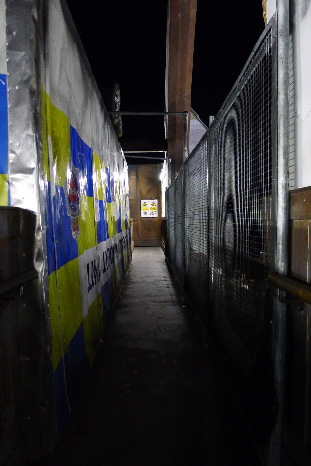
You're kidding, right? Swarm has some of the laziest theming elements going. Those "themed vehicles" are nothing more than old service vehicles which, had they not been picked up by Thorpe, would have otherwise only been good for scrap. Army vehicles, fire trucks, ambulances; you name it, they're parked up with hundreds of other similar vehicles which have outlived their primary purpose. They're dirt cheap and need very little doing to them.
Then we have the burnt twigs in the queue line, TV's playing a news channel that has poor quality acting and spelling, lack of fine details (like the 'kitchen' under Nemesis' catwalk) which add something extra to the experience - something that most of Merlin's attractions lack because they think a two dimensional theme is fine. The water effects on it are fine, but not a patch on the great waterfalls and rivers of blood in the deep pits surrounding the Nemesis creature.
But hey, Swarm has fire and stuff.