• ℹ️ Heads up...

    This is a popular topic that is fast moving Guest - before posting, please ensure that you check out the first post in the topic for a quick reminder of guidelines, and importantly a summary of the known facts and information so far. Thanks.

Kings Island: General Discussion

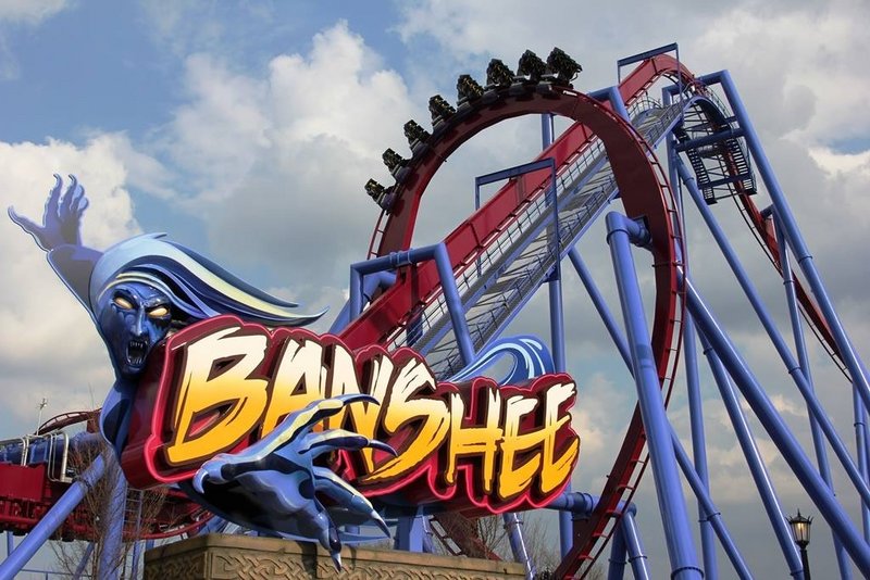
The Banshee entrance sign:

bkfe8okcyaazrd9.jpg


Just under a couple of weeks until this opens now!

:)
 
The blue ice cream at KI is absolutely fab though <3

That entrance sign is nice, but do Cedar Fair parks all have to do this now? Big 3D sign in the entrance plaza? Their creativity lacks so much on so many levels...
 
The first half looks to be taking the elements quite slowly (probably due to the size of them), but with lots of speed out of the elements, then the second half looks like the elements themselves will be taken at an intense speed.

Hopefully the second half will have some large positive & lateral G's - it's also good to see a coaster that looks like it gets better as it goes on, like Nemesis in certain respects, just this is longer & higher, yet doesn't have the theming or the near misses or the landscape. (Only form what we can see so far.)

Excited to see a POV, then KI is a definite for my next trip to the US.
 
The second vertical loop looks like it'a taken at a really nice speed so that should be good. Really looking forward to seeing a POV of this and then seeing some reviews. B&M don't seem to be all that popular at the moment with enthusiasts over in the USA (it's probably the same of here actually) so the reviews should give a good idea of what it's like. If people are saying it's good then that will be a very good sign!

:)
 
A POV has surfaced on the YouTubes. It's not legit, it's a vertical video and it's from the middle of the train so I'm not sure if I should be posting it and encouraging them but it's staff on a closed day and if there's a problem I'm sure someone will tell me.

http://www.youtube.com/watch?v=VvCN8TQeaog#
 
I'm unsure how it looks mental.

Looks good but not exactly sharp turns/craziness.

Solid and will appeal to the masses.

:)
 
It's very hard to judge from that video but the pacing looks good. We'll have to wait for the reviews once it's open to know, I'm sure most enthusiasts will just say it looks boring and forceless from POVs as many are very anti-B&M at the moment. That is both in the USA and here in the UK. With the new trains it will be hard to know how exactly it rides without actually riding it!

:)
 
Rob said:
It's very hard to judge from that video but the pacing looks good. We'll have to wait for the reviews once it's open to know, I'm sure most enthusiasts will just say it looks boring and forceless from POVs as many are very anti-B&M at the moment. That is both in the USA and here in the UK. With the new trains it will be hard to know how exactly it rides without actually riding it!

:)

To be fair, I was excited to ride Alpengeist but only found the first 1/2 any fun. I won't judge Banshee till I've ridden it, regardless, the layout seems solid.
 
Hmmmm... I really don't like the look of the new trains. I dislike the plastic shells on the back of each seat. Part of the beauty of the original design is in its barebones simplicity. They didn't need to try hard and look pretty, as they were just a part of the ride system. Their purpose was functional, and they didn't try to get in on the theming and aesthetics side (Unless a client requested them with custom wheel covers obviously). They did their job of offering the best ride sensation, and the theming dealt with the looks. These new ones try too hard to look modern and sharp, which just doesn't work on every ride (I'm not even sure they work in this instance). I can't visualise these being used on the likes of Mamba and Katun, and having the same effect as they do now. They'd stick out like a sore thumb.

Also, it looks to me like this new idea of a central support column obscures some of the view ahead. Yes, there was never exactly a stunning view with the old trains, but at least when the train pitched to maneuver around elements you could see some of the surroundings, and you could catch glimpse of the train ahead through the seat supports.

I don't know. It just seems to me like the design team got bored and said 'Sod it. Anyway fancy mucking around with our really good train design?'. I realise it's a hand held POV from a phone or similar too, but there does seem to be more shaking than I'd usually expect from a new B&M. I notice the seats are perched either end of the support column, almost winged if you will, so I wonder if there's extra potential now for vibration, like many claim with their winged coasters.
 
I know it will speed up a little, but it does look a bit dull and slow? If I'm honest, a bit wingrider like?
 
My tumblr dash is covered in videos and articles on Banshee. I watched the video and I don't think a POV has ever left me feeling so cold! It was like watching a digital recreation.

I find B&M inverted coasters really samey. I think they really rely on near-misses and themeing elements. The only two that I've ridden that meet this criteria for me are Nemesis and Black Mamba. OzIris at least has the underwater dive but other than that it doesn't do much for me.

Without any sort of themeing context the track just looks like it's going through the motions, making up elements as it goes along. As opposed to Nemesis which is twisting out of the way to avoid the rock face, or river, or giant alien.
 
Hard to assess B&M's on video as they don't throw themselves around as much as other manufacturers but this does on the face of it look very sluggish.

But B&M have struggled to produce "thrilling" for a decade now.
 
Top