• ℹ️ Heads up...

    This is a popular topic that is fast moving Guest - before posting, please ensure that you check out the first post in the topic for a quick reminder of guidelines, and importantly a summary of the known facts and information so far. Thanks.

Alton Towers Graphics - Opinions Needed!

Tyarith

TS Member
Favourite Ride
Nemesis
Hello Everyone!

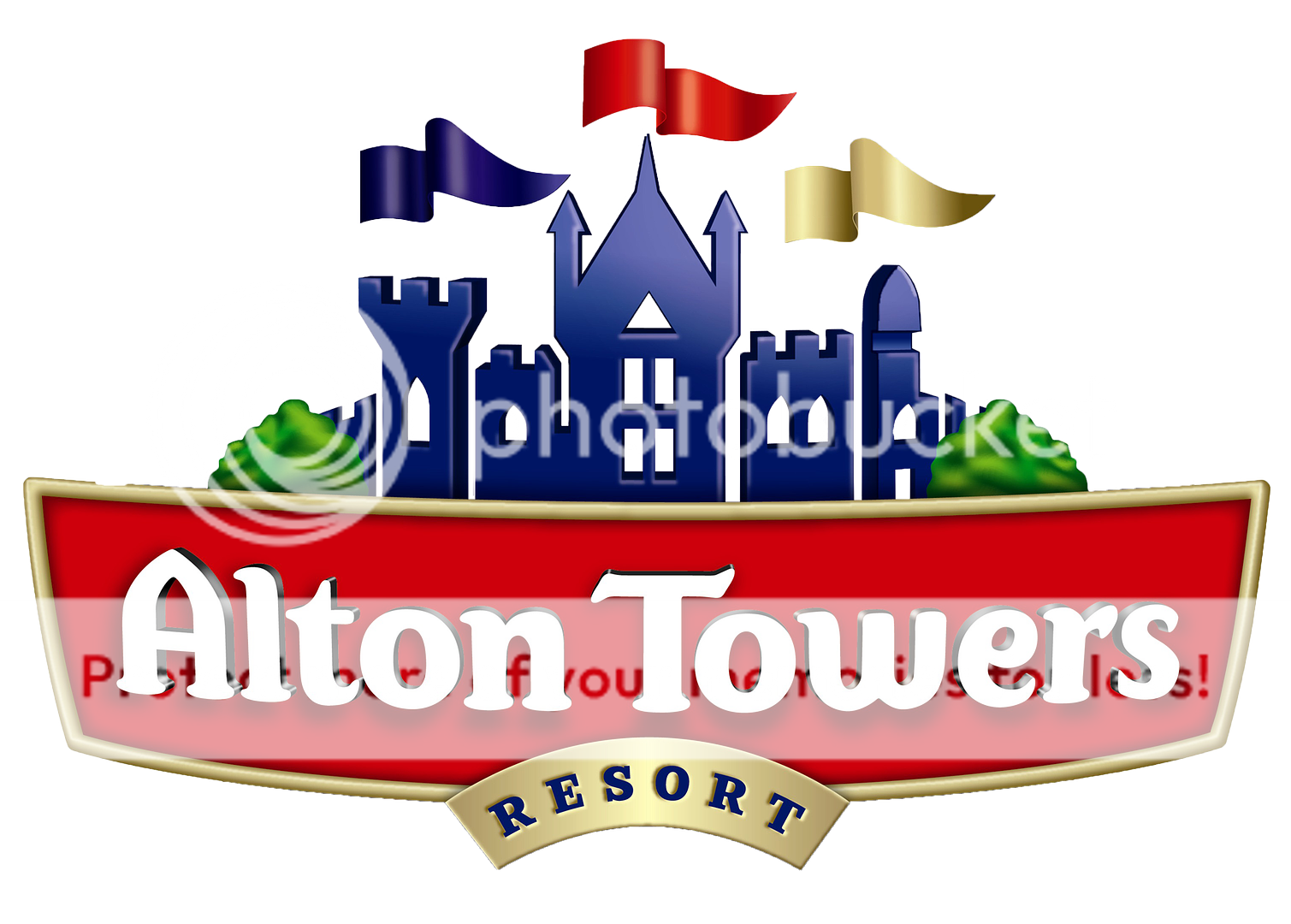
So in my spare time, I like to do a lot of graphics work. Today, I decided to re-create the Alton Towers logo with my own creative flair. And I hope to create more graphics in the future and post them to this thread.

Here is the logo:
logodev_2.png

Please Note: This is not the final version as I still need to add further detail to the background area. However, I would like your opinions on it in it's current state.

Here are a few things to compare to the official logo:

  • This logo is based on simplicity and so the towers have been created in 2D compared to 3D.
  • Added further depth to the red badge with the text.
  • The towers are based on my own interpretation whilst sticking closely with the original design and so the windows may be abstract and areas of the towers may not correlate to other areas.
  • The towers take up a larger majority of the logo space compared to the official one to "get the point of the towers" across.
  • Further detail needs to be added to the background to add "the magic".
In addition to the logo, I actually created a piece of graphics work for some theory branding of air in which I posted in that thread, but I may as well post in my collection here:

air_galactic_v2_1080.png


And here is something random I made - I don't really have point to anything I make, I just like creating:

scarefest2016_posterpromotionv1.png


Anyway; I would love to know what you think about it and if there is anything you think I could add to improve it?

I will most likely add further graphics work to do with Alton Towers in this thread. :)
 
Last edited:
I approve of the reduction of the size of the "resort" at the bottom, plus I like the new size of the Towers. Just as long as you retain the flags and stars, at least in a reasonable capacity, then I think that would be a good modernisation of the logo :)
 
I approve of the reduction of the size of the "resort" at the bottom, plus I like the new size of the Towers. Just as long as you retain the flags and stars, at least in a reasonable capacity, then I think that would be a good modernisation of the logo :)

Yes the stars and the flags will be implemented - I am just trying to work out the best way to implement it. It usually takes me a few attempts and tinker it before I am happy with it.

Thanks for the feedback anyway! :p
 
"32* magical world's" :p

Not sure, but I think you spelt disappointment wrong in the scarefest one. Apart from that they look great. I actually prefer the towers logo like that.
 
"32* magical world's" :p

Not sure, but I think you spelt disappointment wrong in the scarefest one. Apart from that they look great. I actually prefer the towers logo like that.

I couldn't resist to include some of that Merlin marketing. :p

Thanks for pointing out that misspelling. It is a shame that Photoshop does not have spell correct.

I am glad you like the logo anyway! :D
 
Looks good. I quite like the simplicity of it as it is; I always think the stars and other little shapes around the edge of the current logo are a bit fussy.
 
Perhaps curve 'Resort' with the shape?

I'm not entirely sure why you're doing this but, they look good.
 
Perhaps curve 'Resort' with the shape?

I'm not entirely sure why you're doing this but, they look good.

As @Error said, I like doing it as a hobby.

Thanks for your suggestion about the curving of resort - I will keep it in mind.

I am currently in the process of adding further detail to the background, whilst still ensuring it retains it's simplicity. I should have a new version up over the next few days.

If anyone has any suggestions for any further graphics I should create - please feel free to leave your suggestion! :D
 
Lurker, rare poster. Full time graphic designer. I thought I'd share my thoughts! :)

Firstly it's great to see you enjoying your creativity. You’re inspiring me to start a side project of my own!

So here’s a bit of feedback:

- The heavy ‘3D effect’ around the type of ‘Alton Towers’ hinders the legibility and would get worse the smaller the logo is. Remember, as well as large format signage/adverts, the logo must be used in a vast array of sizes and formats. Versatility is key in a brand. I think you’re really onto something by simplifying elements of the logo, maybe follow through with the same treatment for the type?

- I really like the idea of simplifying the towers, I think you could explore this in greater focus.

- There appears to be some kind of clipping occurring on the bottom of some of the letters? Also the baseline of the logotype is not consistent.

- The bevel effect used on the resort panel isn’t convincing for a metal effect. Maybe consider adjusting how hard the edges are to make it feel more metallic? Or maybe experiment with carrying on the ‘simple’ approach.

- The typeface used for ‘Resort’ is too light weight. This will suffer when downscaled, maybe experiment with a bolder version? Or even a different typeface all together.

- Like you said, you still need to ‘add’ the magic so that's something I'll look forward to. That’s something I’ve always liked about the AT logo, it looks like it can’t contain the magic and excitement, almost bursting at the seams.

Keep up the good work man, looking forward to seeing how this develops!:)
 
Thank you for your feedback @ryan_map_collector . It is gratefully appreciated and I will take it on board as I start to change and modify my existing design.

I should have an update to the design over the next few days/weeks, including the suggestions in which you have given.
 
I have to say it but I definitely prefer the current logo. I personally think that your design is too basic and therefore not in my opinion eye-catching. However, I really like the Galactica poster and O find the Scarefest one OK. If I was you, add something to the main logo eg the flags.
 
I have to say it but I definitely prefer the current logo. I personally think that your design is too basic and therefore not in my opinion eye-catching. However, I really like the Galactica poster and O find the Scarefest one OK. If I was you, add something to the main logo eg the flags.

Thanks for your feedback - if you read the OP I did say that this design is not currently finished and was in an early design stage as I wanted to know where I should take the design further. I will be adding the stars and flags, etc... but I will try to make them simple to make the overall design coherent.

Glad you liked the AirGalactica poster though! :p
 
I love your Air Galactica piece.

I've always wanted to see the Alton Towers logo become a little simpler. I like where you're going with the logo in some ways. The 'resort' bit could be more curved in line with the 'Alton Towers' bit (I've always hated how 'Resort' is curved down on the logo), and the magic stars definitely need to be there.

This is a very basic cut out job by me, although I've always wanted to see the logo become something like this (obviously with a lot of design changes):
logoexperim_zps5pzdczly.png


The current official logo, while nice, is a bit too cluttered these days. It could do with being simpler and I like you're experimenting with your own take on that. Keep it up and enjoy what you're doing.
 
One thing in which I actually forgot to post in which I made in September was a Scarefest promotion video in which I was trying out, but I have never thought to post it until now.

Here it is anyway:


Thoughts appreciated! :) - Please note this is only a snippet because it takes a VERY long time to make videos like this for a unofficial fan creation! :p
 
I have just spent a little while testing around with some promotional material.

Thoughts? :)

4q20kn.png
 
Looks nice, two things I would say though is use something like Open Sans or Helvetica for the body copy instead of Mother Hen on everything, and perhaps not centre align everything, other than that though, great! :)

Thanks! :) I did think that the body did not look the best in Mother Hen and I was going to try it in another font - I just couldn't decide which font to use. :)

Proofread!

I see the problem! :p "and" should be "an". :)
 
@Tyarith In the second new for 2016 section, the second Roller Coaster is misspelled. I also don't think "the" is needed in "Escape to the Alton Towers Resort :)
 
@Tyarith In the second new for 2016 section, the second Roller Coaster is misspelled. I also don't think "the" is needed in "Escape to the Alton Towers Resort :)

Thanks for pointing it out! :p Photoshop seems to lag with the Mother Hen font for some reason and so sometimes it causes letters to not go in. :(

I have seen on other promotional material that it says "to the" and some others it does not as you can say it as "the" as in the place or without as a brand. :)
 
Top