I've been away for a bit so I just thought I'd highlight some of my favourites since I was last paying attention along with adding some improvement tips.
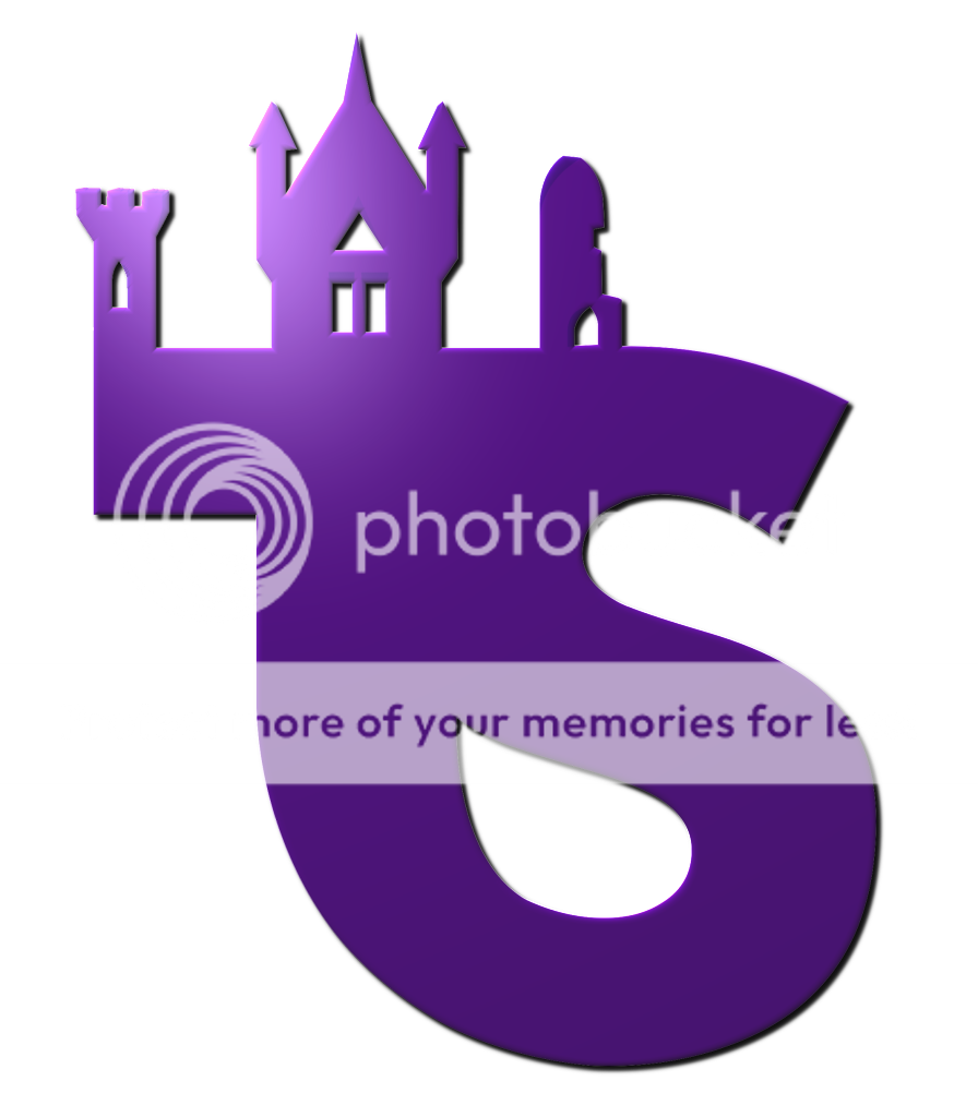
Kelpie, your design is really good and I expect it is the overall favourite so far. I’m not completely convinced with the way the towers appear in the background but their definitely should be something there and I’ve failed to think of a better way to arrange them.
Fredward I think your designs really good and eye catching. Do you mind if I have a go at adding colour to it myself? I like what you’ve started doing but want to add my own variant.
I liked a few of your designs
CGM But I think the simplicity of this one made it my favourite.
As above
Ryan I liked a few of your designs but I don't think any of them quite worked. The one above I think was quite good although I more naturally imagine the Towers as one single colour. I did like your design with the other text but I think the colour should change abruptly between towers and street like it does on this design. I also think the flags were a good idea but didn’t look quite right, a bit too pale maybe.
Rob I liked your design but it's currently missing a bit of character, I'm just not sure what.
Moley, Interesting design. I think the entrance building looks really good, maybe try simplifying the design on the monorail train (remove the logo's on them and alter the shape).
Brett, good improvement. And while we're still talking about your designs:
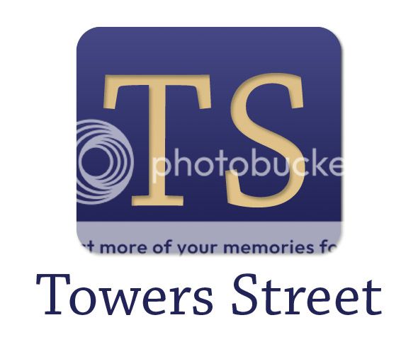
I think this was a really good idea but I feel the T doesn't stand out as its own letter. Rather than curving it at the bottom I'd let it continue straight down and meet the S at a corner.
Jonny I think your design is really nice and simple. It stands out really well.
Now that I've been all critical here's my little brainstorming session from the other day
(although I now see Nathan has pretty much done this design anyway)
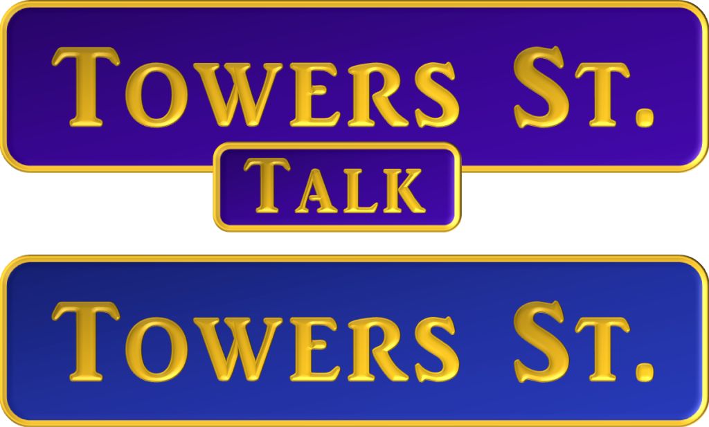
I tried to make it look as much like a road sign as possible and wanted to add a pipe work design to it just like Alton Tower's current style. The blue is (believe it or not) the closest colour match I could find to the Corkscrews. But then I relied it was pretty much TTF Blue so I tried a purple design (above)
Then I ran out of ideas before I could think of something Iconic to go above it.
Sorry for the long post. Keep up the good work everyone.


")