
-
ℹ️ Heads up...
This is a popular topic that is fast moving Guest - before posting, please ensure that you check out the first post in the topic for a quick reminder of guidelines, and importantly a summary of the known facts and information so far. Thanks.
You are using an out of date browser. It may not display this or other websites correctly.
You should upgrade or use an alternative browser.
You should upgrade or use an alternative browser.
Art Thread
- Thread starter Fredward
- Start date
Max
TS Member
- Favourite Ride
- Hex - The Legend Of The Towers
Drew this last night out of sheer boredom

It takes inspiration from quite a few sources, Mainly The Smiler & The Sanctuary, but it also takes little pinches of inspiration from films like A Clockwork Orange & Brazil.
I would've preferred to of draw it in pen, but only had a pencil on hand, although using a pencil proved to be very useful for doing dirt marks and eye bags.

James
TS Founding Member
Not art as such. However I was playing around with the Alton Towers logo the other day, trying to see how 'the magic' marketing could be brought back with a modern feel yet still hold that charm the 90s marketing used to have. Here's what I ended up with (sadly Photobucket has compressed the size so the quality is lacking):

I've watermarked it to avoid people stealing it and claiming it as their own. However if anyone on here would like a copy without the watermark just send me a PM with your email address and I'll happily email it over.")
Also, the edited Alton Towers logo if anyone wants it for any use:

I've watermarked it to avoid people stealing it and claiming it as their own. However if anyone on here would like a copy without the watermark just send me a PM with your email address and I'll happily email it over.
Also, the edited Alton Towers logo if anyone wants it for any use:

Harv
TS Member
I love that, Meat Pie. It's got a really strange feel to it, makes me want to look at it more.
Not really (well, not at all ) art, but I want an opinion on some graphic stuff I was messing with earlier;
Which one would look better on my bedroom wall?


I can't decide which one I prefer.
Not really (well, not at all
) art, but I want an opinion on some graphic stuff I was messing with earlier;Which one would look better on my bedroom wall?
I can't decide which one I prefer.
LewisNavex
TS Member
- Favourite Ride
- EuroSat
Some Pictures of me as a horse PONY!:
By: Bench.addict

By: Kelpie

By: DiogoJ42

By: Joelio

By: Panda

By: Bench.addict
By: Kelpie
By: DiogoJ42
By: Joelio
By: Panda


CGM
TS Member
This probably isn't art as such but I don't think it deserves its own thread, so I put it here.
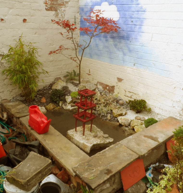
Having done a few theming concepts, I thought I'd have a go at creating some real life theming in the form of a small Japanese water garden area in our back garden.
Unfortunately, it isn't yet complete and I won't be able to work on it for a good few months. I figured that it would be better to leave it and spend time over it later rather than rushing it, so this is what I've done so far:
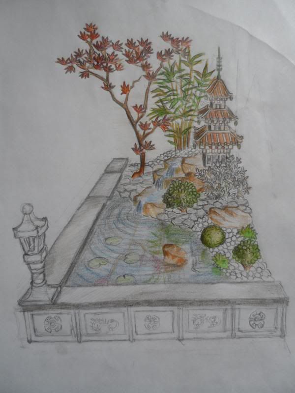
This is the initial concept drawing. The garden is being built in a corner between two high brick walls which once made up the walls of a wooden conservatory.
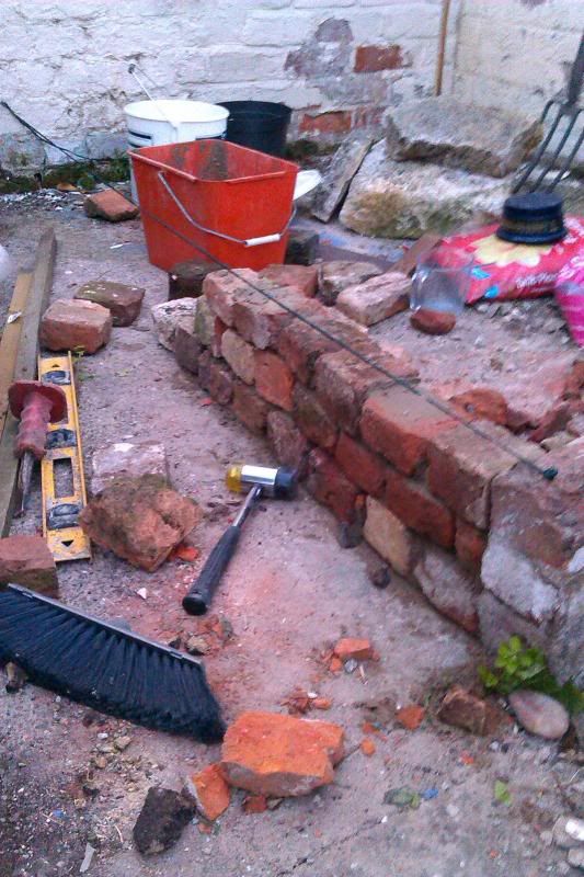
Step one was to build a small brick wall to retain the pond and flower beds. The wall is constructed from assorted brick rubble found in "routine excavations" of our garden. Some of it could well be medieval!
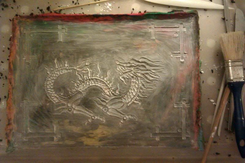
The other retaining wall is left over from the old conservatory and faced with unsightly concrete. I thought I'd get around this problem by producing a series of cast tablets to cover this up. This photo shows the mould for these tablets. It's a plasticine impression which produces a plaster relief.
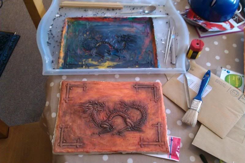
This is the finished result next to the mould. I eventually toned down the rustic terracotta effect as it looked a bit too cartoony outside.
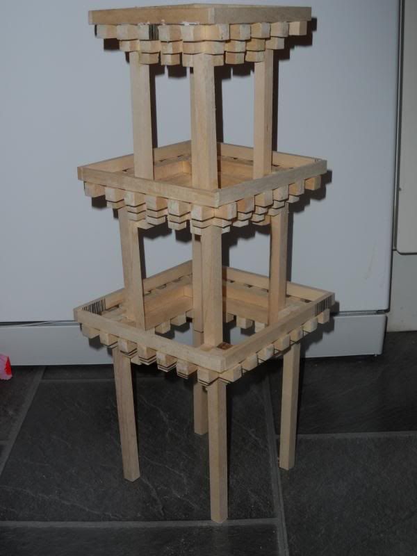
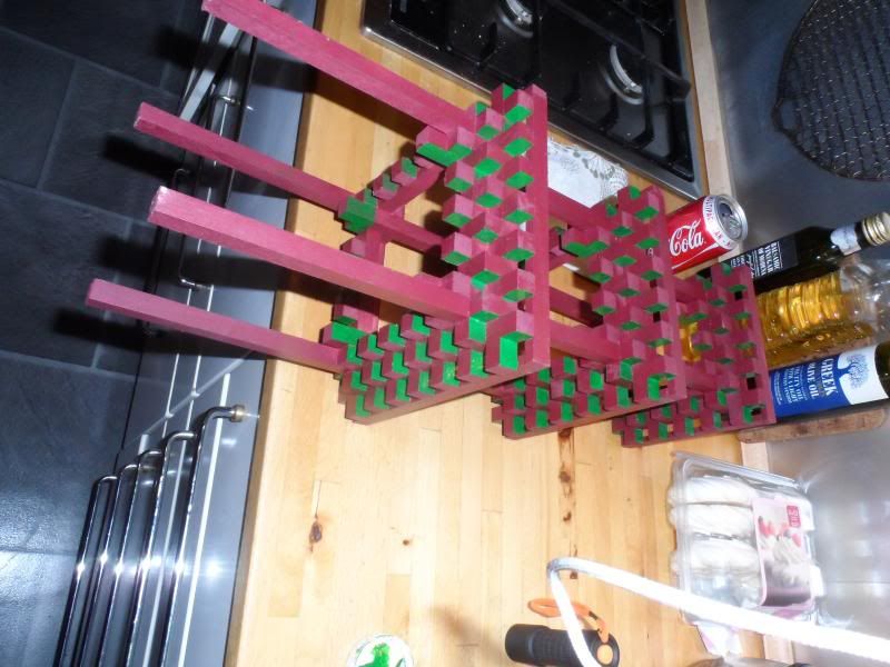
Next, I constructed the frame for the pagoda using basswood and PVA.
The pagoda Frame with a few licks of paint. This is far from the finished paint scheme and the camera flash makes the green appear much more lurid than it is.
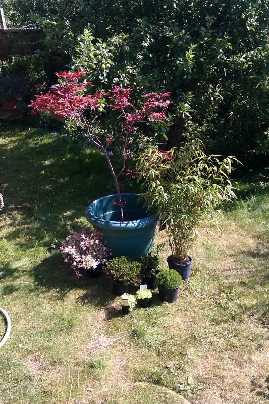
The plants that I picked out. The maple, we have had for a while and I've always wanted to give it a Japanese setting.
Soil, pond liner and plants in position.
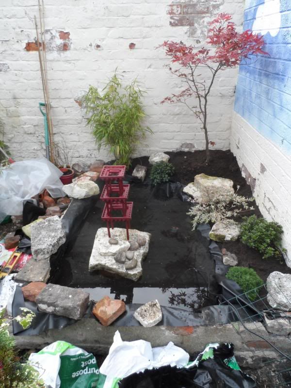
Pond filled, rocks going into place and water movement pump installed. I decided to move the pagoda to a rock island in a more prominent position.
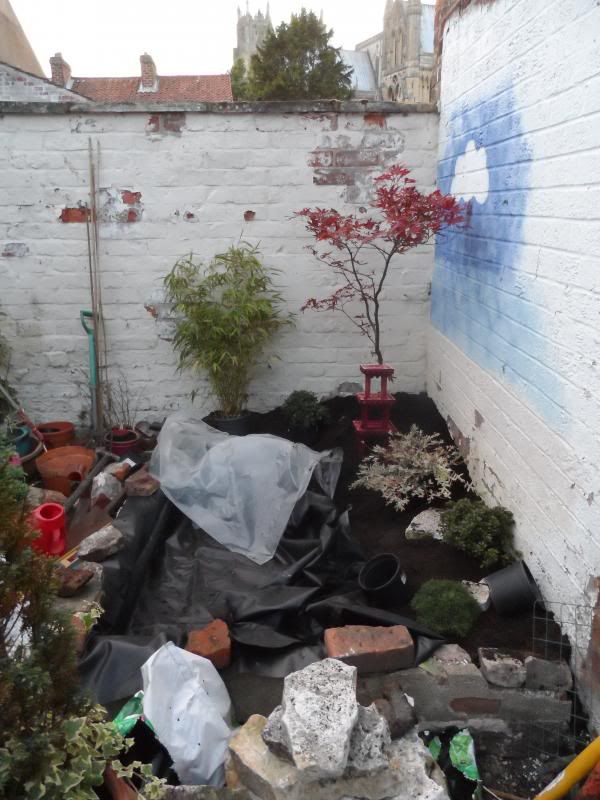
Flagstones placed on top of walls, more rocks installed and aggregate ground cover added.
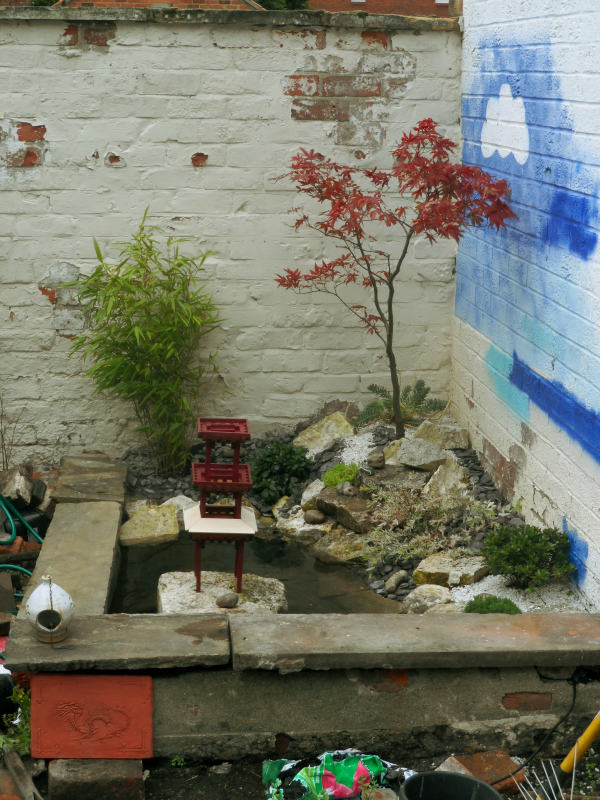
A comparison shot with the concept image. I didn't think that the walls would need paint but having seen it at this stage, I think that some of the plants are lost against the white walls. I didn't paint on the stenciled cloud, that was there before. I'm not sure whether I should paint a background scene or just use a neutral block colour.
So that's what I've done so far. I hope that this post isn't too heavy on your bandwidth.
Having done a few theming concepts, I thought I'd have a go at creating some real life theming in the form of a small Japanese water garden area in our back garden.
Unfortunately, it isn't yet complete and I won't be able to work on it for a good few months. I figured that it would be better to leave it and spend time over it later rather than rushing it, so this is what I've done so far:

This is the initial concept drawing. The garden is being built in a corner between two high brick walls which once made up the walls of a wooden conservatory.

Step one was to build a small brick wall to retain the pond and flower beds. The wall is constructed from assorted brick rubble found in "routine excavations" of our garden. Some of it could well be medieval!

The other retaining wall is left over from the old conservatory and faced with unsightly concrete. I thought I'd get around this problem by producing a series of cast tablets to cover this up. This photo shows the mould for these tablets. It's a plasticine impression which produces a plaster relief.

This is the finished result next to the mould. I eventually toned down the rustic terracotta effect as it looked a bit too cartoony outside.

Next, I constructed the frame for the pagoda using basswood and PVA.

The pagoda Frame with a few licks of paint. This is far from the finished paint scheme and the camera flash makes the green appear much more lurid than it is.

The plants that I picked out. The maple, we have had for a while and I've always wanted to give it a Japanese setting.

Soil, pond liner and plants in position.

Pond filled, rocks going into place and water movement pump installed. I decided to move the pagoda to a rock island in a more prominent position.

Flagstones placed on top of walls, more rocks installed and aggregate ground cover added.

A comparison shot with the concept image. I didn't think that the walls would need paint but having seen it at this stage, I think that some of the plants are lost against the white walls. I didn't paint on the stenciled cloud, that was there before. I'm not sure whether I should paint a background scene or just use a neutral block colour.
So that's what I've done so far. I hope that this post isn't too heavy on your bandwidth.
And I'm back.
So I decided to wait a while for more posts just so it didn't seem like I was hogging the thread. So in the months since then I've finished drawing the older characters and designed a few new ones. They're all rather large unfortunately, but oh well.
Alton Island - Th13teen

Alton Island - Rita

Alton Island - Enterprise & Submission
Alton Island - Duel
I've done a list of all the characters I plan on drawing, which is essentially most of the rides in the park, past and present. Thankfully not all of them will be drawn, but there are a few I really can't wait to get to...
So I decided to wait a while for more posts just so it didn't seem like I was hogging the thread. So in the months since then I've finished drawing the older characters and designed a few new ones. They're all rather large unfortunately, but oh well.
Alton Island - Th13teen
Alton Island - Rita
Alton Island - Enterprise & Submission
Alton Island - Duel
I've done a list of all the characters I plan on drawing, which is essentially most of the rides in the park, past and present. Thankfully not all of them will be drawn, but there are a few I really can't wait to get to...
Glad you like it. I usually try to have some sort of reference to the rides (or at least the area) in the pictures, just to cement the connections.
And it's happened again. First a new one, then revisiting an old one (which, again, is pretty large).

Alton Island - Battle Galleons
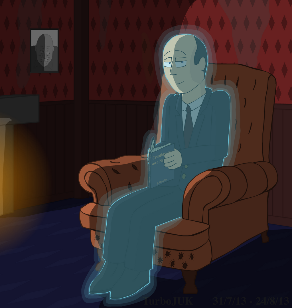
Alton Island - Hex
Please comment, I like comments.
And it's happened again. First a new one, then revisiting an old one (which, again, is pretty large).
Alton Island - Battle Galleons
Alton Island - Hex
Please comment, I like comments.
Panda
TS Member
- Favourite Ride
- Monster, Walygator Parc
Hex is amazing! You truly have a knack for pulling off vivid personalities for each ride. Would be interesting to see how your others turn out. More, please.
Lost all motivation to draw for a while, but I bought some new pencils and I'm rather eager to use them.
Lost all motivation to draw for a while, but I bought some new pencils and I'm rather eager to use them.
I'm glad you like them! Hex certainly turned out better than I expected and they're all miles better than the ones I made several years ago. Back then the characters and their personalities were barely established, and many of them were simply standing plainly in their pictures. The characters are all doing something in this new series and it's far more interesting to look at.
The newer pictures definitely have better atmosphere too. That's what I get for experimenting with the shading.
Ask and ye shall receive.
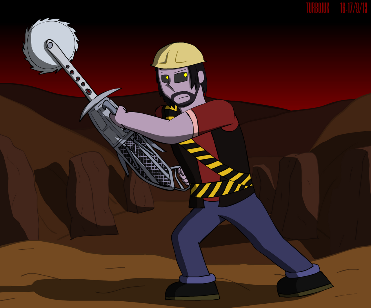
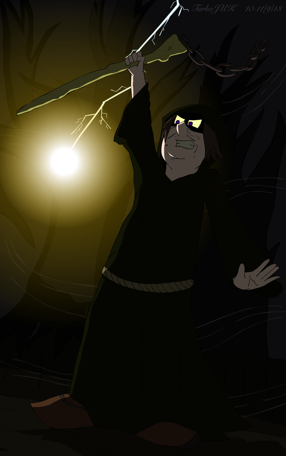
Alton Island - Ripsaw
Alton Island - Blade
Hope you enjoy them. I'm going to Alton next week, so expect a certain 'cheerful' character upon my return... :twirly:
Please comment!
The newer pictures definitely have better atmosphere too. That's what I get for experimenting with the shading.
Panda said:More, please.
Ask and ye shall receive.
Alton Island - Ripsaw
Alton Island - Blade
Hope you enjoy them. I'm going to Alton next week, so expect a certain 'cheerful' character upon my return... :twirly:
Please comment!
blackholes crow
TS Member
please can someone explain to me how to post art on this thing.
Well, it's time.
Time for something I've been waiting to show you guys for months...
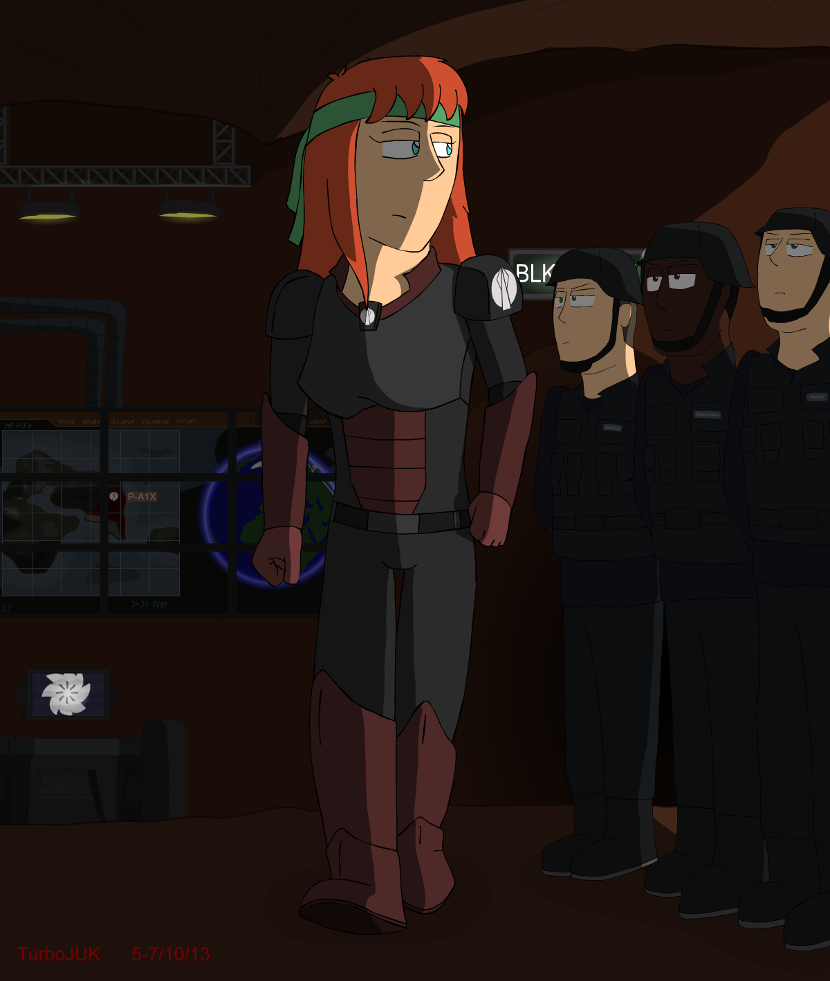
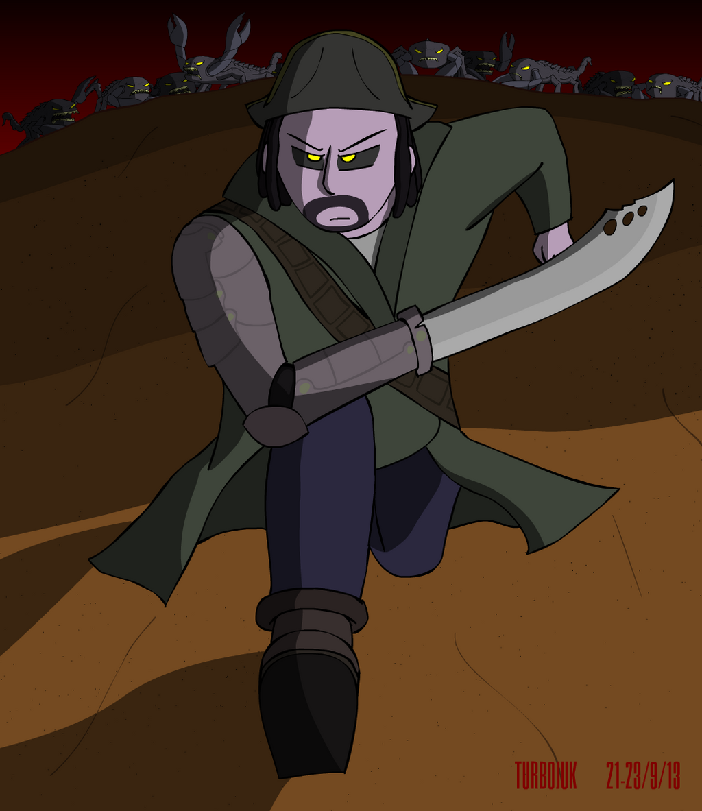
Alton Island - Nemesis: Sub-Terra
But seriously, here's the one I've really been waiting to show you.
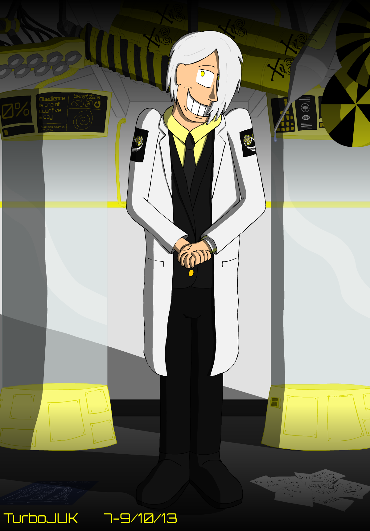
Alton Island - The Smiler
Hope you like them!
Comments make me smile. :twirly:
Time for something I've been waiting to show you guys for months...
Alton Island - Nemesis: Sub-Terra
But seriously, here's the one I've really been waiting to show you.
Alton Island - The Smiler
Hope you like them!
Comments make me smile. :twirly: