• ℹ️ Heads up...

    This is a popular topic that is fast moving Guest - before posting, please ensure that you check out the first post in the topic for a quick reminder of guidelines, and importantly a summary of the known facts and information so far. Thanks.

Splash Landings repaints

CoasterCrazyChris

TS Member
Favourite Ride
Nemesis
Just noticed on TowersStreet Facebook more pictures of the ghastly repaints going on at Splash Landings Hotel.

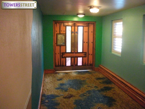
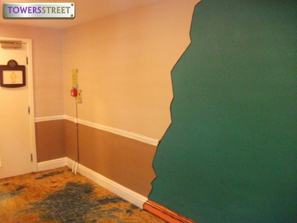
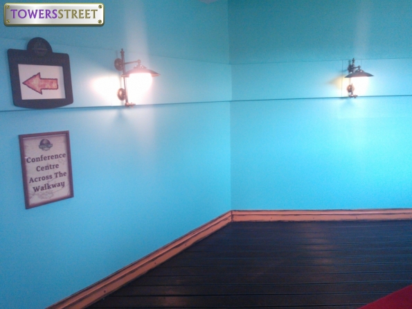
The whole place is starting to look incredibly tacky in all the public areas; the carefully selected colour schemes with the sun bleached effect which made the hotel look really authentic originally are being ruined by some idiot with a paintbrush slapping rainbow colours and cartoon styles on anything and everything.

I'm not sure whether the are consciously trying to make Splash as child orientated as possible to really differentiate between the two hotels, but I personally think they are really spoiling what was a great themed hotel.

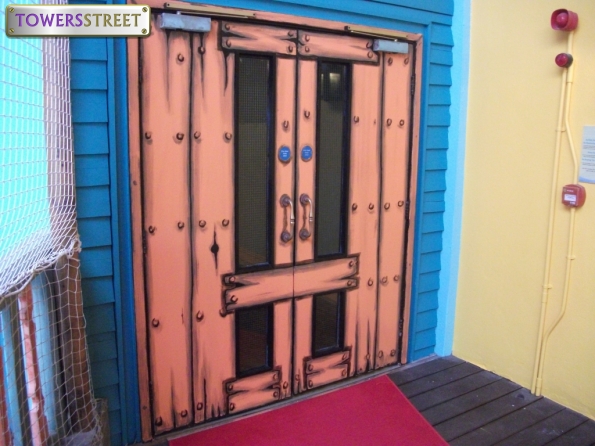
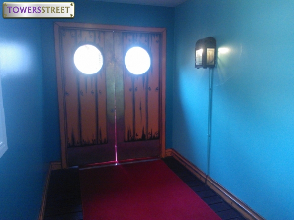
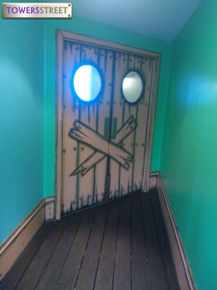
On a more positive note the Moon Voyager corridor looks great along with the other small changes in Alton Towers Hotel but I feel it is being overshadowed by the shoddy workmanship next door.

:/

EDIT: Sorry if this should belong in 'Resort niggles' but I felt it deserved a topic of its own.
 
I strongly dislike the recent repaints in Splash. Though I haven't seen them in person, the new lift doors and other doors or details look very cartoony and brash compared to the more subtle and worn nature of the old paint job. It is not well done and it is not detailed enough. The painting looks very low budget and of low quality and is a definite step down in terms of theme from what was there before.

It's a massive step back for the hotel, and is a shame considering the Resort side of Towers has been getting steadily better (in terms of look) lately.
 
I absolutely agree - its awful!

Whoever has been let lose with a paintbrush need to go and sit in a dark room and think about what they have done.
The hotel was never meant to be a kooky, cartoonish hotel but an authentic caribbean hotel with a plumbing issue.
It was pale yellows, soft pinks and light blues with fun little details and just seemed (from someone who has visited the caribbean a few times) to be a pretty good representation and it worked so well.

The person currently behind the painting has apparently only ever been to a creche.

Primary colours, slapped haphazardly all over. Red, yellow and green - must have been the Early Leaning Centre poster paints on offer.
And the stupid wooden plank effects everywhere is awful.

Please - STOP IT NOW.
 
The wooden planks would be encouraged were the outlines not so obvious and black. Thinner outlines to the planks, with a bit of detailing and fading in the middle would be good - what we now have is not.

The repaints in areas like the steps or the bar have been okay. Though not quite up to the original standard, the worn theme was adhered to and wood was repainted in light colours with fading in the middle. What has been done now is just awful compared... For the desired effect to work, it needs to be more subtle, lighter and actually feature some distress on the wood, or at least well-painted fake distress.

Seriously, it may seem petty but it riles me. The standard is not up to scratch. It's theming that would look good in a panto and not in Splash Landings!
 
Ive caught the decorators in the act (tho it seems their skill is improving!)

9587581-four-preschool-kids-painting-the-wall.jpg
 
I personally really like the splash repaint, I don't know why but just like it :)
 
I really dont mind some of the new painting, for example I like the stairs and works around margs, which does have detailng in it and looks nice. However I do agree some of the work in the waterpark is a bit more bold, and clashes a bit too much. At the splash landings side of the walk way one wall in green, then the other is blue, and then the doors are orange, it all just clashes a bit too much, like others have said some paler colours would work.

I do however quite like the doors, they look a bit quirky and fun, but certainly dont look like real planks of wood.

I think in the water park they have thought its probably easior and cheaper to just paint things simple colours, and not have shading and fading effects, as I imagine these take time and cost money, and are harder to repaint if needed, compared to solid bright colours.

For those who havent seen the photos:
waterpark-feb-18_595_towerstreet_sign_clean.jpg


i.php


i.php


i.php


i.php


i.php
 
I hadn't seen all of those pictures but my god I wish I hadn't now.....WHAT HAVE THEY DONE?! The second picture is just a complete fail, I mean really what were they thinking.

Why they are wasting money on repaints which are completely unnecessary is beyond me.

I will most definitely not be staying in Splash again until they sort this out.

:(
 
I think it did all need painting, the doors were certainly looking faded and had lots of paint missing. Im not sure if any of these walls or doors have been painted since the hotel opened.

They are the only photos I have at the moment, but they have painted other areas of the hotel which I think look quite nice, next time im on park ill get some photos and post them here. However this boarded up wood effect seems to be spreading, I know its on some of the lift doors, and also the doors leading to the corridors in the hotel.
 
I love them.

It's giving the hotel a refreshed up to date feeling about it. They are quite high quality, if not as imaginative in colour. Tastes and themes change, and going from a worn down carribean twist to a colourful vibrant carribean twist is good. It's just keeping up to date with the times and making them look quality for guests.

Otherwise we'd still have the old plain paintings on ATH when it first opened, and noone wants that nowadays.

See them in person, they certainly have a better feel to them than looking at photos.
 
thefatone said:
I love them.

It's giving the hotel a refreshed up to date feeling about it. They are quite high quality, if not as imaginative in colour. Tastes and themes change, and going from a worn down carribean twist to a colourful vibrant carribean twist is good. It's just keeping up to date with the times and making them look quality for guests.

Otherwise we'd still have the old plain paintings on ATH when it first opened, and noone wants that nowadays.

See them in person, they certainly have a better feel to them than looking at photos.

Keeping up with the times you say?

It has become very apparent with Merlin that the modern way is to sacrifice quality workmanship for something which is done on the cheap and then dressed up as "fresh and modern". Bright freshly painted walls always have an appeal, even when the quality of work is poor. This is usually due to a combination of small budgets and incompetency at management level.

I see it everywhere in society at the moment, where the care and the attention to high quality details is replaced with mediocrity in a desire to create something which appears contemporary. Both Disney and Universal would ensure that the hotels were maintained to their original high quality finish. The best way to ruin something is to continually remove the little things which made it special in the first place, which has happened in many areas of Alton Towers in recent years (see Ripsaw and Oblivion for example).
 
Hmmm... See for me, the doors and stuff don't really bother me. I like the details on them, regardless of how cartoony they may be.

But the two things which really grate me are:

1) The supports in the waterpark for Master Blaster. While I think the multicoloured look is great on the Wacky Waterworks I think that it looks dreadful on the likes of Master Blaster and the area around Little Leak. They just look really cheap and nasty compared to the lovely wood effect they all used to have, and they are far too distracting from the themeing in the water park.

2) The walls in the waterpark. Over the tops of the building facades the walls used to be light blue with clouds dabbed onto them to make them look for realistic. But now, where they've repainted some of the walls they've just washed them all in blue and left them. They really look odd if you ask me.

So yeah, for me, I don't mind the hotel bits they've done, but I hate those two bits they've done in the waterpark :(
 
Ian said:
Hmmm... See for me, the doors and stuff don't really bother me. I like the details on them, regardless of how cartoony they may be.

But the two things which really grate me are:

1) The supports in the waterpark for Master Blaster. While I think the multicoloured look is great on the Wacky Waterworks I think that it looks dreadful on the likes of Master Blaster and the area around Little Leak. They just look really cheap and nasty compared to the lovely wood effect they all used to have, and they are far too distracting from the themeing in the water park.

2) The walls in the waterpark. Over the tops of the building facades the walls used to be light blue with clouds dabbed onto them to make them look for realistic. But now, where they've repainted some of the walls they've just washed them all in blue and left them. They really look odd if you ask me.

So yeah, for me, I don't mind the hotel bits they've done, but I hate those two bits they've done in the waterpark :(

Those points you raise just highlight pure laziness and incompetency on behalf on the hotel management. I really don't buy the "we have no budget to do it properly" business.

I genuinely believe they have the attitude that painting everything in bright colours will improve the appeal. These people are fools and should not be working in theme parks.

Even in 2003, what was considered the start of the "dark years" for Tussauds they were able to pull off the superb Caribbean themed environment of Splash and Cariba. The same could not be said for today.
 
Not much for the doors. Shame they didn't theme them.

Ian said:
2) The walls in the waterpark. Over the tops of the building facades the walls used to be light blue with clouds dabbed onto them to make them look for realistic. But now, where they've repainted some of the walls they've just washed them all in blue and left them. They really look odd if you ask me.
Eh? Damn! I thought they'd just started to repaint them the last time I was in there! I didn't think they'd actually just leave it like that. :(
 
What I really dislike is the part after the waterpark walk through but before ATH, where they've tried to do the half and half bit on the walls to show the movement between the two hotels. They had already done this in a much more effective way further down the corridor where the carpet changes. That now looks strange and out of place, which is a shame because I've always loved that little touch...looking out for the random solitary crab on the carpet!
 
It would also work better if it had the ATH wallpaper and wooden dealing, but as it is it's just painted on which makes it looks even worse.
 
I don't really mind the doors, but the transition in that second picture is absolutely horrific.
 
I've just seen a pic of the bar area too, it looks just as bad. Everything has been painted in multi-colours. I also noticed the palm trees up the stairs have been removed as well but i'm not sure...
 
I actually think it looks perfectly acceptable.
Except this bit:
waterpark-feb-19_595_towerstreet_sign_clean.jpg

Whoever did that needs to be shot.
 
The doors with the wooden plank effect painted on them....didn't they used to have a really cool oxidized metal look before like the lift in ATH? It's a shame that was lost.
 
Top