• ℹ️ Heads up...

    This is a popular topic that is fast moving Guest - before posting, please ensure that you check out the first post in the topic for a quick reminder of guidelines, and importantly a summary of the known facts and information so far. Thanks.

The Pipes

Jordan

TS Contributor
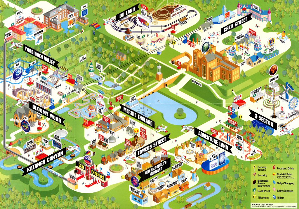
Is it just me, or does anyone else miss the old resort branding, with the pipes, the gold gradients and the lovely slab serif typeface?

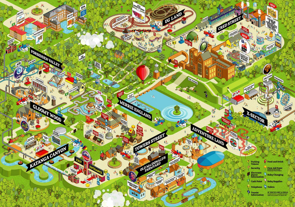
There are parts of the new brand which I like, such as the tiled Towers wallpaper, but I think a lot of the newer signage and marketing looks a bit flat. And the new typeface (Mother Hen) seems to be way overused around the park, when it should really be confined to just the odd title here and there.

I always thought the whole pipes thing conveyed a sense of adventure, perhaps imagery like all these pipes were some crazy underpinning of the park that was creating all the escapism/magic/fantasticalism.
 
I thought you meant this guy for a second...
pipes4.jpg
 
DiogoJ42 said:
I thought you meant this guy for a second...
pipes4.jpg

Thank you... I'd been trying to remember the name of that show a couple of weeks ago!

And regarding the pipes, I didn't like them at the time as they were massively overused and a little bland I thought. However the remaining reminders of them (such as the entrance marque towers), are now quite welcome, as it is a more understated usage of them.

Overall, after the Habbo Hotel phase, I thought the pipes were one of the weaker branding identities the park has used in recent years. (Although they did lead to the trumpets the following year, which was a bit of a silver lining)
 
Squiggs said:
Overall, after the Habbo Hotel phase

Thank you for reminding me of a game I used to hate, it had escaped my memory. ;)

Although I'm not sure what you mean by the 'phase', I haven't been around for long. What sort of time was this around? :)
 
2005 - 2007 Alton went through the 'Habbo phase'.

2005 Map:
2005map_main.jpg


2006 Map:
2006map_main.jpg


2007 Map:
2007map_main.jpg


2007 Scarefest Map:
2007map_sf_main.jpg


I sometimes forget about the Habbo style maps. They weren't the most appealing of things but did the job well nonetheless.


On the topic of the pipes. I've always had a love-hate relationship with them. When they were first introduced in 2008 I thought they were vile, garish and made Alton's branding very tacky. However I love the concept behind it, by having pipes across the resort to make the whole brand link as one - as before 2008 Alton Towers was seen as a theme park, with a resort next door - the pipes aimed to link it all as one so the whole place is a resort. Which I think did work very well.

I use to like the idea of the pipes 'pumping the magic' around the resort. Sadly, not a theme used.

The current branding does seem a bit messy although it does not feel as garish as it did with the pipes in 2008. I wouldn't mind seeing the pipes back, as it gave the whole resort a 'connected' feeling - however they would need to do something so it's no so in your face.
 
I wouldn't say I like the 2005-2007 maps particularly, but I have a 2007 map here somewhere that used to be stuck to one side of my wardrobe as a reminder of my first ever trip. Back in the days when I'd only made a few and far between visits I used to look at it and smile quite often.

With the 2011-onwards map Towers seem to have forgotten that a map is first and foremost a navigational tool, and I really hope that they remember this when they next change the design. The 05-07 design definitely isn't the most attractive theme park map ever made, but it clearly defines the areas of the park and the main routes between them. That's more than you can say about the current map; how in the name of Wardley first-time visitors get around with that I have no idea!
 
They don't get around......

Deffo the biggest problem with them.

Sent from my GT-S5830 using Tapatalk 2
 
Top