• ℹ️ Heads up...

    This is a popular topic that is fast moving Guest - before posting, please ensure that you check out the first post in the topic for a quick reminder of guidelines, and importantly a summary of the known facts and information so far. Thanks.

[2024] Nemesis Reborn: Construction and Speculation

Status
This topic has been locked. No further replies can be posted.
You generally have been determined to dislike everything so far this season so I doubt you will change your opinion one iota.

I doubt it’s being painted entirely black, probably a base to build up the rest of the colour scheme.
I'm sorry. I don't know how else to put it, I just don't like it. I literally Don't know what else to say... hopefully it'll turn out decent and I'm proven wrong though 🤞
 
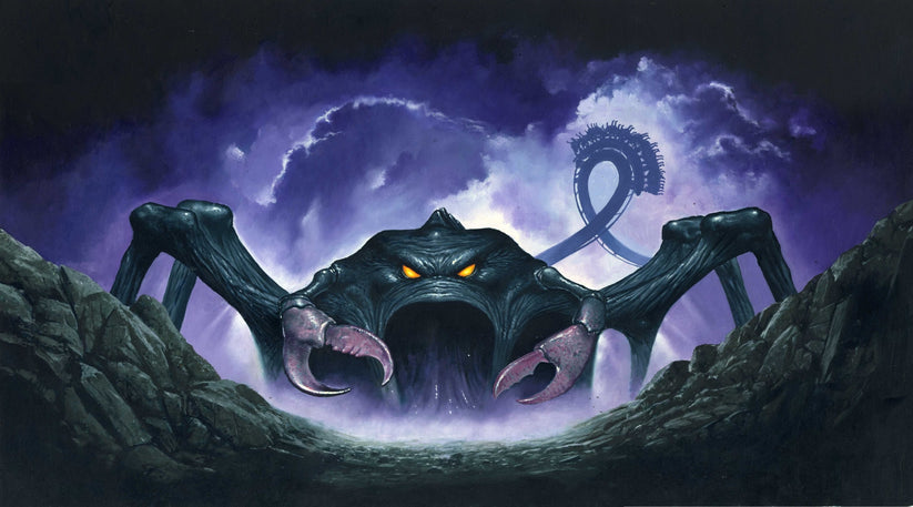
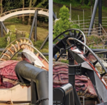
Actually, I think that the black is actually going back to the original 1994 promo design picture for the beast as seen here and with the eyes gone it might gain new orange eyes which would greatly change the look of the creature.
Nemesisart_823x.jpg


That said, add a touch of purple or red for some of the extra details (we know the park has a endless supply of purple) then it might end up looking good.
 
The one shame if we lose the eye stalk is that it made a good leg chopper.

But animating the eyes to sell the idea it's a real living monster would be amazing. I don’t know if the original ride was immediately obvious to most that it was meant to be a living thing.
 
I'm also feeling positive about the changes and waiting to judge only as a complete finished package on opening day next season. As much as I loved the OG junkyard rust, if these changes were necessary for the marketing team to justify the budget allocation for the retrack then I'm all for it. I will, however, be joining @Trooper Looper on the negativity train if they butcher the soundtrack :tearsofjoy: Rightly or wrongly, it's the thing I'm most caught up over on the whole project.
 
Actually, I think that the black is actually going back to the original 1994 promo design picture for the beast as seen here and with the eyes gone it might gain new orange eyes which would greatly change the look of the creature.
Nemesisart_823x.jpg


That said, add a touch of purple or red for some of the extra details (we know the park has a endless supply of purple) then it might end up looking good.
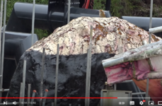
You could be onto something here. The black does look good, and on TPWW's latest video he shows it close up. He seems concerned that they appear to be just painting over broken foam and fibreglass, but to me that black - whether the final coat/colour or not - does look a bit thick and "rubbery" so maybe it's a more protective material than just paint?

1690399438144.png

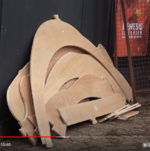
Also, he spots these wooden cut outs:

1690399484579.png

Now of course they could be for just about anything at the moment, but with the fact that the eye stalks have been removed, in that 1994 artist's drawing the arms and claws look like they protrude from somewhere near where the eye stalks were and the shape of these wooden cut-outs, could these be the frames and skeleton for these claws?


From: https://www.youtube.com/watch?v=HikQiQED0Mw


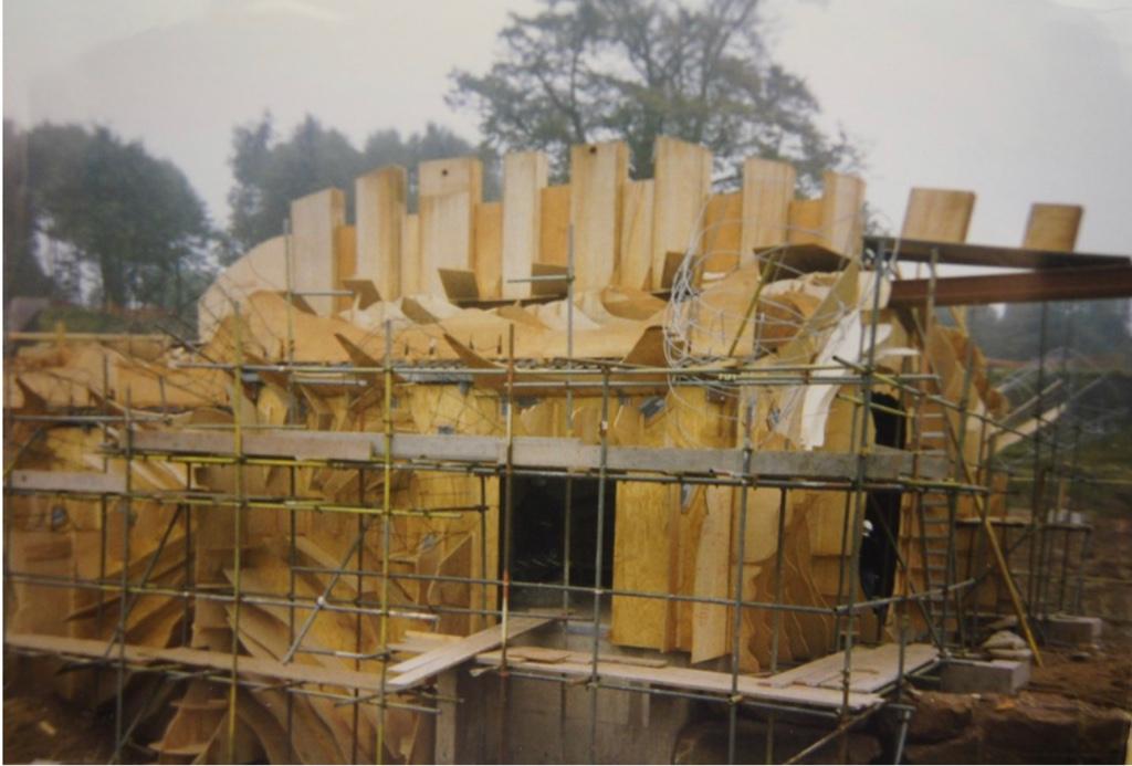
If you look at the original construction pictures, the frame underneath the fibreglass is made up of the same cut outs. They are probably just replacing parts of the monster that are beyond repair.

0c530796404af1d757dd390994ed76e7.jpg


Credit: TowersStreet

Sent from my iPhone using Tapatalk Pro
 
Last edited:
I'm disappointed if they are painting over visibly very old and worn theming. Given the work going on around the ride, I would rather they look more at replacing the majority of the station than throwing a load of black and red paint over it (of course, it's hard to judge at this point precisely what work is ongoing).

As for the eye, it seems some animation will be coming, either a screen or animatronic. I think that with some smoke/mist and sound effects and it will serve as the big central ‘Instagrammable’ theming object that Merlin loves to do with their coasters.
 
  • Like
Reactions: Tim
Hot take here that might sound controversial on here but I have always hated the googley eyes for Nemesis which always looked comical to me though some might argue that it is good old 1990's cheesy goodness and I must say I never even noticed the leg chopper element before and I'm sure 80% of the GP didn't even notice them too. At least if they were replacing them with the original orange eye look built into the head of the creature then it might be not only more easily seen as being a giant alien monster but actually the original look had this evil look to it far more than what we have now.

Now regarding the painting of the station, I do think it's just a testing to see what looks good as I have noticed in TPWW's video that towards the back of the station building there is grey primer added which I'm sure was never there before and is likely a test too as to see what looks good before they rebuild the whole structure.

Personally I'd go all out in making the creature twice as big in which the monster covers the maintenance shed area which I have felt ruined the overall feel so blending it in or covering it up would be good. Plus imagine a bigger Nemesis monster with it's tentacles all on the edge of the pit as if it's trying to climb out in which if you were walking under it would create one hell of a image...mind you being under giant spider legs would give utter fear for those who suffer from a fear of spiders given the spider/crab design of the monster to begin with.
 
Hot take here that might sound controversial on here but I have always hated the googley eyes for Nemesis which always looked comical to me though some might argue that it is good old 1990's cheesy goodness and I must say I never even noticed the leg chopper element before and I'm sure 80% of the GP didn't even notice them too. At least if they were replacing them with the original orange eye look built into the head of the creature then it might be not only more easily seen as being a giant alien monster but actually the original look had this evil look to it far more than what we have now.
I think the original eye could be really good if they leaned into the more body horror aspect of it. They could make it look wet, like a muscle or organ, and some sound design could really aid that
 
Status
This topic has been locked. No further replies can be posted.
Top