- News all the latest
- Theme Park explore the park
- Resort tour the resort
- Future looking forward
- History looking back
- Community and meetups
-
ℹ️ Heads up...
This is a popular topic that is fast moving Guest - before posting, please ensure that you check out the first post in the topic for a quick reminder of guidelines, and importantly a summary of the known facts and information so far. Thanks. - Thread starter Tyarith
- Start date
- Favourite Ride
- Nemesis
- Favourite Ride
- Th13teen
- Favourite Ride
- Nemesis
- Favourite Ride
- Steel Vengeance
- Favourite Ride
- Nemesis
- Added three flags.
- Reduced the white glow from around the towers so it stays inline with the flags - otherwise it was too much.
- Removed the white glare from the background and replaced it with a blue gradient instead.
- Added two "bolts" on either side of the red background of the logo.
- Removed the depth of the text and made it more simplistic by just using a small shadow around the text instead.
- Curved the "Resort" tag and made the background "more metalic", include with AT branding.
- The word "Resort" has now been made slightly bigger and bolder and also curves alongside the tag.
- Favourite Ride
- Th13teen
- Favourite Ride
- Steel Vengeance
- Favourite Ride
- Nemesis
- Favourite Ride
- Gotta be Oblivion tbh!
- Favourite Ride
- Steel Vengeance

You are using an out of date browser. It may not display this or other websites correctly.
You should upgrade or use an alternative browser.
You should upgrade or use an alternative browser.
Alton Towers Graphics - Opinions Needed!
Tyarith
TS Member
Your use of generic Vekoma track offends me. Fan art is supposed to correct the mistakes of the marketing department.
D- Must try harder. See me after school.
Well it is a marketing piece!

ThemeParkCrafter
TS Member
Don't get me wrong. It looks alright but not amazing. I don't really like the fact that some of escape is blocked off by a person's hands. Use B&M track not Vekoma!
Tyarith
TS Member
Don't get me wrong. It looks alright but not amazing. I don't really like the fact that some of escape is blocked off by a person's hands. Use B&M track not Vekoma!
Thanks for your feedback!
The hand is meant to go through the "S" since a lot of AT Marketing makes the items go through or curve around the text. I have used Vekoma since this is the track that is used within the actual Galactica marketing and it would otherwise look weird and not coherent if there were two different track types.
James
TS Founding Member
There needs to be SPG errors for it to be a true Alton Towers marketing piece, no?Proofread!
MaxPower
TS Member
I've always hated the way they've implemented the resort tag onto the logo, especially the larger version.
I've designed a few different variations over the years although I think only minor tweaks are needed for the next design.

I look forward to your next designs Tyarith, it's always interesting to see different concepts!
I've designed a few different variations over the years although I think only minor tweaks are needed for the next design.
I look forward to your next designs Tyarith, it's always interesting to see different concepts!
Burbs
TS Team
Good god that looks somewhat evil! I would definitely change the black to gold and the resort to a different colour.I've always hated the way they've implemented the resort tag onto the logo, especially the larger version.
I've designed a few different variations over the years although I think only minor tweaks are needed for the next design.
I look forward to your next designs Tyarith, it's always interesting to see different concepts!
Tyarith
TS Member
Ok so I have made a few updates to the logo with the feedback from this forum. I still need to add "the magic" such as the stars, etc... but I have managed to introduce the flags (they are still not perfect and do still need to some tweaking). In addition, I have managed to get the bottom half of the design to a feel that I like. I have done the following since my original design:
Thank you to @Alastair , @Rick and @ryan_map_collector that I have based the changes on from their feedback.

Comparison:

Next step is to work on "the magic" and see how that work.
I would greatly appreciate any feedback for the logo V2!
Thank you to @Alastair , @Rick and @ryan_map_collector that I have based the changes on from their feedback.
Comparison:
Next step is to work on "the magic" and see how that work.
I would greatly appreciate any feedback for the logo V2!
ThemeParkCrafter
TS Member
No doubt the logo looks so much better but I prefer had the Towers with the bright glow. The colours for the flag look a bit weird for some reason but other than that, it looks great!
Rob
TS Team
I've always hated the way they've implemented the resort tag onto the logo, especially the larger version.
I've designed a few different variations over the years although I think only minor tweaks are needed for the next design.
I look forward to your next designs Tyarith, it's always interesting to see different concepts!
Love the logo on the right and how the word 'resort' is incorporated!

Tyarith
TS Member
I like it... but the green textured background should really fill the whole circle. There's a bit at the top and to the right where it's clearly cut off.
I noticed the green on the right that was a mistake and will be removed. However, the green background actually has a swirl in as though some of it is trying to escape the logo and so this was done intentionally.
Blizzard
TS Member
Loving the logo! You might try having "scarefest" where alton towers would be. Using "Alton towers" as a subtitle. A-la "The Lost World Jurassic Park":
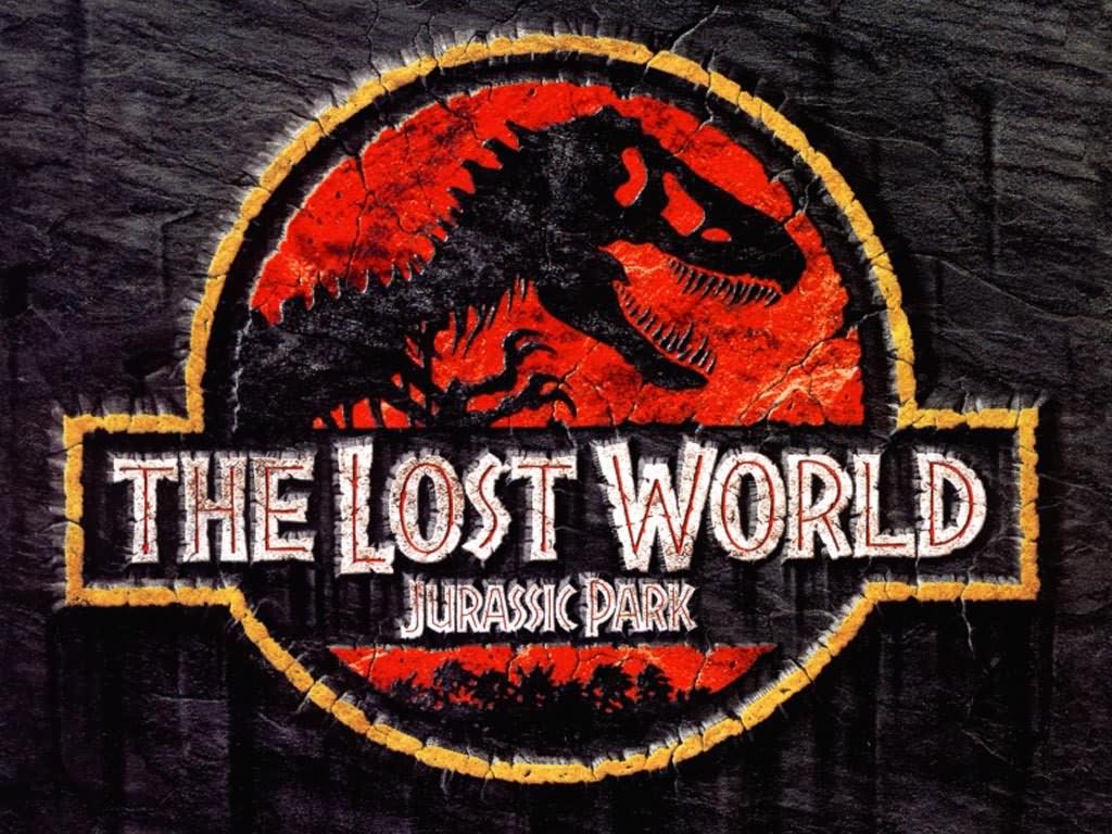
Maybe change the red to a more bloody/purple colour and use a more intimidating font for the "scarefest"
Maybe change the red to a more bloody/purple colour and use a more intimidating font for the "scarefest"
Burbs
TS Team
To be fair to him, the font he's used is the same font that Alton Towers use for Scarefest branding. (green fuzz)use a more intimidating font for the "scarefest"

