• ℹ️ Heads up...

    This is a popular topic that is fast moving Guest - before posting, please ensure that you check out the first post in the topic for a quick reminder of guidelines, and importantly a summary of the known facts and information so far. Thanks.

Ex Alton Towers theming

Andrew

TS Contributor
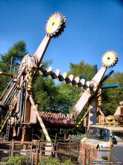
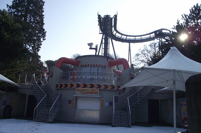
After seeing a picture (see below) which was posted on the internet, it got me thinking: What other pieces of theming have been removed from Alton Towers?

23377_334883319946136_471709594_n.jpg


Obviously, many people know of the original theming of the Fresh Fish and Chips outlet in Forbidden Valley, but it would be interesting to see what other rides or areas had more theming than they currently do!

I'm sure there will be lots.
 
I totally forgot how amazing that thing looked - this topic could be very depressing!
 
Absolutely agree!

That creates a nice link also between Blade and Nemesis. Somehow it fits both.
 
I wouldn't really call Nemesis Nosh -> Fish'n'Chips a 'theming removal' though, it was replacing a dilapidated old outlet with a new (sadly less themed) one.

It's the equivalent of saying Corkscew had a Th13teen retheme!
 
That looks brilliant, it's one thing that towers needs to get back. Theming improves parks :)
 
An obviouse example for me is the theming of Ripsaw. Which originally had big blue transistor style elements on top of its vertical supports. And the saw blades from which it takes its name on the end of the arms.

Sadly all of this was removed over the years to allow access for maintainance I believe,and were never put back!

ripsaw01.jpg
 
^Not to mention the bulky machinery style theming up the side arms and the original blood red restraints. All now gone.

:(
 
Wasnt the Nemesis Nosh removed due to it being unsafe though? as in rotting? That's what I heard anyway.
 
I always preferred the old nemesis logo / font. Seemed to fit the rides evil side much better than the almost generic font of today.
 
Not sure if this is lost theming or just recycled, but the Egg in the Ug Land hole on the extraordinary golf, is that a replica or is that one original egg?

full-image.php


Would be nice to think its the original really, but I dunno, anyone have any evidence regarding this?
 
I just found this old image from inside the Rehydrator from an archived version of Alton Towers Almanac. You can see the Oblivion Report screens in the background and the touch-sensitive effects on the panels in the centre.

01042001_rehydrator_interior_1.jpg


It looks so... bland and small? Extremely different to the proposed concept art. Perhaps it suffered from cut budgets. Maybe the photo was taken with a flash cancelling out the ambient lighting they had in there, but it doesn't seem like it...

It's a shame because the original intention sounded so good in theory, and you can see they had planned a lot of different ideas for it. In the end it just turned out to be a glorified Coca-Cola drinks outlet. No wonder it was always abandoned.

I wish they had redesigned it to make it work, rather than just shutting the doors and turning it into... whatever it is now.

Here's some more of the outside. Notice the 'condensation bubbles' on the pipes, perhaps because "ice cool coke" was flowing through the pipes. Some of the holes where the bubbles used to be are still visible.

03042001_rehydrator_1.jpg
 
electricBlll said:
Some of the holes where the bubbles used to be are still visible.

Well they won't be visible on that side of the building because those pipes were removed completely a few years back.

In fact that side of the building as a whole looks dreadful these days...

6858860431_9ab0cf8e46_z.jpg
 
Yes, I guess they removed the pipes on that side for no reason so people could see the shop window better.

Although actually the holes are only on the four pipes feeding into the upper section. The vertical pipes had larger 'bubbles' that were glued on, rather than inserted into holes. They were still there as late as 2005 (although some had been pulled off), as shown in these TowersTimes closed season updates:

0507.JPG


Enterprise03.jpg

(Look on the far right)

I don't exactly lament the loss of those bubbles, but poor Rehydrator! It's been plastered with three drinks brands now (Coca-Cola, Fosters and of course Fanta) and it's never a very popular food/drinks outlet anyway. All it does these days is look weird and orange - not what was intended.

In light of the recent X Sector refurbishments, it was interesting to go through past closed season photographs and see that actually something gets altered in X-Sector almost every year. It seems they painted the Oblivion queue buildings a nice silvery grey in 2005, only for them to be cream again by 2007, then they cladded two queue structures in plastic in 2010, then painted the pipes orange in early 2011, etc... Unfortunately, several small details have been removed during of all these changes. The three vents, "SW4" embossed lettering and the toothed door pattern on the top of QLB 002, for example, have all been covered up.
 
The annoying thing is how very little it would cost to put the problems right, but they just don't seem to notice or care. Painting Oblivion is great, but they really need to pay attention to the smaller things too.

Just removing the endless amount of crappy signage and giving everything a good scrub would be a start.

:)
 
Such a shame that the theming was removed from Ripsaw and never put back on. Any particular reason? And what happened to the removed theming? :/
 
BigAl said:
Such a shame that the theming was removed from Ripsaw and never put back on. Any particular reason? And what happened to the removed theming? :/

I believe they were removed due to them having to be taken off and put back up every time they did winter maintenance. It seams like a general case of "can't be bothered" as is normal with Towers. As to where they are I can only guess they are either in storage or were just scrapped all together.
 
The same thing happened to Rameses Revenge at Chessington with its decoration. The props were not designed to be repeatedly removed so probably became damaged after a while. Ripsaw's themed supports were replaced for technical reasons soon afterwards.

Basically attaching elaborate props to a complicated ride that has to be stripped down every year was a bit ambitious.

Rameses and Ripsaw are also rather old, I don't think such high maintenance is necessary with the new Huss models? Hence you now get densely themed top spins like Talocan.
 
Sorry to chime in late here - but there's some confusion about Nemesis Nosh.

The location where the current Fish & Chips outlet is was originally home to the Nemesis Shop from 1994. The Nemesis Nosh bus joined the Valley in 1997, along with the Blade and Ripsaw, taking up Thunder Looper's old footprint. The Nemesis Shop closed at the end of the 2001 season, and became another Nemesis Nosh outlet; I'm pretty sure the menu was different though (from memory, the bus did hot dogs and the old shop did kebabs). This continued until about 2005, when at the end of the season the bus' roof collapsed.

The remaining Nemesis Nosh (nee Nemesis Shop) was then dismantled and the current Fish & Chip shop built.
 
BigAl said:
Such a shame that the theming was removed from Ripsaw and never put back on. Any particular reason? And what happened to the removed theming? :/
For *ages* the transistors were stored around the back of the ride.

Sadly, the previous theming (although fantastic) covered over critical parts, and when it was removed several serious cracks showed up, leading to these parts being reordered from Huss. This was not long after a Weber/Huss 1001 Nights type ride was found to have integral theming which was covering cracks so serious the entire structural integrity of the ride (especially when in motion) was in question.
 
Top