- News all the latest
- Theme Park explore the park
- Resort tour the resort
- Future looking forward
- History looking back
- Community and meetups
-
ℹ️ Heads up...
This is a popular topic that is fast moving Guest - before posting, please ensure that you check out the first post in the topic for a quick reminder of guidelines, and importantly a summary of the known facts and information so far. Thanks. - Thread starter Burbs
- Start date
- Favourite Ride
- Nemesis
- Favourite Ride
- Hex

You are using an out of date browser. It may not display this or other websites correctly.
You should upgrade or use an alternative browser.
You should upgrade or use an alternative browser.
Thorpe Park: General Discussion
Dave
TS Founding Member
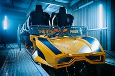
The trains look incredible. I think the zero car is one of the best ones in the uk. I have been critical of some things they have done but this is a slamdunk success
We looking at the same train?
I mean in all seriousness these things are subjective so no issue with people liking the train but to my mind it’s boring and unimaginative.


Robinsonhtid
TS Member
Looks great, most of you are sad who just like to moan, get a life.
Im a sucka for stylised design though i think the station looks good aswell. The 2 tone trsck colour not so much.We looking at the same train?
I mean in all seriousness these things are subjective so no issue with people liking the train but to my mind it’s boring and unimaginative.

Manchester1894
TS Member
I'd still take this over the Starfall Racer design. It doesn't matter what the design looks like to me once I'm sat in that seat tbh. The Mack chair and restraint is perfect on Icon. And I think that's what will make this ride, the Big Ones height, the Mack train and it being a hyper means I'll be a giddy goat in June. Still slightly nervous about that long bit of hang time. The first time I went upside down slowly with that restraint on icon was the first genuinely oh s*** moment I'd had on a rollercoaster. Felt like I was falling out.
kramnosive
TS Member
On first glance, didn't hate it. Upon a second glance...
RIPCorky
TS Member
It's not like you're going to be sat in it for long anyway....On first glance, didn't hate it. Upon a second glance...
coastinginlife
TS Member
Hmm is it me or does it resemble a bumper car?

Flerf
TS Member
I'll be honest, I'm a little disappointed they didn't integrate the angled wing design into the train itself
Something along the lines of the Zadra or Untamed cars but with the winged motif?
That and the promotional photos make the paint look a little saturated, I hope it matches closer to the rail colour in person
Something along the lines of the Zadra or Untamed cars but with the winged motif?
That and the promotional photos make the paint look a little saturated, I hope it matches closer to the rail colour in person
RIPCorky
TS Member
Would cost money that, as would having a longer layout....I'll be honest, I'm a little disappointed they didn't integrate the angled wing design into the train itself
Something along the lines of the Zadra or Untamed cars but with the winged motif?
That and the promotional photos make the paint look a little saturated, I hope it matches closer to the rail colour in person
Ryan
TS Member
I'll be honest, I'm a little disappointed they didn't integrate the angled wing design into the train itself
That's what I was imagining, or something like this...
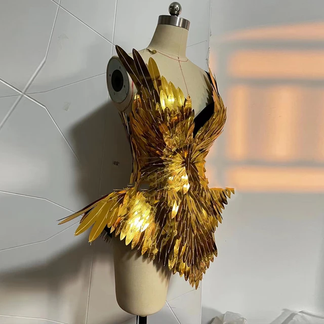
...but, you know, a rollercoaster train shell not just a natty little outfit you'd find me in on a Saturday night

I’m surprised by the design language incorporated into the trains. The inspiration looks more American muscle car than fearless mythical goddess…. ‘Gentlemen, Start your engines Find your fearless!’
I thought they would have opted for softer curves to fit the feminine goddess theme.
I would have loved them to tie in the wing emblems inside the Thorpe park logo by having the wing texture/pattern in place of the two black racing stripes running up the zero car.
A cool design but mismatched to the rest of the style of the coaster in my opinion.
The site aerials look awesome but my god they could have packed in so much more into this layout and threaded the track around the perimeter a couple more times.
I think this coaster will be amazing, especially for the UK, but I believe it’s length (or lack of) will hamper it being ranked amongst the best in the world.
Itgoeshowhigh
TS Member
running
I absolutely agree. Very masculine looking for a Greek goddess.I’m surprised by the design language incorporated into the trains. The inspiration looks more American muscle car than fearless mythical goddess…. ‘Gentlemen,Start your enginesFind your fearless!’
I thought they would have opted for softer curves to fit the feminine goddess theme.
Dave
TS Founding Member
Mack chair and restraint is perfect on Icon.
If you took away the inversion a wacky worm restraint would do for Icon, it doesn’t do anything really requiring much restraint….
Thorpe posted this pictures of the train
Same exact images but they've altered the colouring of the picture making it a bit more gold than bumblebee yellow earlier.

Looks cool.
It reminds me a bit of the Incredible Hulk trains, probably not what they were going for but still.