Love this. One of my favourite pieces of theming, tucked away as it is!
On a slightly related note:
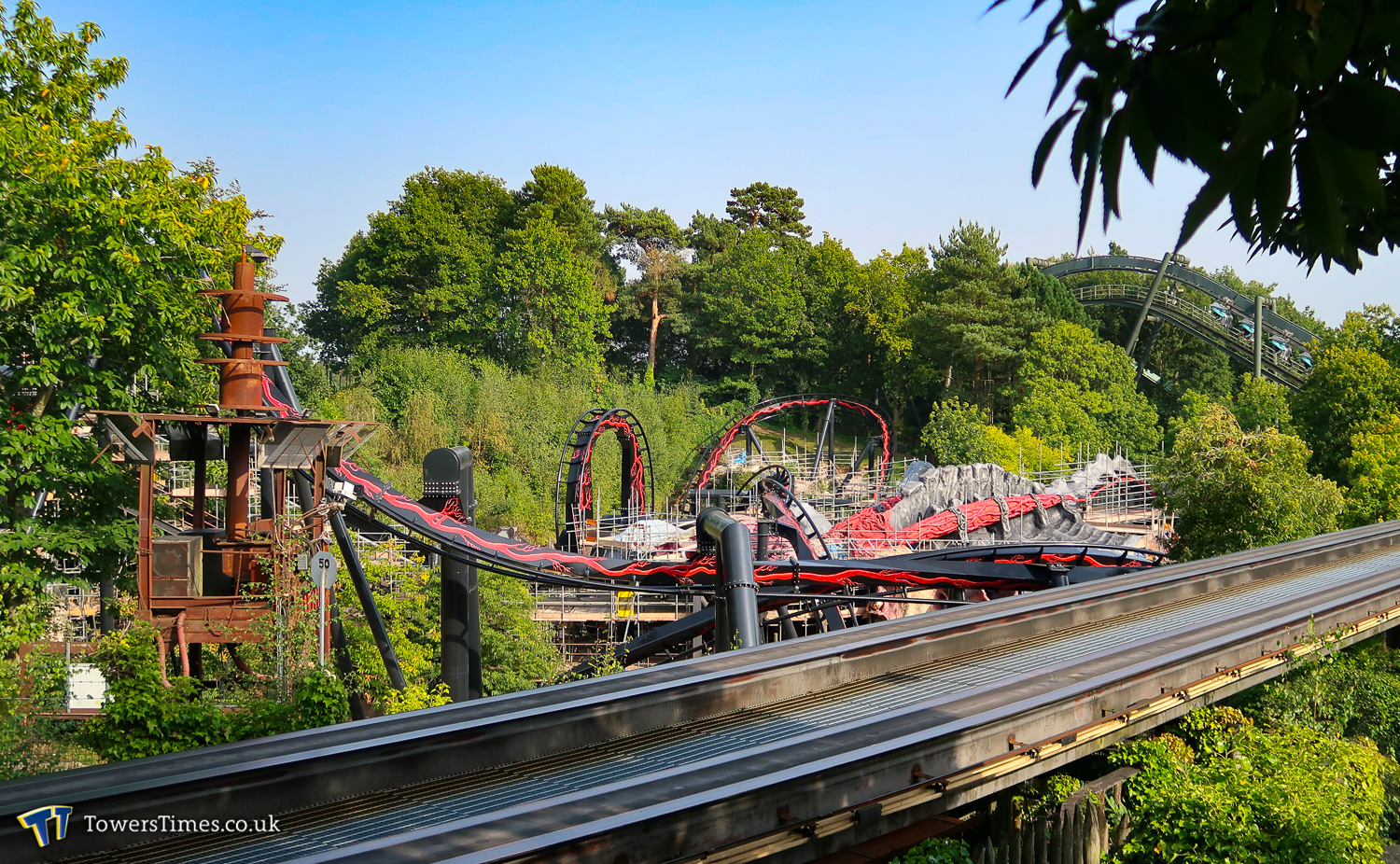
In the more recent photo updates, particularly wide shots of the site, the new track and station refurb is beginning to appear rather sleek/refined/verging on elegant. I've always loved the weird (post apocalyptic/war?) rusty theming around FV but I spotted a photo yesterday that showed the whole Nemesis site including the queue entrance structure.
Against the slick black polished rails and smartly painted station, the dirty orange rust and the strange jumble of sharp shapes on the tower really clash. It suddenly looks lost.
The angle of the photo didn't show any other theming, so maybe among the other rusty elements it won't look so out of place. I do wonder though.