- News all the latest
- Theme Park explore the park
- Resort tour the resort
- Future looking forward
- History looking back
- Community and meetups
-
ℹ️ Heads up...
This is a popular topic that is fast moving Guest - before posting, please ensure that you check out the first post in the topic for a quick reminder of guidelines, and importantly a summary of the known facts and information so far. Thanks. - Thread starter Skyscraper
- Start date
- Status
- This topic has been locked. No further replies can be posted.
- Favourite Ride
- Hex
- Favourite Ride
- Galactica
- Favourite Ride
- Hex
- Favourite Ride
- Taron @ Phantasialand
- Favourite Ride
- Hex
- Favourite Ride
- Your Dad
- Favourite Ride
- Hex
- Status
- This topic has been locked. No further replies can be posted.
You are using an out of date browser. It may not display this or other websites correctly.
You should upgrade or use an alternative browser.
You should upgrade or use an alternative browser.
[2024] Nemesis Reborn: Construction and Speculation
Ryan
TS Member
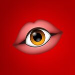
I hadn't really thought of it as a mouth, I thought it was more a kind of shell, like an over-engineered eyelid.Still don't understand the logic of the monster having a big fat eye in its mouth, unless it's just got very spiky eyelashes and the mouth is elsewhere
This thing flies through the vacuum of space unaided right? Maybe it's a segmented space helmet for it's massive eye?
D
Deleted member 17985
Still don't understand the logic of the monster having a big fat eye in its mouth, unless it's just got very spiky eyelashes and the mouth is elsewhere
...elsewhere...

The advert looks fantastic, makes me feel like a nipper again. Can't wait to see everyones reports from opening day!
Mhoowee
TS Member
I don't think so, a lot of the lights we see are 5pin lighting which are more expensive to run and own I doubt that most of the lighting there is permanent but we could see it there for this seasonAnd in the advert we can see…
Permanent lighting! That isn’t festoon lighting! Yay!
Ryan
TS Member
I think the light posts on the pathway are the permanent lighting @havaska was referring to? Maybe? Are they new?I don't think so, a lot of the lights we see are 5pin lighting which are more expensive to run and own I doubt that most of the lighting there is permanent but we could see it there for this season
GothMonsieur
TS Member
I reckon it eats through its claws…
Besides, it’s supposed to be an alien! It doesn’t need to subscribe to our limited understandings of extra-terrestrial dietary habits.
Besides, it’s supposed to be an alien! It doesn’t need to subscribe to our limited understandings of extra-terrestrial dietary habits.
Didn't say I didn't like the design, I guess it's like the Xenomorph and its little baby jaw and space creatures just defy sensible logic...elsewhere...

The advert looks fantastic, makes me feel like a nipper again. Can't wait to see everyones reports from opening day!
I'll be looking forward to riding it when all the initial chaos dies down in a few weeks
Dobba
TS Member
If I was on the design/marketing team one of the reasons I'd have kept it around myself is that it works better when it's alongside other text than the new/original one does, with it being a font rather than an artistic design. One of the issues they had with the original logo was that its intricacies were lost when it was shrunk down for maps or other promotional materials and the nature of the design just looked jarring when placed alongside traditional, fixed height, text. Whoever came up with the altered version for this probably discovered that for themselves, hence Reborn not being in a traditional font but something unique. I'm sure there are plenty of versions of the logo where Reborn was written much more conventionally that didn't get beyond the draft stage.Interesting that the prior logo remains around. I've always like how simple yet imposing it is
The fact the eye is now an actual part of the new logo design suggests that it belongs to the rollercoaster alone and the previous font logo will be for off-shoots such as Sub-Terra or Inferior at Thorpe Park.
Mykeprime
TS Member
SHOTS FIRED!Inferior
Mykeprime
TS Member
Nemesis takes a lot of inspiration from HP Lovecrafts alien/ dimensional entities. They're portrayed as not conforming to known science or biology, with many of their forms being in flux. To the point where seeing and trying to understand what they are drives people insane.Still don't understand the logic of the monster having a big fat eye in its mouth, unless it's just got very spiky eyelashes and the mouth is elsewhere
Edit: Don't just take my word for it;
From: https://www.youtube.com/watch?v=IrUiXNrcauw
Last edited:
have to ask why £60 off pass..?Merlin just emailed me saying they'd refunding me 60 quid off my pass, and now this, it's all coming up Martin!
Steve74
TS Member
Maybe they wanted to move away from mouths and eating because 1) that's a bit more scary and gruesome (for the kids) and 2) if it had a mouth, it infers it has to have a bottom. And we all know where we enter that station on the brake run!I hadn't really thought of it as a mouth, I thought it was more a kind of shell, like an over-engineered eyelid.
This thing flies through the vacuum of space unaided right? Maybe it's a segmented space helmet for it's massive eye?
Ryan
TS Member
Maybe they wanted to move away from mouths and eating because 1) that's a bit more scary and gruesome (for the kids) and 2) if it had a mouth, it infers it has to have a bottom. And we all know where we enter that station on the brake run!
And the ad does imply that she picks the security guard up, and instead of eating him, secures him into his seat. I'd love to see how she managed the seatbelt with those nails
Martin
TS Member
Bought it just before the sale started so they're refunding the difference, they contacted me about it.have to ask why £60 off pass..?
They really are under new management
Dobba
TS Member
Looking at the advert it looks as if this new version has tongue-like things within it's claws.Still don't understand the logic of the monster having a big fat eye in its mouth, unless it's just got very spiky eyelashes and the mouth is elsewhere
TBWA\MCR are the people responsible for bringing this promotion to life, following on from their work with TCAAM last year. They've also worked with Merlin on similar promotions for Legoland and Heide Park.
Ben
TS Founding Member
And the ad does imply that she picks the security guard up, and instead of eating him, secures him into his seat. I'd love to see how she managed the seatbelt with those nails
Ryan
TS Member
BennyBoy
TS Member
Advert is great, however I thought they'd have played the new soundtrack towards the end rather than the Alton Towers tune. And surprised there isn't the usual voice saying "She's back with a Vengeance" or "Nemesis Reborn" etc. Also, why does the security guard have earphones in!! I know it's to keep up with the modern world and eventually show the earphones dropping, but, surely you can't hear much with them in! Especially as a security guard you want to be able to hear stuff lol. Anyway class advert.
dazza4783
TS Member
It gathers nutrients through the organisms (trains) that it sends along it's exoskeleton (track), that is the logic of how it feeds. The eye is not in it's mouth.Still don't understand the logic of the monster having a big fat eye in its mouth, unless it's just got very spiky eyelashes and the mouth is elsewhere
Dobba
TS Member
ITHOTMK is much more iconic than the Nemesis theme, especially with the people they're hoping to get the attention of with this advert. Anyone who recognises the Nemesis theme is almost certainly already aware of it coming back.Advert is great, however I thought they'd have played the new soundtrack towards the end rather than the Alton Towers tune. And surprised there isn't the usual voice saying "She's back with a Vengeance" or "Nemesis Reborn" etc. Also, why does the security guard have earphones in!! I know it's to keep up with the modern world and eventually show the earphones dropping, but, surely you can't hear much with them in! Especially as a security guard you want to be able to hear stuff lol. Anyway class advert.


