- News all the latest
- Theme Park explore the park
- Resort tour the resort
- Future looking forward
- History looking back
- Community and meetups
-
ℹ️ Heads up...
This is a popular topic that is fast moving Guest - before posting, please ensure that you check out the first post in the topic for a quick reminder of guidelines, and importantly a summary of the known facts and information so far. Thanks. - Favourite Ride
- EuroSat
- Favourite Ride
- Nemesis
- Favourite Ride
- Nemesis
- Favourite Ride
- NemiLerVion
- Favourite Ride
- Forbidden Journey
- Favourite Ride
- Zadra, Energylandia
- Favourite Ride
- Steel Vengeance
- Favourite Ride
- Zadra, Energylandia

You are using an out of date browser. It may not display this or other websites correctly.
You should upgrade or use an alternative browser.
You should upgrade or use an alternative browser.
LewisNavex
TS Member
I wish they'd find a way to conceal those heaters somehow, I understand it would be difficult but not impossible. :")
CoasterCrazyChris
TS Member
Fantastic that they have stripped that facade off the Burger King and attemped to restore what is left of the original. I do hope that they keep the interior theming though, it might not be in the style of Bavaria but it is still pretty fantastic nonetheless.
With regards to the 'Creaky Cafe' I wish they had just left it alone as it was before. All it needed was the Refresh sign removed from the front facade but instead thay spoiled it by painting it in bright colours and making it resmble a christmas grotto! It is obvious that they did not consult anyone in their creative department before wrecking some great theming.
With regards to the 'Creaky Cafe' I wish they had just left it alone as it was before. All it needed was the Refresh sign removed from the front facade but instead thay spoiled it by painting it in bright colours and making it resmble a christmas grotto! It is obvious that they did not consult anyone in their creative department before wrecking some great theming.
E
electricBlll
Not wishing to start another argument but I have to disagree.
If people prefer the old style over this, I think they are being too sentimental. Which café would you rather go in?


Look at the themed wooden door, the themed windows, the themed walls, the chimney that serves no purpose other than to 'be theming', the 3D carved wood sign, etc... They have actually been creative.
Whereas before it had fake snow and Swiss architecture that hadn't been cleaned in two decades... is that really such "great theming" to lose? Admittedly the bright green pillars are garish, but, hey, this café is creaky.
Personally, I'm not too precious about the previous Alpine theme and think the new one is great. Love the cuckoo clocks on the ceiling. Chessington rarely does anything good, don't discourage them! In fact I was even thinking of writing a letter to Chessington to praise them on what a great year 2013 is turning out to be.
I think it is clear that they did consult the creative department, since there is now twice as much theming as was there before. They even released concept art, done by the creative department. In fact, this whole idea was probably penned by the creative department!CoasterCrazyChris said:With regards to the 'Creaky Cafe' I wish they had just left it alone as it was before. All it needed was the Refresh sign removed from the front facade but instead thay spoiled it by painting it in bright colours and making it resmble a christmas grotto! It is obvious that they did not consult anyone in their creative department before wrecking some great theming.
If people prefer the old style over this, I think they are being too sentimental. Which café would you rather go in?
Look at the themed wooden door, the themed windows, the themed walls, the chimney that serves no purpose other than to 'be theming', the 3D carved wood sign, etc... They have actually been creative.
Whereas before it had fake snow and Swiss architecture that hadn't been cleaned in two decades... is that really such "great theming" to lose? Admittedly the bright green pillars are garish, but, hey, this café is creaky.
It looks just like the concept art, unless you were expecting the café to be painted in watercolours or something? Concept art never looks exactly like the finished product anyway, it is always drawn to look more impressive than is possible - to convince the management to build it! But they have most of the details there - many props on the ceiling, decor on the walls. Just no fireplace or benches - is that a massive loss? It's easy to look at a photo and have a rant, but how about you actually go to Chessington and have a look before getting so upset about things?LiamC said:Something along the lines of the concept art released above that's all. I was merely stating my disappointment that it looks almost nothing like it.
Personally, I'm not too precious about the previous Alpine theme and think the new one is great. Love the cuckoo clocks on the ceiling. Chessington rarely does anything good, don't discourage them! In fact I was even thinking of writing a letter to Chessington to praise them on what a great year 2013 is turning out to be.
Whilst it's not quite like the concept, it is a 100% improvement. On a cold day like yesterday sitting in Refresh with all the elements exposed around you was out of the question, forcing you somewhere else. But with it enclosed it feels a lot larger and certainly warmer for families, there aren't many places you can get a hot Jacket Potato any more!
CoasterCrazyChris
TS Member
electricBlll said:Look at the themed wooden door, the themed windows, the themed walls, the chimney that serves no purpose other than to 'be theming', the 3D carved wood sign, etc... They have actually been creative.
The windows, shutters, green pillars, chimney etc are of no architectural relevance to Bavaria or surrounding areas at all. They are just generic. The roof just looks **** as well now, instead of painting the snow they stripped it and we're left with a messy mismatch of tiling.
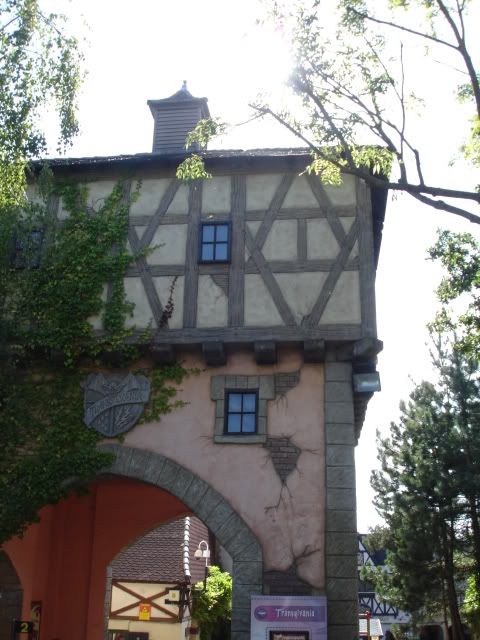
At the end of the day it is just a theme park, theming is supposed to be a bit off the wall and quirky...but the Transylvania area is trying to be correct to the area is portrays and this just looks just a little bit naff in relation to the other buildings.
I'm not going to get worked up about it, at the end of the day its just a cafe, but it is a shame to loose yet more good quality theming design from Chessington. Especially after the mess they have made of Forbidden Kingdom.
E
electricBlll
I see your reasoning, however I would argue that those architectural details are relevant to Transylvania, especially the new little (and working!) lamps, windows and walls. It seems to me that there has been a conscious effort to theme it appropriately. For example, just around the corner next to Bubbleworks we have this building, with strikingly similar shuttered windows - with the shaped-cut centres (on the far left, sorry this is the best image I could find):CoasterCrazyChris said:The windows, shutters, green pillars, chimney etc are of no architectural relevance to Bavaria or surrounding areas at all. They are just generic. The roof just looks **** as well now, instead of painting the snow they stripped it and we're left with a messy mismatch of tiling.

And the cracked plaster walls have also been modelled on similar details dotted around Tranyslvania and The Vampire's queue buildings. Here one example:
And the mismatch of tiling is because they have retitled large parts of the roof, which must have been expensive, so they haven't "just" stripped the snow off. Anyway, how was an Apline snow lodge relevant to Romania specifically? It was still associated with Europe, and so is the new look, just a quirkier style of European architecture.
And you posted on TTF:
Clearly the original design to be a covered patio outlet did not work - hence its significant unpopularity as an eatery. They have probably been wanting to make it indoors for quite some time for economic reasons. Those are not just "cheap wooden walls" - they are made of the same material as everything else, and those electric heaters have been there for years but at least now you will be able to get some insulation in there. ThemeUk mentions above how warm it is now.Oh come on, its hardly a fully functioning cafe, just the same thing as before but with some cheap wooden walls added. Clearly its not even proofed against the elements, which would explain those heaters which have been stuck on the ceiling beams. It was obviously originally designed to be a fast food outlet with just a covered patio area instead of a proper indoor cafe, so people could sit outdoors during warmer weather.
Well, let's just agree to disagree!
TheMan
TS Member
electricBlll said:
The chimney stands out a bit, the green is maybe a little over the top perhaps too, the tiling looks messy.
Which fits more into a mystical spooky theme? An snowy alpine hut with great big apple on the front, or the touches that make it feel straight out of a Brothers Grim fairy tale.
You know what, it is not perfect - but my goodness me, it is beautiful! And as much as I think the chimney looks daft, and the green OTT, the windows, shutters, touches like the door and even those lamps.
That, during Halloween (IF THEY ACTUALLY STAY OPEN WHEN IT IS DARK!!), with effects they lay on around the park will look brilliant.
You know what though? When I saw the difference between that first picture and the second one, I SMILED. As something designed to be a spruce up, you have to applaud it!
Couple of big coasters at Chessie and it would usurp Alton as my favourite park.
Dave
TS Founding Member
I quite like the new cafe and the only real let down is the fact the counter area hasn't been worked on and stands out a bit but thats a minor detail. As for the benches it's probably a case that they ran out of budget or time and are using some older picnic tables for the moment. They might update them at some point when there is time and money.
Seems like Merlin are stumping up budgets for theming maintenance this year, what with Chessingtons changes and the additions at Towers (X-Sector, Burger Kitchens, Hex & Hotels), hopefully they will continue to stump up money for stuff like this at their parks.
Seems like Merlin are stumping up budgets for theming maintenance this year, what with Chessingtons changes and the additions at Towers (X-Sector, Burger Kitchens, Hex & Hotels), hopefully they will continue to stump up money for stuff like this at their parks.
ThemeParkMania1
TS Member
Cafe looks brilliant - imagine the benches will come later, as the play area hardly seems finished either.
For those moaning about the snow (of which didn't fit in anyway), there's still bits left on the little chimney things on top of the building. Go climb up there and have a sandwich next to it if it cheers you up.
Chessington improvements are fantastic, however small they may be it's been making a huge difference to the park. And it's getting improvements under merlin, which is more than it's had since early 00s! (tomb remodel and a cheaply generic LOTD were not improvements, and decisions destroying the parks integrity were rife during the Charterhouse/DIC tussauds years)
BigAl
TS Member
Spotted these videos a while ago but never thought to share them on here. They're from Aden Hynes / Sculpture Studios and show how they created some of the iconic theming elements found at Chessington:
Buddha Faces by Sculpture Studios
Dragon Head by Sculpture Studios
Snake Themed Poles by Sculpture Studios
Rodeo Cowboy by Sculpture Studios
Carousel Rounding boards by Sculpture Studios
Again, I'm sure many of you will have seen them, but I thought I'd put them on here for anyone that hasn't. Even so, watching them back again is still just as fascinating to me as the first time I watched them.
They've also done work for Alton Towers, Thorpe Park and the Legoland Discovery Centre over the years. Just scroll through this page on their site to see everything they've done for these other three attractions (and many more amazing sculptures for other things).
Quetzal
TS Member
Wow, thanks for sharing, it's really interesting to see the amount of work that goes into creating these rides.
It's a shame to compare today's Rameses Revenge to the one shown in the video. I guess it's had the same problem as Ripsaw, in the fact that it's a moving ride, and theming has needed to be removed for maintenance reasons. It's interesting that the Kobra snakes are almost identical though.
It's a shame to compare today's Rameses Revenge to the one shown in the video. I guess it's had the same problem as Ripsaw, in the fact that it's a moving ride, and theming has needed to be removed for maintenance reasons. It's interesting that the Kobra snakes are almost identical though.
joelpagett
TS Member
Chessington have released details for thier 2013 opening hours. Pretty much the same as last year except Halloween period.
For my article regarding the opening hours
http://www.themeparknewsuk.com/2013/02/chessington-opening-times.html
for website
http://www.chessington.com/plan-your-trip/opening-times.aspx
On a note they will be keeping thier Halloween opening hours at 7pm
*puts on ear protection and awaits complaints*
Lottie.
TS Member
Shame they are sticking with the 7pm ride closing for Halloween. Interesting that they have extended the Halloween event, which is beginning on 19th Oct till 24th October with 10am till 5pm. Personally I like this idea as their Halloween event is great fun for the family
John
TS Member
Extending the halloween event is welcome, but it's a shame they've been so half-hearted about it. I can appreciate that Chessington isn't busy midweek on school days, but they could at least have gone for 7pm closures on the first weekend of the event.
Lottie.
TS Member
John said:Extending the halloween event is welcome, but it's a shame they've been so half-hearted about it. I can appreciate that Chessington isn't busy midweek on school days, but they could at least have gone for 7pm closures on the first weekend of the event.
Didn't occur to me until you pointed that out John. Totally agree.