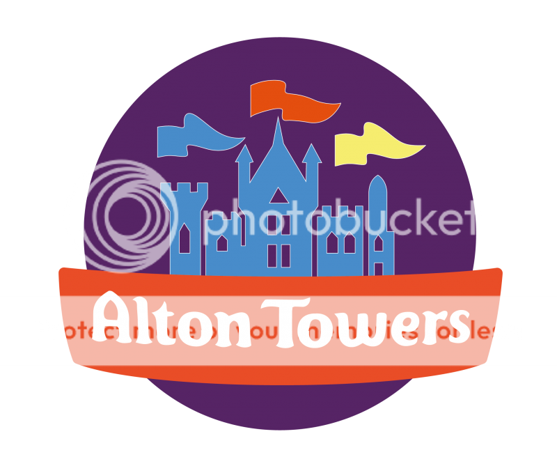
• ℹ️ Heads up...

    This is a popular topic that is fast moving Guest - before posting, please ensure that you check out the first post in the topic for a quick reminder of guidelines, and importantly a summary of the known facts and information so far. Thanks.

Marketing Future - Opinions Please!

Sam said:
It's distinctly 'OK'. I wouldn't say it's particularly stylish (too busy and complicated) and it's very dated. What are those naff multicoloured stars shooting off it? And the weird geometric shapes?

The depiction of the towers and the text bits are alright (though Alton Towers needs to be in a cleaner font), but the rest is oddly low-quality, especially the shapes. Also, because of how 'busy' it is, it scales really badly, and is quite hard to make out when it's very small.

Compare to say, the Phantasia logo:

7udOPtW.jpg


Simple, elegant, modern and minimalist, but also distinctive due to the custom stylised lettering. A top logo.

sVcFffX.jpg


Not very modern, but clean and simple, without any extraneous 'fuss' around it. The grand style of the lettering deliberately positions the park at the top of the industry. Also, the 'flying stars' is wonderfully elegant, and simple, and can be used on its own without the text for flexibility.

w7gKsu2.jpg


Yet again, simple and elegant, with no unneeded ornamentation.

Compared to the above modern and minimalist designs, the Alton logo is very 90s, and has a 'complex' look that I don't think any other major European theme park has with their logo. Something new and simple - stripping away all the rubbish - would do the park's branding a world of good, imho. :)

Couldn't disagree with this more. With the exception of Disneyland Paris logo, which works because of the iconic Disney font, the others look incredibly bland, amateur and boring. For the example the spacing on 'Land' is awkward, and each could have easily been created with word art!

I'm not saying Alton Towers logo couldn't be better than it is now, everything can always be improved, but never in a million years would I want to see it go in this direction!
 
Its always bugs me on the Towers logo that the left hand side is missing the 3 diamond shapes, they're all the way around the circle except for there.

Is there a reason for this? Or is it just as silly design oversight?
 
These are some scrapped ideas for a new logo that were made for Towers a few years ago. They're obviously prototypes, but interesting nonetheless.

bVPfW0q.jpg
 
Jordan said:
These are some scrapped ideas for a new logo that were made for Towers a few years ago. They're obviously prototypes, but interesting nonetheless.

bVPfW0q.jpg

I really worry someone at Towers will see this thread.

I'm not against quality alterations to the logo but the existing logo is iconic and really quite good. Those are horrid.
 
That looks horrific. That would have age very badly given the gold pipes aren't used any more!

It'll be interesting to see when the next rebrand happens and what they will do with the logo. Hopefully not a change as drastic as the above image. Although it would be nice to see it a bit simpler (look at Cheese's edit on previous page).
 
Dave said:
I'm not against quality alterations to the logo but the existing logo is iconic and really quite good. Those are horrid.

I think it all depends on the variant of the existing logo that they use and the quality of the image. The one they use on the Alton Towers Facebook page with the enlarged 'resort' looks damn awful, really cheap and nasty.
 
CoasterCrazyChris said:
Dave said:
I'm not against quality alterations to the logo but the existing logo is iconic and really quite good. Those are horrid.

I think it all depends on the variant of the existing logo that they use and the quality of the image. The one they use on the Alton Towers Facebook page with the enlarged 'resort' looks damn awful, really cheap and nasty.

ohh i'm not saying the existing logo can't be tweaked to make it better but its truely iconic and not at all boring.
 
Dave said:
CoasterCrazyChris said:
Dave said:
I'm not against quality alterations to the logo but the existing logo is iconic and really quite good. Those are horrid.

I think it all depends on the variant of the existing logo that they use and the quality of the image. The one they use on the Alton Towers Facebook page with the enlarged 'resort' looks damn awful, really cheap and nasty.

ohh i'm not saying the existing logo can't be tweaked to make it better but its truely iconic and not at all boring.

I agree but it really doesn't scale well and too often it is pixelated or the colouring is all wrong. Especially with promotional materials like 2 for 1's and other external branding. Usually it's the one with the larger Resort banner.

The logo that is on the first page of this thread looks great but they rarely seem to use it!
 
I don't see what it truly matters if it 'doesn't scale well' or is pixelated or whatever.

Like it or not the logo for Alton Towers is damn recognisable across the country. Be it on a cereal box, a TV Ad or a small pinbadge it has huge brand penetration simply because of how long it has been used.

Drastically change that and you instantly lose brand awareness. By all means the logo could do with tweaking but not dramatically changing.

Oh, and those gold concepts that were made? Appalling.
 
I've been working on some heavily simplified versions of the current logo. I'd be interested to hear views and opinions on these.

AltonLogonewproportions-01_zps6e7a2bc4.png

AltonLogowhitewindows-01_zps41bb7012.png

AltonLogo2-01_zps0f7e3a88.png

AltonLogo2Yellowwindows-01_zps8c8b4f48.png
 
Personally, I dislike those logos. They seem very, very, very simple. However if I was to pick a favourite out of those, it would be the last one, due to the lights in the windows and the shade in the actual logo.

It looks what I would expect the TS logo to be look like if it was a full circle, which is perfect for a fan site!
 
Tom.B said:
Personally, I dislike those logos. They seem very, very, very simple. However if I was to pick a favourite out of those, it would be the last one, due to the lights in the windows and the shade in the actual logo.

It looks what I would expect the TS logo to be look like if it was a full circle, which is perfect for a fan site!

I agree re. the lights stand out. 4th is the best. I'd increase the size of the towers on the image.

Simple can still be effective. I always thought the Towers logo appears to be exploding out of its small space - maybe something to try and achieve?
 
I would actually quite like the fourth merged with the current logo alton use just use the font around the current towers on the logo and change the towers windows like those on that design,remove the stars and the 'Resort' branding and you have a simple yet effective logo.Great job CGM
 
So glad I'm not the only one!

It's tacky, grating and overused and probably the single worst aspect of Merlins branding.

'Alton Towers' is majestic and iconic. It does not need that word stuck on the end in which they have insisted upon since 2008.

Completely and utterly agree 100%. Always hated the tacked on resort text. Alton Towers is not a resort, fact! Even when/if it does become a resort, they don't need to tack on the word Resort!

What grinds my gears even more is that since Alton did this, nearly every theme park in Britain followed (because it's just cool to copy Towers all the time) with 'resort' tacked on the end of their names. They are not resorts, fact.

There's theme parks in Europe with far more facilities than Towers but they don't stick Resort on the end of their names. Bad marketing is all it is, and that's the problem Merlin have always had.

Regarding the logo, how ironic that 'flat design' is all the rage these days. The logo they used in the very early 90's seems more relevant now than it did then.
 
Top