• ℹ️ Heads up...

    This is a popular topic that is fast moving Guest - before posting, please ensure that you check out the first post in the topic for a quick reminder of guidelines, and importantly a summary of the known facts and information so far. Thanks.

New Website

So a modern design with the heart of Towers embedded into it. I like it other than as already mentioned - the quality of some of the images/backgrounds. If only Thorpe had taken a similar route rather than its bland and overly complicated whilst trying to be simple theme.

Edit: Oh goodness. Due to the utter monstrosity that is the footer, the transition from the main body onto the site footer is terrifying.
 
Last edited:
Tis rather laggy on mobiles and not very well thought out for them either. Pictures and buttons cover up text for example.

Better than the old one though.
 
animations are choppy. wont read with my text reader. I wonder about site accessibility for some disable visitors.
 
Everything feels very incomplete on it for some reason. It seem like it's either work in progress or just a temporary re-design in preparation for a full overhaul. I can't see it staying how it is right now as it's very slow, laggy, and hard to navigate around. The drop down boxes don't fit with the rest of the site and it doesn't feel right when compared to the websites over the past few years.
 
After having complaints from parents expecting CBeebies to be separate. It seems a bit silly to list it as something different from the theme park in 'Things to do'.
 
I have a mixed opinion on this new website.

For starters, the homepage feels very 'mobile site' style. I dislike it, and find it far more difficult to navigate through. Yes, it's more artistic and colourful, but shouldn't navigation and ease of navigation be paramount on websites? To find the opening times, it took me about 5 minutes, on the previous site, 30 seconds.

They seem to really be pushing Splash out to be the budget Hotel, and really pushing the Hotels out more than the Theme Park itself. Doing that is good yes, but they are forgetting some people will come to the website thinking it's a Hotel Resort and doesn't have the Theme Park anymore (some people probably do this anyway).

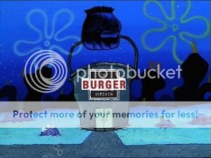
Also, I'd like them to let me know when Burger Kitchen's food is 'scumptious' and when 'Air is one of the most expensive rollercoasters in the world'. Good play on words, but espesially the Burger Kitchen comment, is it better to not push it out gently so people don't expect too much? They are basically asking for people to complain through this play on words.

I like the design and the art/colour of it, but some of it is really slow quality, really low. I prefer the old one in my opinion, easier to navigate through and easier to get information, which is the entire point of a website anyway.
 
Like all the latest versions of websites and software, it looks like a retarded worm designed it.
 
Also, I'd like them to let me know when Burger Kitchen's food is 'scumptious'

Was this a freudian slip? I really hope that's a genuine typo. I doubt it. Merlin aren't that honest.

a99f2aa3-00b7-475d-9b5b-9accdf2e7cc1_zpsaa4a7a57.jpg
 
Last edited:
Not sure if this is better or worse than Thorpe's recent 'upgrade'...

It's so laggy, which I'm guessing is because it's brand new...
 
Well, they needed a website update as they'd had the old design for quite a while. So that's good. Unfortunately that's where the good ends for me, I am not a fan at all. I've never liked this style of websites where scrolling reveals a new 'page', I think they are awkward to navigate and it is difficult to find what you want.

The new Towers website is quite laggy at present although I assume that will improve seeing as it has only just launced. Following on from that the homepage is completely useless. It provides you with zero useful information. Maybe it is because it is out of season and they'll change it once the park is open again (as a result of seeing comments on here) but something saying whether or not the park is open today and until what tome would be useful. Or something weather related. Or maybe, just maybe, something that makes it look like a theme park website?

That brings me on to the next point. I know Merlin want to push all their theme parks as resorts. I know they are all officially 'theme park resorts'. I know it is important to get people to stay for longer. I know it is currently closed season and only the resort side of things are open. However this website puts way too much focus on the hotels rather than the theme park. The park is the main product, it's what brings people in. Promote it!! If you don't hover over anything the homepage does not even mention the words 'park' or 'theme park'. There is no sign of any rides. You have to go hunting for basic information about the park. This is not how it should be.

I don't want to keep using Europa as the comparision but it is the first example of a park that has recently introduced a new website that came to mind. This is a good example of a theme park resort website! It's simple to use, professional, navigatable (is that a word!?) and informtative. And that's just the homepage.

Anyway, a couple of my favourite bits from the new Towers website:

- This from the Mexican Cantina description
Alton Towers said:
Join us for authentic Mexican food at our tasty Mexican Cantina. With a range of hot and mild meals available, grab a Fajita or some nachos with a filling of your choice and relax in our traditional Mexican restaurant to refuel for your next adventure! New for 2013 - gather up your amigo’s and enjoy our new Old El Paso menu where you’ll find a dish that everyone will enjoy!

Fajita? You'll be lucky! Good to see they are using up to date content.

- According the the opening hours the park opens at 10pm every day. So at Scarefest the park is open from 10pm-9pm, a whole 23 hours of theme park fun. Brilliant!!

I'm sure there are more gems like this to be found.

:)
 
The new design really just reminds me how much they could do with a rebrand. Even though the whole resort had a major rebrand in 2008 it all feels so outdated now and it looks like they could really do with modernising that.

Navigation is terrible on the website. As mentioned above you have to search through tabs to get to any theme park information! They should keep it simplier with a theme park tab that takes you to the information required. The images really need to be sorted too. I have a small laptop with a small display and the images look awful! They're pixelated in places and when it comes to pages like images of the lodges or treehouses the pictures are zoomed in, giving you no general view of the whole rooms.

At the moment it definitely pushes you towards booking hotel rooms and spending extortionate amounts of money. There seems to be no push from the homepage for you to actually find out more information about the theme park or attractions.

On the bright side at least they have unveiled this in December, it will give them some time to fix all the outdated and wrong details, update images (get the quality higher, and maybe don't use pictures of attractions from 20+ years ago) and come on here, see us lot moaning, sigh, and then fix everything that's wrong because deep down they know it looks messy.
 
Well would you look at that! Looks like Forbidden Valley is going to be devoid of flat rides now, with Ripsaw going to X Sector and the Blade has now clearly been 'shipped' off to Mutiny Bay

966f0b8326e8c7bc625d863705779674.jpg
 
Oh god... this is horrible!

No point going into all my opinions as they've mostly been mentioned in the above posts, however the theme park page is dreadful! Why have huge pictures which take up the whole page with tacky animations, that when I go to scroll down it just takes me to the next page? Took me a while to find how to get onto the other types of rides, not just thrill.
 
See, I like it. It is just too laggy. Having some of the backgrounds reacting to your mouse is pointless and very distracting. It would be much better just to ditch it and improve the speed of the website. What's with the scrolling as well? It so jumpy and hard to read.

Other than that though, it pretty nice! :)
 
Main concerns about the new site:
- General graphic of the Towers/buildings looks nothing like anywhere at the resort... it's not even an enhancement of Towers Street, those buildings are just fabricated out of thin air. Pity, of course - because if TS looked anywhere near as well kept as that...
- Hotel categories? How can ATH suddenly become "superior" overnight? There's nothing superior about those rooms. They have barely seen a refresh in 15 years.

Oh my goodness I couldn't find what you were on about, so I tried scrolling down a bit and what do you know, there's a random street!

Why would you even do that?

And what are all those buildings in the background?!

Is this Efteling??!
 
Top