Joel
TS Technical Admin
- Favourite Ride
- Closed season on TST
Hello all!
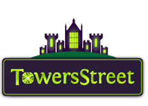
So, just a measily 5 weeks down the line, TowersStreet has another milestone - we have our first OFFICIAL logo of the site and community! YAY!
To say we've come a long way in 5 weeks is an understatement, we never ever thought 5 weeks ago that we would be this far along when we came up with the idea out of the blue to start afresh on that fateful evening back in June.
Firstly, a MASSIVE thanks to everyone who took part - and an even more massively extended thanks to those 4 final entrants who have worked so hard to polish their logos for us and then to wait through all of the suspense of the final vote at the hands of our very own community. I can't begin to thank you all enough for all of the hard work, devotion and support you've all given to us since we began.
However there could only be one winner, and that was all down to our community, because we have the mission statement emblazoned upon our walls at our HQ* that we are different, and we are here for our community, and that we want every one of you to be involved as much as possible!
(*Yes, my bedroom, and those bedrooms of the other 12 team members )
)
So, as you may have seen, the community voted the logo designed by Adam, and I'm sure you'll all take a moment to congratulate Adam on his hard work and support for the community too - we love the design, and thank you from all of the team once again too!
The vote was eagerly watched over by the team (yes, we could see how things were progressing! ) and at times it was very very close - but as I said before, we are as transparent as possible, so here is the voting break down for you all:
171 votes were cast.
Logo 1 - Adam 78 (45.6%)
Logo 2 - Mr P 21 (12.3%)
Logo 3 - Tim 48 (28.1%)
Logo 4 - Ryan 24 (14%)
We watched these numbers change and grow so much, but it was clear that Adam's logo hit the spot with the majority of the community. A massive thanks once again to Mr P, Tim and Ryan for your stellar efforts with your logos - we'll feature all of the final entrants on our site pages in the history of our site section we are building!
We'd still love to hear your thoughts and feedback about the new logo, and we'll certainly take any feedback and work with Adam and the team to put those finishing touches to our new logo.
Thank you thank you thank you once again to everyone that has taken part and voted, and congratulations to Adam once again!
So, just a measily 5 weeks down the line, TowersStreet has another milestone - we have our first OFFICIAL logo of the site and community! YAY!
To say we've come a long way in 5 weeks is an understatement, we never ever thought 5 weeks ago that we would be this far along when we came up with the idea out of the blue to start afresh on that fateful evening back in June.
Firstly, a MASSIVE thanks to everyone who took part - and an even more massively extended thanks to those 4 final entrants who have worked so hard to polish their logos for us and then to wait through all of the suspense of the final vote at the hands of our very own community. I can't begin to thank you all enough for all of the hard work, devotion and support you've all given to us since we began.
However there could only be one winner, and that was all down to our community, because we have the mission statement emblazoned upon our walls at our HQ* that we are different, and we are here for our community, and that we want every one of you to be involved as much as possible!
(*Yes, my bedroom, and those bedrooms of the other 12 team members
So, as you may have seen, the community voted the logo designed by Adam, and I'm sure you'll all take a moment to congratulate Adam on his hard work and support for the community too - we love the design, and thank you from all of the team once again too!
The vote was eagerly watched over by the team (yes, we could see how things were progressing!
171 votes were cast.
Logo 1 - Adam 78 (45.6%)
Logo 2 - Mr P 21 (12.3%)
Logo 3 - Tim 48 (28.1%)
Logo 4 - Ryan 24 (14%)
We watched these numbers change and grow so much, but it was clear that Adam's logo hit the spot with the majority of the community. A massive thanks once again to Mr P, Tim and Ryan for your stellar efforts with your logos - we'll feature all of the final entrants on our site pages in the history of our site section we are building!
We'd still love to hear your thoughts and feedback about the new logo, and we'll certainly take any feedback and work with Adam and the team to put those finishing touches to our new logo.
Thank you thank you thank you once again to everyone that has taken part and voted, and congratulations to Adam once again!


