- News all the latest
- Theme Park explore the park
- Resort tour the resort
- Future looking forward
- History looking back
- Community and meetups
-
ℹ️ Heads up...
This is a popular topic that is fast moving Guest - before posting, please ensure that you check out the first post in the topic for a quick reminder of guidelines, and importantly a summary of the known facts and information so far. Thanks. - Thread starter Joel
- Start date
- Favourite Ride
- Air / Blue Fire
- Favourite Ride
- Steel Vengeance
- Favourite Ride
- Nemesis
You are using an out of date browser. It may not display this or other websites correctly.
You should upgrade or use an alternative browser.
You should upgrade or use an alternative browser.
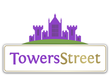
The TowersStreet Community Logo!
Tim
TS Member
I'm not sure why but after the changes I feel the middle tower needs windows, but before it didn't really bother me.
Also like Rupert I thought the oval worked, didn't understand the issue with it. I don't have the same issue with the hill but I didn't really think it needed changing.
Also like Rupert I thought the oval worked, didn't understand the issue with it. I don't have the same issue with the hill but I didn't really think it needed changing.
Rob
TS Team
I think it looks much better now, although I do think windows in the Towers could improve it slightly. Also, the space to the right of the logo looks very empty, I can't help but feel something should be there, even if it's just some faint stars in the background.

Scott
Former TS Team Member
Just a couple of things I'm thinking:
- Sometimes when I glance at it, the Towers don't look centred and look like they're slightly toward the right because of the brighter star on the left compared to the duller star on the right.
- The clearance at the top and bottom of the logo seems to be a bit small? The very bottom of the logo is very close to the star behind the menu below it.
Looks good though
I just noticed the new logo hasn't been uploaded as the display picture for both the TowersStreet Facebook and Twitter pages, which I had assumed it would have?
As nice as the current display pictures are, I personally feel that by using the logo voted for by the community, it would add consistency between the different formats.
As nice as the current display pictures are, I personally feel that by using the logo voted for by the community, it would add consistency between the different formats.
Meat Pie said:I just noticed the new logo hasn't been uploaded as the display picture for both the TowersStreet Facebook and Twitter pages, which I had assumed it would have?
As nice as the current display pictures are, I personally feel that by using the logo voted for by the community, it would add consistency between the different formats.
It looks like an adapted version for smaller use:
Full logo:

Facebook logo:

Forum Icon:

Twitter Background logo:

Facebook Cover logo:

As you can see, they all following the same branding and brand style, just customised for different applications and uses. As most sites and businesses do.
Ah... I was just not being perceptive enough. :-[
Still though, part of me thinks it would be nice to see 'The Towers' part of the graphic appear somewhere in the display picture designs as I see that as being the more memorable and iconic element of the original logo design.
Still though, part of me thinks it would be nice to see 'The Towers' part of the graphic appear somewhere in the display picture designs as I see that as being the more memorable and iconic element of the original logo design.

