- News all the latest
- Theme Park explore the park
- Resort tour the resort
- Future looking forward
- History looking back
- Community and meetups
-
ℹ️ Heads up...
This is a popular topic that is fast moving Guest - before posting, please ensure that you check out the first post in the topic for a quick reminder of guidelines, and importantly a summary of the known facts and information so far. Thanks. - Thread starter Jabberwocky
- Start date
- Favourite Ride
- Stardust Racers
- Favourite Ride
- Space Station Mir
- Favourite Ride
- Air / Blue Fire

You are using an out of date browser. It may not display this or other websites correctly.
You should upgrade or use an alternative browser.
You should upgrade or use an alternative browser.
Legoland Windsor
Benjsh
TS Member
With it being such a popular park to visit.....you'd think they'd spend more money on the upkeep and new rides than they currently do at the other parks, wouldn't you?
I'm sure it will be great attraction but it does look a bit tacky from that angle for sure.
I'm sure it will be great attraction but it does look a bit tacky from that angle for sure.
siralgenon
TS Member
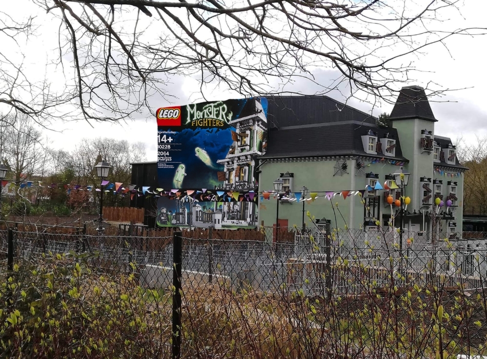
Well I've just seen a photo of the Haunted House on Facebook, (it won't let me share the photo) and it's safe to say it looks bloody awful. I know it wasn't meant to be hidden very well, but there's a difference between not being hidden well and not being hidden at all.
From what I've gathered, one side is hidden partly by trees but the other is completely open, which happens to be the side with the queue line on. Now surely they could have atleast stretched the facade to cover that side. There's not even any trees or anything to hide it at all.
Moving on to the queue line it just looks identical to Saw's. I was expecting a little bit more, especially from Legoland, even Ninjago was done better than this and that was done cheaply.
Islander
TS Member
I mean. The front looks great...
Second only to Disney everyone. What's a Phantom Manor again?

siralgenon
TS Member
I mean. The front looks great...
The front is fine, but that queue and side view is awful.
I mean. The front looks great...
It looks alright....
Missed a trick by not theming the shed to a box that a set comes in. Could have vinyl'd the **** out of it and it would have made sense!
siralgenon
TS Member
It looks alright....
Missed a trick by not theming the shed to a box that a set comes in. Could have vinyl'd the **** out of it and it would have made sense!
That's a really good idea actually! Would be dead cheap and be really effective!
Coaster
TS Member
I'm sorry, but the more I see of this the more utterly terrible it looks.
It's sad to think that Legoland were capable of producing attractions like The Dragon before Merlin took over, an incredibly well themed ride and area where no corners were cut.
As well as looking poor, this completely destroys the illusion a Mad House ride is supposed to create.
The park would be better off with nothing new rather than this monstrosity completely destroying the look and feel of the park. Embarrassing.
ChristmasPud
TS Member
Wow, makes the Towers Dungeon exterior look like a work of art
MakoMania
TS Member
What the hell even is this!? An absolute joke! I have never seen a dark ride be so hideously presented in any park anywhere in the world, ever.
Even painting the shed at the back to match the building would have at least been something, even if it wouldn't have been ideal.
Tim
TS Member
Just a note about the queue. I've seen the plans and unless they've been busy with that red marker it is going to be more than just a cattle-pen.
I have nothing to add about the show building. It would have cost practicly nothing to make it look like the facade. A proper job would have been to at least to sink the show building to the same height.
I have nothing to add about the show building. It would have cost practicly nothing to make it look like the facade. A proper job would have been to at least to sink the show building to the same height.
A few pages back I said that I could understand them not burying the haunted swing in a pit, but you'd think they'd have a ramp rather than stairs and a lift. Having seen those photos I take that back. Obviously I do still 'understand' that it's about saving money, but how does that look acceptable for the UK's most visited theme park? It's what you expect to see at somewhere like Crealy or Twinlakes. It's like Alton Towers, Thorpe Park and Legoland are having a contest to see who can irritate their fans the most.
djtruefitt
TS Team
It’s safe to say it looks just as awful as I imagined.
And it is simply Merlin being greedy by cutting costs massively! They re actually a joke in the theme park industry, does Nick Varney really think it looks great?
There is NO other reason why they would shove this in the middle of the park and not theme it, any DECENT theme park operator would either place the ride at the edge of the park. Pretty sure Legoland must have some land on the outskirts they could have put this (move the Disco ride). Or they would actually pay the extra money and theme all the way round.
I men’s they’ve even cut costs by not digging in the ground, which makes this show building look even worse! They could have at least made the frontage bigger than the show building behind it.
Anyway gone are the days when Merlin bothered to theme things at Legoland, just look at the warehouse they built the other year, or the rapids on the hillside.
I do look forward to riding this and see what the inside looks like, just a shame moneys been cut left right and centre like all Merlin projects on this. I do wonder how the theming and ride will compare to other madhouses.
Meanwhile here’s a few other madhouses in the world..
Sent from my iPad using Tapatalk
AT86
TS Member
What's quite weird is that the variant at Billund is also located in the middle of the park but is/was covered by the surrounding area themeing (the queue was however awful flat cattlepens)...
They CAN do it, they just won't...
I would take a guess that in Billind Merlin don’t also own two other parks just down the road. They have so little competition in the UK there is little incentive to improve.