• ℹ️ Heads up...

    This is a popular topic that is fast moving Guest - before posting, please ensure that you check out the first post in the topic for a quick reminder of guidelines, and importantly a summary of the known facts and information so far. Thanks.

Thorpe Park: General Discussion

As much as a mask may seem innocent on the face of it, and I know that your use of one was entirely innocent, they can be used for malicious means. The reason for banning masks isn’t so that “people don’t look like actors”, it’s because people often use masks to harass people and cause trouble and not get identified by CCTV cameras and such. Masks are a security risk, and if I were in the park’s shoes, I’d certainly prefer to be safe rather than sorry. Even getting it back from Guest Services when you leave arguably opens up a security risk in that the park don’t know that you won’t go back into the park with the mask and cause trouble.
In heindsight I probably should’ve checked, and I agree. Had no idea to be honest. It is weird, all they told me was that I would look like an actor and would get punched in the face! I also got it taken off me before I even got past the turnstiles (in security) so I don’t see myself getting in again with it.

Oh well, lesson learned hey?

Besides,
Sorry to double post, but it is being hinted on a Fright Nights gravestone that Thorpe Park may be retiring its infinity logo after this season:

I remember there being rumours of a logo change last closed season… could this be coming to fruition?

Good. The current one just doesn’t look good. I like the infinity, but I hate the font.
 
In heindsight I probably should’ve checked, and I agree. Had no idea to be honest. It is weird, all they told me was that I would look like an actor and would get punched in the face! I also got it taken off me before I even got past the turnstiles (in security) so I don’t see myself getting in again with it.

Oh well, lesson learned hey?

Besides,

Good. The current one just doesn’t look good. I like the infinity, but I hate the font.
The font is very comic-sans-esque but the Infinity is so iconic (which seems to be getting the chop from the look of that headstone theming piece). I remember the park holding a questionnaire last year on guests' thoughts on the logo but I'd say now is a good time to renew the visual brand alongside the flagship coaster for 2024.
 
THANK GOD! I've hated the logo since they changed it to ALL CAPS. Think it was the year Merlin took over from memory?

The lettering was so much better before - fun but not Comic Sans. Anyway - makes sense, new logo to go with Hyperia. Sure we'll finally get a new map design too, they'll want to show off the height of Hyperia instead of the 2D aerial view they use at the moment, showing off all the lovely metal warehouse buildings top-down.

1455887069thorpe-park-logo.jpg
 
Here’s my two pence: (I have learned @rob666)

The actual event was very good.
Stiches was a Major Highlight, the theming is incredible. We got split up in the wrapping machine, and then my problems started. We missed all the intended show scenes, as everyone had already gone and the actors weren’t expecting us, but they tried their best. There was no one in the reject room, though, and we missed the giant spider, along with the sewing machines going on.

Survival games is actually good this year, I thought I got manhandled last year, I hadn’t seen nothing! A problem is is that everyone in the arena forms a big conga line, and then an actor tells the guy at the front to turn around, and then 687 people have to turn around as well. Eventually, I got sick of being a wimp and having to turn around every 5 seconds and walked out. Then, the actors where REALLY good.
The chainsaw runout is far better than it was in creek freak, as everyone is let out at different times, so they really go for it.

Trailers time is up. It’s literally falling apart, needs new scenes or even just a spruce up for next year. Felt very understaffed.
Even the pyro effects looked.. constipated.

Deaths doors was pretty much the same, and the new amity and lyca- sorry, I might say this wrong
“Creature campus: troubles brewing”
was good, even if the bleachers made the dancing limited. And the name is 9 syllables long.

The crows was also great (as always they are my favourites!) but some of the hallways were kinda just fabric stretched out over some fencing.

This review sounds negative, but I had a wonderful time. Go there. Just not on a Sunday.

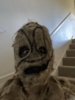
Also, I made this scarecrow mask.
I bring this up because I brought it there for fun, thought it would be cool, but got it taken away in security. They told me I could get it back at the end of the day, and well, fine. I come back at the end of the day and. I am the told that I can’t get it. So right now, it is in some confiscation room and I am raging war with customer services.
E5DB5F58-F036-458C-904F-F6A25463D025.jpeg
^ Maybe in heindsight I would’ve looked like an actor as they said BUT THEY CAN'T JUST STEAL IT FOR 2024!
I hope that you get your mask back. I have mainly heard positive things said about Stitches, which is a good sign.
 
I hope that you get your mask back. I have mainly heard positive things said about Stitches, which is a good sign.
Thanks, I appreciate it.


Get real: the infinity isn’t going away - it’s too well known for that. I suppose to a certain extent anyway. Marathon Bars can change to snickers - I know it’s because of localisation, but they can get away because everyone knew about it. Thorpe park, not so much. I’d be surprised if they threw away the little brand recognition that have.

We’re going to get an Alton towers esc redesign. Subtle but different. I’ll bet a hyperia mug on it.
 
THANK GOD! I've hated the logo since they changed it to ALL CAPS. Think it was the year Merlin took over from memory?

The lettering was so much better before - fun but not Comic Sans.

1455887069thorpe-park-logo.jpg
The logo’s always been hideous and it’s incredible they’ve stuck with iterations of this design for 20 years - in terms of “iconic” it’s not a patch on the long-standing original which now looks retro-cool it’s been so long:

IMG_3736.png
 
I have posted a mockup I have made before (It’s far from perfect I know) but I definitely think their old logo is something that I would love for them to revisit, it’s got a lot more charm than the logo of the last 20+ years
fb9b14d8112404ee49852e98d1e1789b.jpg


Also the branding they did with it for the 40th actually worked very well and felt very fitting for where the park is now, it’s very fresh and I think the flags work well and could be recognisable
3631170ed95d1c6e901c9ec89d3954e7.jpg


Whatever they do I hope it works out well and is the start of a new era!
 
Just reinstating @Craig's earlier post here given I've just had to edit a post. This applies in any topic!
I've removed a number of posts related to what many refer to as "Traveller's Day", which occurred today. As many will know, it's a topic that's been discussed repeatedly on the forum over the years with dedicated topics. Unfortunately, those topics nearly always ended up with the same repeated arguments being made back and forth, often quickly diving into being offensive with nothing constructive coming out of it.

As a result of this, we recently took the decision as a team to lock any dedicated topics related to it in future. For the same reason, the posts in here have also been removed.

I know some will not agree with that decision, but the procedures that the park has adopted to deal with such days is now long established and has changed very little in recent years. It happens, people generally know when said days occur and the park deals with it as best they can under the circumstances. Things then get back to business as usual for the multitude of other park opening days.

So if we could continue discussion about the resort in general except for this subject it'd be appreciated. I'm happy to address anyone's complaints/queries about the decision over PM. Thanks :)
 
Actually, I saw a higher resolution image of it and it says
Suppose infinity isn’t forever.
So that probably means I was wrong
Who wants a hyperia mug?
 
Actually, I saw a higher resolution image of it and it says
Suppose infinity isn’t forever.
So that probably means I was wrong
Who wants a hyperia mug?
Yes - TP have confirmed the infinity is going and it will be a complete rebrand. They've offered the reasoning that it was made in 2008 and no longer represents their brand vision, transitioning from 'Insane fun' to 'Feel good thrills' which does tie in with the most recent marketing video for Hyperia! Usually not one for change but open to this, especially if it means Thorpe are finally putting a little more love back into the park!

Have they got Hyperia merch in?
 
I don't think there is any brand association with the current logo except for die hard enthusiasts.

You ask people what they think of when you say Thorpe Park and I reckon the majority would say Rollercoasters.
It'll be the first rebrand of the logo, aside from colour changes, since it stopped being marketed as a primarily water theme park.
 
Yeah they have spent a lot of signage changes last season on signposting and updating the design language around the logo.

Thorpe have never stuck with one consistent design language and theme and changed it very few seasons meaning their has been a clash on park and it’s not been very cohesive.

From the 2009 logo they have had 4 branding themes
-Big heads/ thrill capital
-Endless fun
-Island like no other
-the current infinity swish theme

The only one that was executed as well was the island like no other theme and they brought back the themed areas and new soundtracks for the park. The big heads theme was … bad.

I hope their next logo just has a theme that they stick with and is executed well to be as iconic as Alton/cwoa, also hope that all signage on park changed to reflect this!
But the 2009 logo shares its design language and the infinity loop from the Tussaud's 2001 logo, doesn't it? Just a different colour scheme.
 
But the 2009 logo shares its design language and the infinity loop from the Tussaud's 2001 logo, doesn't it? Just a different colour scheme.

Yes it does, the 01-03 logo was with a purple type, 04-08 had white type. In 2009 Merlin changed all the resort logos and removed ‘Tussauds’, Thorpe park was changed to all caps and the infinity symbol was re-drawn.

The design/ brand language is the thing that has changed multiple times alongside this current logo, which has made thorpe lose itself in an identity crisis.
 
Wonder if it'll mean binning all those themes they paid Imascore for a few years ago (glad I've got the CD).

Watching E4 whilst having my lunch and seeing the seasonal Thorpe Park adverts won't be the same again.
 
Top