• ℹ️ Heads up...

    This is a popular topic that is fast moving Guest - before posting, please ensure that you check out the first post in the topic for a quick reminder of guidelines, and importantly a summary of the known facts and information so far. Thanks.

2013: General Discussion

They definately need to add more rides to the queue boards, at the moment even on moderate days the boards make the park look busier as it's only representing the high-demand rides. If they indicated that Duel was only 10 minutes and ripsaw only 5 people will be more likely to ride them.

Baffles me that they don't have queue-time indicators on the smaller rides at Towers, would help spread the crowds. You see people not going on Duel when the queue reaches the door as they think it is going to be huge yet it's barely 5 minutes at that point.
 
I agree entirely Dave. It always strikes me as strange that one of the best queue munching attractions at the park doesn't actually have its queuetime listed anywhere. Duel is the key to soaking up Valley and Canyon crowds, yet it's vastly under-utilised.

I'd say the same goes for Hex really. As with Duel, people see the queue is about half the Armoury on Hex and think they'll leave it as that many people will take ages to get through. When you're taking 70 odd people through every couple of minutes it's not bad at all though.

In a perfect world I'd like to see Towers have every ride listed on the queuetime screens. It'd be really useful in helping guests to plan their day and get the most rides done :)
 
Thorpe have every single ride listed on their boards, and im sure it helps them if people see Swarm 90 but Rush is only 10, etc. It spreads the people out around the park.
 
Well if they didn't fill half the new board with adverts, they could easily show all the rides.
 
The new board looked pretty nice today in my opinion. Certainly better than the previous board!

The Burger Kitchen in Mutiny Bay was slow but the food did have quite a bit of flavour. It is better than Burger King which was sloppy. There was no problem with the bread today either.

Sub Terra does appear to be fine now (I heard rumours of it having some troubles) and all of the effects are working well. It was probably my best ride on it.

Nemesis' breaks are squeaking a little bit so now they sound like Sonic Spinball. Other than that, it was very good.

TH13TEEN was down for most of the day today and there didn't seem to be too much going on around there.

The Smiler's effects are working (aside from The Giggler which is a little weak). It was a very smooth ride as well.

I didn't see any entertainment today roaming around. However, this may have been due to me arriving late and being in the wrong place at the wrong time.

There seems to be more work continuing on Scarefest, especially in the Towers.

The trommel is working in Duel again along with the other effects which have been hit and miss over the last few seasons.
 
The thing is, even if they are instant on using half the board for adverts, then the other side could easily scroll through attractions.
Like the old LED ones used to, with the main attractions appearing more frequently.

I mean its not like its a static system, it can be easily programmed to perhaps keep the main coasters (Nemmy, Air, Rita, 13, Blivvy and Smiler) then rotate the rest.

5 family:
Sonic, Hex, RMT*, Charlie, Duel

5 water:
Flume, Rapids, Battle Galleons, Ripsaw, (errm Heave Ho)

5 Misc:
Sub Terra, Submission, Enterprise, Blade, Squirrel Nutty.


*Known as its full name, not just 'Mine Train' why even bother with a full name if you cant be arsed to call it that?
--

Again I raise the point though, why are Alton Towers investing in these new displays when their queue time predictions are so poor?

Ridetimes is awful, its worse than the old screens, its simply a guess. It says its updated every half and hour - from what Ive seen in practice I REALLY doubt that is the case. Also every 30mins, so its not even close to accurate, we know the queues can change vastly in such a short amount of time.

I'd love to be behind a more modern queue times display, which can show where to head where its quiet - but the fundamental flaw is Alton themselves have such a poor grasp on the issue its not helping anyone: neither guests looking for a small queue or the park itself looking to promote attractions and real times.
 
Some of the rides on there barely ever get queues worthy of mention though. LED boards should be relevant to their area, really. I suppose it may occasionally be useful, but how many people in Forbidden Valley care if Squirrel Nutty Ride has a 5 minute queue, realistically?
 
That's a good point - although I would guess that it would take some time to program a system that could be area dependent.

With the new boards the right side could be kept as advertising while the left hand side could scroll through all (if not most) of the ride and attraction times across the whole park. The right hand side could also be made to use to advertise the shows and other entertainments across the park. It has the potential to be something that can be used as a great benefit.

The way queue times are logged... I like the idea someone posted on here that it should be updated by ride teams when they need to update them (scrapping the every 30 minute idea), as each ride can vary with how often the ride time can change (like Charlie could stay with a 10 minute queue for 2 hours while Nemesis' time could change 5 times within those 2 hours).

I doubt there's any easy way to log queue time though, as it's all dependent on staff and there's no fail safe system that could realistically work without some form of investment in a newer system.
 
I'm just guessing here but I think that the newer rides with the new queue time indicators at entrance (so Smiler, Th13teen and Sub Terra) can update their signs really quickly and easily. Whereas the older scrolling signs are a bit more of a pain in the arse.

If the newer simple indicators could be rolled our across the park and then linked together to control, when the time is updated by the op - control also get sent it and its automatically put on the queue boards.

Would be ideal but would involve a lot of infrastructure first.


Sent from my iPhone using Tapatalk.
 
Surely ride ops have a good idea of the que length from the monitors (showing how big que is) and along with the information they have on despatch times and fastrack allocation. They could easily just have one member of staff updating the boards constantly, receiving even just radio messages from each ride op. Granted it would be a crap job, but would hardly cost them anything!
 
Think ride ops have got enough to do like...operating the ride, without having to radio the queue time through to someone every time it changes a bit!
 
Scott said:
I'm just guessing here but I think that the newer rides with the new queue time indicators at entrance (so Smiler, Th13teen and Sub Terra) can update their signs really quickly and easily. Whereas the older scrolling signs are a bit more of a pain in the arse.
They're all as easy as each other - the number ones type in a number. The scrolling signs you type in a number to display the message. All very very easy.

The big rides should continue to get the half hour call through, but the smaller rides or those with little changing queues like Duel should phone through when theirs change. It would work well to disperse guests, if you consider that Duel would be at the top of the new board constantly due to low queues, imagine how many extra guests would visit (and relieve other queues) because of the boards?
 
At least with the new queue boards, the queue times online and on the Sales and Information screens around park will be using the same source of data as the main queue boards. I'd say that's quite a good start!

Mother Hen is not a good typeface for signage, particularly at small sizes on an LED board. The same goes for the wallpaper background. To get information across to people as quick as possible, you need to get all the cruft out of the way.
 
I like the mother hen font along with the purple towers wallpaper and think it is a vast improvement over the branding of 2008-10, but just like then they are still over-using one singular font for just about everything which is not practical for a lot of signage especially LED display boards.

:)
 
I agree. Mother Hen is a great font for Towers but it is being slightly overused. It certainly shouldn't be used for queue time boards around the park; you need something that is just simple and therefore effective.

:)
 
Personally, if they were adding new LED screens around the park I'd like to see them "themed" to their area. For example, in Forbidden Valley the background is sort of rusty looking, etc, to fit the FV theme; The one on Towers Street to be generic; and the one in Mutiny Bay having some sort of pattern similar to the new effect on the access gates by the Shoppe :)
 
Ian said:
Personally, if they were adding new LED screens around the park I'd like to see them "themed" to their area. For example, in Forbidden Valley the background is sort of rusty looking, etc, to fit the FV theme; The one on Towers Street to be generic; and the one in Mutiny Bay having some sort of pattern similar to the new effect on the access gates by the Shoppe :)

Could you imagine how much of a pain that would be to read, though? :/

Consistency is needed for something like this - it's no good if people have to stop and read it, it should be so clear that they can see it from a distance whilst they're walking in the middle of a horde of guests down Towers Street.

When the signage for the UK motorway network was being designed, one of the aims was that they should be able to be read by drivers travelling 70mph in torrential rain. I think that sort of approach would work well here.
 
Jordan said:
Ian said:
Personally, if they were adding new LED screens around the park I'd like to see them "themed" to their area. For example, in Forbidden Valley the background is sort of rusty looking, etc, to fit the FV theme; The one on Towers Street to be generic; and the one in Mutiny Bay having some sort of pattern similar to the new effect on the access gates by the Shoppe :)

Could you imagine how much of a pain that would be to read, though? :/

Consistency is needed for something like this - it's no good if people have to stop and read it, it should be so clear that they can see it from a distance whilst they're walking in the middle of a horde of guests down Towers Street.

When the signage for the UK motorway network was being designed, one of the aims was that they should be able to be read by drivers travelling 70mph in torrential rain. I think that sort of approach would work well here.

I'm not suggesting plastering them in highly detailed images or anything. Just giving them a little variety. Mother Hen aside, the current display is quite easy on the eyes and clear I'd say. Just colouring say one in Dark Forest dark green with white text where the current one is cream, etc or sticking a decorative border around the edge of the screen (Vines for example).

Thorpe's ones have some simple gradients and colour on them, and I think they work very well. The same could be done here but with a bit of variety between them.

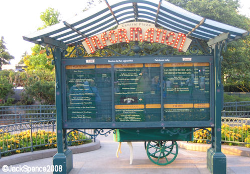
At the end of the day, given how many attractions are listed, and if more were to be added with the need for a second set of times to switch between people will need to take more time to read down them and find what they need. It's not going to be a massive issue. Better than DLP's, where you have to get right up close to them to stand a chance of reading it! :p

DLP%20Hub%2003.jpg


IMG_3073.JPG


It seems daft to me investing in new screens if you aren't going to make use of what they offer extra. If they want to keep it plain and simple they may as well just replace the existing screens with the same ones. It'd just be nice to utilise some of the new features available to them to make them look fresher :)

Whilst I do think it should be easy to read, you're looking at a queue time in a theme park. It's unlikely to be as serious as you say on a motorway going at 70mph, where a display is warning you of an incident ahead you need to be aware of :p
 
I would rather just a plain LED board like they had before which is easy to read from a distance, but perhaps with a physical themed surround on the board (so for example a rusty jagged metal frame in FV).

What they don't need is a cheap cartoony themed graphic on the screen which will look naff and make the text hard to read.

:)
 
A textured background does not make things difficult to read, unless you have bad designers, all they need to do, is use a design like the main website uses. Just theme the content box and background to the different park areas.
 
Top