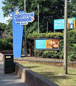
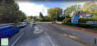
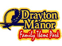
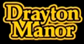
Its a new sign at an established small family theme park.
The way people are speaking, it's the new headline attraction!
It isn't designed to attract people to the park, it's a sign saying turn off here.
It will do.
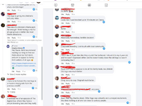
I completely disagee, and think you are disregarding the importance of signage and logos. I would firstly ask you to explain this reaction when the logo change was first announced on the parks official social media (from thousands of people on social media, who are normal members of the general public, not enthusaists or people following theme park communities like us). I have blocked out their names on this screenshot, which only gives a glimpse in to the reaction.
It got so bad, that the Drayton Manor social team (who include extremely dedicated people who did not deserve the abuse they got) had to step in and remind people to not be abusive. While this was excessive and at points abusive, the brand change itself was not good for the image of the park, especially nowadays where social media is so important for company image. The reaction was largely negative, with a few neutral and positive reactions here and there. But overwhelmingly negative.
Bottom line is: Branding can be just as important as the introduction of 'headline attractions'
It's all good saying "ahhh well, its just a sign, it's not a ride" . yeah.... It's a signpost. It's also the first piece of information that you get about a place if you don't know much about it. Visual information and stimuli especially from logos have been shown to be very important in convincing people to trust or engage with a company. This is not an anecdote, it is supported by research: In fact there are numerous academic papers on the psychology behind logos and why logos are
critical for company performance.
I have cited an academic journal here for anyone interested which explains this better using evidence and studies involving a number of logo-related variables and how consumers responded to changes in these variables to show the importance of factors like 'elaborate' logo designs and 'natural logo designs'. There's a big statistical variance in responses, which should give you a clue in to how a lot of people see and interpret logos
https://doi.org/10.2307/1252158
I would also refer you to
@Ian 's excellent post on the importance of logos for theme parks from a couple of months back, where he gives great examples on using European theme park logos, and what has worked for Europa Park, Efteling and Phantasialand over the years. All 3 parks went for a text based logo, but as Ian says, because the text was large, 'assertive' and bold, it does show the significance of the parks, and how they are high quality attractions.
Can’t say I’m a fan.
All that the new Drayton logo has is a cheap and clumsy swirl for the O and two little Shutterstock stars that look like a naff afterthought to try and give it some personality.
It’s generic, amateurish and devoid of any personality or charm. I would really hope this is something they’ve tried to come up with in-house and haven’t paid large sums for a branding agency to come up with it (not that I believe they have…).
My biggest concern is that it looks cheap. As someone else has said previously, it looks like the sort of logo the local nursery or soft play area pays the local graphic designer and £99 website shop to come up with. It doesn’t look like the logo of an established, large scale attraction. It’s what I have expected to find for somewhere like Sundown, Bottons or any seaside fair/amusement park. Not Drayton Manor.
Consumers
do make these associations too. It’s the reason branding and marketing are such huge industries (it’s kept me in work for nearly a decade now
). People do judge the book by its cover, and the quality of the brand makes a statement to customers. I’m not suggesting that people will stop visiting Drayton because of a new logo, but it will set a different tone for their marketing and shift perception I think.
It’s a shame really, as the old branding was pretty iconic in my opinion, and seemed to have stood the test of time pretty well given how long it had been in use. It was getting ready for a refresh and yes the inclusion of Shockwave was questionable given the audience they now seem to aim for, but a
refresh was all that was needed. Not a complete ground-up restart.
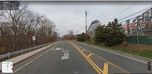
On the signage and its importance... I guess if you're passing Six Flags New England where all the rides are basically thrown in front of your face(Wicked Cyclone almost hugging the side of the road) even from outside the park then perhaps signage isn't as important:
I mean it's pretty obvious what the place is when you look at this roadside view on google earth: less reliance on signage here:
Meanwhile Drayton (much like Towers) is almost completely hidden. The signpost is the only indication you have of the park existing from the POV of a passer by.
Most of the thousands of people passing by Fazeley, Kingsbury or Tamworth every day need a good impression to let you know what's actually inside. The old logo definitely did this better than the current (even though it's needed an upgrade for a while now). Large stencil emblem of a corkscrew, big bold text, and oviously the theme park text too. I would bet that kids and families would see this logo and think "That place looks cool" and the Thomas logo would probably evoke similar reactions because Thomas is a good, well known brand and has a cool anthropomorphic logo for kids. And this is just with respect to the main entrance signpost, setting aside the park website, and social media.
It's quite possibly the difference between visiting, or deciding on somewhere else, if you aren't 'in the know' on theme parks (which most people aren't) ; it's one of those subconscious factors that comes in to play. And of course, for people who
are visiting, and are set on visiting, it also plays in to the perception of the place, to an extent, which is why the signs by the internal park entrances and kiosks are also important too. We should not be so dismissive of the importance of branding and signs. The new Drayton logo, both on social media and on signage is a big downgrade on the older one; and this is important to highlight.