- News all the latest
- Theme Park explore the park
- Resort tour the resort
- Future looking forward
- History looking back
- Community and meetups
-
ℹ️ Heads up...
This is a popular topic that is fast moving Guest - before posting, please ensure that you check out the first post in the topic for a quick reminder of guidelines, and importantly a summary of the known facts and information so far. Thanks. - Favourite Ride
- The Metropolitan Line
- Favourite Ride
- Pirate Adventure
- Favourite Ride
- Black Hole
- Favourite Ride
- ICON
- Favourite Ride
- Stardust Racers
- Favourite Ride
- Pirate Adventure
- Favourite Ride
- Black Hole
You are using an out of date browser. It may not display this or other websites correctly.
You should upgrade or use an alternative browser.
You should upgrade or use an alternative browser.
DiogoJ42
TS Member
It'll never be as bad as "But looking down is the fun part!"Seems strange to tell people there is no escape, and follow it with unfasten your seatbelt
Trooper Looper
TS Member
Blackhole_Sun
TS Member
Alexsniff7
TS Member
didn't know there was anything going on? those walls have been around for a whileAnyone know what’s going behind the walls in the oblivion shop?
i felt like oblivion had much more mist than usual yesterday, also was the most unsecured ride i have ever had on it
Nerdsticks
TS Member
Have a look into the Fanta sponsorship, it's awful. Tummy bubbling fun.No... thet can't be real... please tell me you're lying...
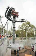
Yes they’ve replaced/refurbished the misters apparently. From the photos and videos I’ve seen, the drop looks the best it’s looked in a long time.i felt like oblivion had much more mist than usual yesterday, also was the most unsecured ride i have ever had on it
TroySmith1
TS Member
Unless I’m mistaken but looking at Bianca newest post on social media, it appears more painting and refurbishing works has been carried out since opening day?
I don’t remember seeing the floor brick work painted black if you look back at TPWW?
Sent from my iPhone using Tapatalk
I don’t remember seeing the floor brick work painted black if you look back at TPWW?
Sent from my iPhone using Tapatalk
djtruefitt
TS Team
Think that’s just the shading on the photo she has used.Unless I’m mistaken but looking at Bianca newest post on social media, it appears more painting and refurbishing works has been carried out since opening day?
I don’t remember seeing the floor brick work painted black if you look back at TPWW?
Sent from my iPhone using Tapatalk
GJMarshy
TS Member
Argh why??!!
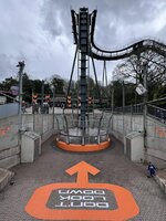
Sometimes less is more, and in the case of Oblivion, it most definitely is! The orange "Don't Look Down" sign became iconic because it stood out. Over the years more and more orange has been added to the ride area/x sector, starting with the painting of the logos in the concrete, then the. pipework around the old "Rehydrator", now it's plastered all over X-Cite and a the hole is surrounded with a thick band of orange. It's too much!
The "Secret government/military facility" theme only works if it maintains a serious and forbidding appearance. The only thing saving it is the fact the park haven't painted the track a glossy black with orange rails or something, it's teetering on the edge "pun intended" of becoming a parody of its former self in my opinion.
All the ride needs is a good jet wash, a return to the less "in your face" orange-ness, and two new flat rides that add activity to the area, whilst not detracting from X-Sector's theme.
Attachments
Trooper Looper
TS Member
Argh why??!!
Sometimes less is more, and in the case of Oblivion, it most definitely is! The orange "Don't Look Down" sign became iconic because it stood out. Over the years more and more orange has been added to the ride area/x sector, starting with the painting of the logos in the concrete, then the. pipework around the old "Rehydrator", now it's plastered all over X-Cite and a the hole is surrounded with a thick band of orange. It's too much!
The "Secret government/military facility" theme only works if it maintains a serious and forbidding appearance. The only thing saving it is the fact the park haven't painted the track a glossy black with orange rails or something, it's teetering on the edge "pun intended" of becoming a parody of its former self in my opinion.
All the ride needs is a good jet wash, a return to the less "in your face" orange-ness, and two new flat rides that add activity to the area, whilst not detracting from X-Sector's theme.

blackholes crow
TS Member
It's like Nickelodeons vomitting over it with it's iconic orange splatArgh why??!!
Sometimes less is more, and in the case of Oblivion, it most definitely is! The orange "Don't Look Down" sign became iconic because it stood out. Over the years more and more orange has been added to the ride area/x sector, starting with the painting of the logos in the concrete, then the. pipework around the old "Rehydrator", now it's plastered all over X-Cite and a the hole is surrounded s likewith a thick band of orange. It's too much!
The "Secret government/military facility" theme only works if it maintains a serious and forbidding appearance. The only thing saving it is the fact the park haven't painted the track a glossy black with orange rails or something, it's teetering on the edge "pun intended" of becoming a parody of its former self in my opinion.
All the ride needs is a good jet wash, a return to the less "in your face" orange-ness, and two new flat rides that add activity to the area, whilst not detracting from X-Sector's theme.
TroySmith1
TS Member
Argh why??!!
Sometimes less is more, and in the case of Oblivion, it most definitely is! The orange "Don't Look Down" sign became iconic because it stood out. Over the years more and more orange has been added to the ride area/x sector, starting with the painting of the logos in the concrete, then the. pipework around the old "Rehydrator", now it's plastered all over X-Cite and a the hole is surrounded with a thick band of orange. It's too much!
The "Secret government/military facility" theme only works if it maintains a serious and forbidding appearance. The only thing saving it is the fact the park haven't painted the track a glossy black with orange rails or something, it's teetering on the edge "pun intended" of becoming a parody of its former self in my opinion.
All the ride needs is a good jet wash, a return to the less "in your face" orange-ness, and two new flat rides that add activity to the area, whilst not detracting from X-Sector's theme.
I mean the walls look cleaner but I’m still not a fan of this look, maybe was good in the 90s not now just feels bland and reminds me of the dreaded M1 I traveled to get to the park. It needs a complete refresh and “concrete look” cladded with a better colour scheme. If it was all black and the hole surround orange that would look a lot slicker in my opinion, or if they took on the smilier theme, with the floor and walls looking like a black and yellow illusion perhaps?
Sent from my iPhone using Tapatalk
QTXAdsy
TS Member
Given the more orange accent around it, I'm more certain that they are leaning into turning Oblivion into more of her Italian sister which given how that one is more an updated version of UK Oblivion's theme, I wouldn't be all that bothered in all honesty.
I'm certain this retheme and maybe even new floorless trains would have happened sooner were it not for the Smiler incident and only now that it seems that they have taken this proposal off the shelf and dusting it off; the success of Nemesis returning will only fuel that confidence even further for them to do this though likely an updated theme for the ride and X-Sector as a whole, maybe at a longshot push new lapbar trains for Smiler, all will be done when a new flat or too is added in the area so that they can kill three birds with one stone.
I'm certain this retheme and maybe even new floorless trains would have happened sooner were it not for the Smiler incident and only now that it seems that they have taken this proposal off the shelf and dusting it off; the success of Nemesis returning will only fuel that confidence even further for them to do this though likely an updated theme for the ride and X-Sector as a whole, maybe at a longshot push new lapbar trains for Smiler, all will be done when a new flat or too is added in the area so that they can kill three birds with one stone.
Bert2theSpark
TS Member
With new Forbidden Valley taking on a new theme more similar to X-Sector. I'd like to see X-Sector move in a new direction.
I'd love the area being an experimental facility for existentialism with the Ministry of Joy being mad scientists. The Smiler being a psychological device twisting the meaning of life towards happiness, and Oblivion being a physics experiment simulating what's beyond the stars and the nothingness and meaninglessness of space. And then add flat rides themed around other areas of science gone wrong...
Extend the narrative that was recently introduced with the Ministry of Joy being this comical organisation that you'd expect from a TV sitcom with Mad Hatter-esque ambitions, but have various theming elements of them existing throughout time. With a 'Ministry of Joy' headquarters mimicking Downing Street and a wacky twisted version of a sundial.
GJMarshy
TS Member
Sure if it Smiler was the only coaster in the area. Oblivion has a fantastic theme. It's a one trick pony, and it's the theme of forebodingness and anticipation of the unknown that makes it successful. Strip it of that and start adding humorous elects in and it'd kill it stone dead.With new Forbidden Valley taking on a new theme more similar to X-Sector. I'd like to see X-Sector move in a new direction.
I'd love the area being an experimental facility for existentialism with the Ministry of Joy being mad scientists. The Smiler being a psychological device twisting the meaning of life towards happiness, and Oblivion being a physics experiment simulating what's beyond the stars and the nothingness and meaninglessness of space. And then add flat rides themed around other areas of science gone wrong...
Extend the narrative that was recently introduced with the Ministry of Joy being this comical organisation that you'd expect from a TV sitcom with Mad Hatter-esque ambitions, but have various theming elements of them existing throughout time. With a 'Ministry of Joy' headquarters mimicking Downing Street and a wacky twisted version of a sundial.
I love a bit of light-hearted/ironic self-aware humour as much as the next man, but applying a theme like the Smiler's to Oblivion will turn it *literally* into a laughing stock. Even "Oblivion: The Black Hole" which is a sort of hybrid between the two, creates nowhere near the same levels of anxiety, anticipation and adrenaline as the original, it's too clean, too polished and too funky.
We've got the Dark Forest and Adventure Land bott sitting waiting desperate for a new theme and rides, those are the places for more light-hearted themes. Not X-Sector. Even before the smiler it was arguably the best themed area in the park. Given Oblivion is so embedded into it (into the ground) any changes to the area's theme mean a change to Oblivions theme, which as originally envisaged, is without a shadow of a doubt the best way to theme such a one-tick-pony of a ride. Seriousness, anticipation, anxiety-inducing ride with a foreboding appearance and feel. For the love of god don't mess with Oblivion's theme!
I mean, Oblivion: The Black Hole is like what Aldi's "Wheat Biscs" are to Weetabix. It's a massive nope from me!
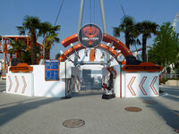
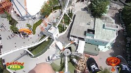
Eurgh.
Last edited:
