• ℹ️ Heads up...

    This is a popular topic that is fast moving Guest - before posting, please ensure that you check out the first post in the topic for a quick reminder of guidelines, and importantly a summary of the known facts and information so far. Thanks.

Park Map

IanB said:
Should they be thinking about scrapping the free map, and having a easy to use app which can be downloaded?

Ideally, it can be used to encourage people to the less busier areas, and can alert users when they are near something that they might find interesting? It can also be updated throughout the season as things change, or rides close/break down?

You could then have a paid for map, which is a higher quality and longer lasting. It would make Alton Towers more environmentally friendly as less paper/printing is been used, they are not getting thrown and dropped all over the place so you do not have to worry about picking them up later in the day?

Just throwing it out there :)

Ian

But then people like me wouldn't just be able to take home piles of maps for merch collections! ;)

I think the park map should be on the Towers app regardless of whether there is a free paper version as well. I'd imagine in the long run parks in general will fade out paper maps in favour of maps on apps.
:)
 
Rob said:
IanB said:
You could then have a paid for map
But then people like me wouldn't just be able to take home piles of maps for merch collections! ;)

No, you would still have the pile of maps, but Merlin would be a lot richer :p

On a serious note, think how nice a Premium Map (Not to be confused with a Premium Merlin Annual Pass, although those plastic membership cards do feel the opposite of premium) would be for your collection, without any of the horrible up-selling or adverts on it.

Ian
 
I've always said my favourite type of map design is that used by Legoland, with the rides in the middle and the names on the outside divided up by area.
 
Sam is only promoting the Habbo hotel style maps as amazing, just because he knows everyone else hates them ;)

and with good reason, they were just terrible.
 
Dave said:
They need to stop giving the resort a third of the map, yes put the resort on there for advertising but it takes up so much space the rest of the map is squashed.

Dave basically said what I think on the matter, it's ludicrous how much space the resort takes up - whose stupid idea was that anyway?

A map first and foremost should be exactly that A MAP!!11!11!!!!!11

I have been asked so many times, by people HOLDING MAPS, where they are and how to get to XYZ.

Of course, I tell them, there X is at THORPE, Y - because it would bring the tone of Towers down, and Z because it's dull when the disco stuff doesn't work.
 
TheMan said:
I have been asked so many times, by people HOLDING MAPS, where they are and how to get to XYZ.

Of course, I tell them, there X is at THORPE, Y - because it would bring the tone of Towers down, and Z because it's dull when the disco stuff doesn't work.

And just how long did it take you to come up with this little gem? I thought you'd been fairly quiet for a while! ;) :p
 
Pixie-Ro said:
TheMan said:
I have been asked so many times, by people HOLDING MAPS, where they are and how to get to XYZ.

Of course, I tell them, there X is at THORPE, Y - because it would bring the tone of Towers down, and Z because it's dull when the disco stuff doesn't work.

And just how long did it take you to come up with this little gem? I thought you'd been fairly quiet for a while! ;) :p

Takes me longer in my old age...
 
James said:
Could they not put the resort on the back of the map? Could work just as well. Have the one side dedicated to the theme park and the other site with the usual info and half covered with a map of the resort.

This is pretty much what I would like to see them do. A decent, colourful, but functional map like the one from 98-99 that Dave linked to. However, rather than wasting space including the hotels I would perhaps have the Monorail track vanishing off the page to the top left corner, after passing Air, with a nice bit of text saying Monorail to Hotels and Resort!.

Then on the back, I'd have the Monorail track appearing from the same corner of the page as it vanished off on the reverse, again with similar text, and dedicate perhaps a quarter of the back page to a map of the hotels, waterpark, and golf. Then fill the rest of the page with the usual info.

It'd help to provide two decent maps, which are both functional and uncrowded.

The current map is nothing short of dreadful if you ask me, and serves virtually no purpose as a functional map.
 
I really do hope we see a new map feature this year, I have an inkling though that we might not see one, as the maps usually update along side a new graphics style, and this hasn't appeared, it would be nice to revert back to the 2008-1010 maps, and stop the overuse of that Mother Hen, perhaps somethings similar to the font they used from 2008 and still in the hotels.

Visual Maps have done some amazing maps over the years, yet when you check out their website, the Towers one just doesn't look as nice, its far too crammed.
 
ryanlovesaltontowers said:
perhaps somethings similar to the font they used from 2008 and still in the hotels.

Yet they overused that font as well back in those days and I must admit the current style of branding is better than in 2008-10 (with the exception of the map and the dodgy Photoshop images).

I really like some of the stuff they put on the promotional images at the moment too like the purple background wallpaper they use with the towers on it as well as the gold frames.

I do think the park needs a full rebrand though - not since the 80's have we gone so long without a new park logo. And I can't be the only one who is sick of the whole 'fantabulous' and 'fantastical' spiel.
 
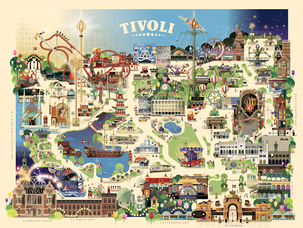
Just looked at some of "Visual Maps'" work online. The TIVOLI Gardens one caught my eye:

c7828ad2fb50019a261ce2eb7bb42245.png


The paths are drawn from a top-down perspective, whilst the rides are drawn 2D & Vertical. Ok its very simplistic on that particular map, but if towers were to adopt it, they could show the true layout of the park with real distances,and if done correctly, still look exciting.

Just maybe I'm not sure?

:)
 
The only thing I dislike about that map is the lack of denoting of what rides are and where (i.e. can anyone spot where on the map the dodgems are?)...

It's a beautiful map for a beautiful park though...
 
Well we all thought 2013 would see a new map with the Smiler, however they just made everyone around it even smaller! I think 2014 we will 100% see a new map design. There is no way they can fit the Smiler and CBeebies land together.

But the map does need to be nice looking, fun but also easy to use. They tried a bit with the 2013 map by removing a lot of the trees/bushes and making the paths a clearer colour, but it was still hard to navigate. They need the right balance of nice looking and easy to use. Something which seems hard to do!
 
A map needs to prioritise navigation, not advertising. Make a map with the areas evenly spaced out (like they actually are) with simple name tags. No advertising material. Keep the hotels on the map but don't show them in detail. And please don't go for the Thorpe Park Thorpe Park Resort approach.
 
BenBowser said:
And please don't go for the Thorpe Park Thorpe Park Resort approach.
Alton Towers has already been known as Alton Towers Resort in branding, signage and advertising for years now?
 
Scott said:
BenBowser said:
And please don't go for the Thorpe Park Thorpe Park Resort approach.
Alton Towers has already been known as Alton Towers Resort in branding, signage and advertising for years now?

I think he means the bobble-head design? And he was just making a joke about 'Thorpe Park Resort' :)
 
Top