• ℹ️ Heads up...

    This is a popular topic that is fast moving Guest - before posting, please ensure that you check out the first post in the topic for a quick reminder of guidelines, and importantly a summary of the known facts and information so far. Thanks.

Splash Landings repaints

Ian said:
1) The supports in the waterpark for Master Blaster. While I think the multicoloured look is great on the Wacky Waterworks I think that it looks dreadful on the likes of Master Blaster and the area around Little Leak. They just look really cheap and nasty compared to the lovely wood effect they all used to have, and they are far too distracting from the themeing in the water park.
Interestingly I did notice when I was having a nosy around Master Blaster in February that the supports/pipes are actually colour coded. Can't remember which is which colour, but all the supports are one colour, flow pipes a second, and drain pipes a third.

It's not just random multicolour, there is logic to it, but why they needed to do that is beyond me.
 
I belive they were just a faded yellow look, the rest of the ones in Splash currently look like that anyway. They wernt bright like they are now.
 
I didn't like the look of the paint job in picture form, but when I saw it in the flesh it looks quite nice. I always think photographs make things look more garish then they do in real life.
 
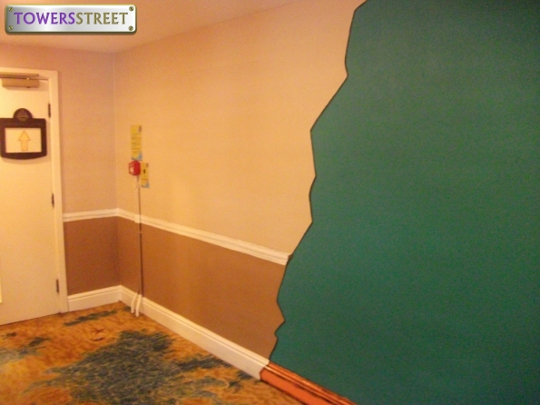
Splash Landings has been re-painted in two different styles:

Block cartoon style with black borders (elevators and waterpark)

and

Pastel colours with fading in the middle (can be seen on front facade)

I think the pastel colours look fine and blend in with the original painting, the cartoon style just looks a mess.
 
Ah I thought something looked different about those fences whilst I walked through to the AT Hotel with a few others on the Saturday meet. The fences are the same from the looks of a few images on Google, but their paint scheme is certainly different. It now looks like something from a play area. :(
 
I thought I would find the whole repaint intrusive and tacky looking, but apart from the one cartoony area as you cross from ATH into Splash near the sky walk it actually looks fine on the whole.

It really doesn't look bad at all in my opinion :)
 
I'd never even stepped foot in Splash until the weekend, but personally I loved the feel of the place. Obviously I have no idea of what it used to be like, but for new people it still looks really good.
 
More new painting has taken place in Splash Landings recently on the floor of Flambos.

Toilets:
644495_474488232621626_1949065298_n.jpg


These surf boards were repainted a few weeks back and now the wooden panels and wall behind has been repainted:
298210_474488222621627_887410795_n.jpg


The coridoor leading towards the lifts:
376171_474488465954936_2083066990_n.jpg


New sign:
388978_474490739288042_845023293_n.jpg


Outside the lifts:
317444_474488445954938_285448479_n.jpg
 
Do you think that Splash Landings looked better before these repaints or after?

They seem a little too 'cartoonish' for my liking but I haven't actually saw them in person. I hope they don't ruin the hotel with this though...
 
After seeing them in person myself admittedly the repaints do look far better. However I'm still not keen on it. It kind of goes again everything the original theme thrived to do. Although if they are indeed making Splash the 'budget' hotel as rumoured then I suppose this fits in well.

On the whole though I'm 'meh' over the whole thing myself.

This though...

waterpark-feb-19_595_towerstreet_sign_clean.jpg


...looks just as horrific in person as it does in picture. It looks awful. They don't need a way to have it leading like that. Utterly vile.
 
In general I do quite like the majority of the painting. In person they don't look anywhere near as garish as they do in photos. However, that transition to ATH is nothing short of dreadful. Whoever did that deserves to be bitch-slapped! They already have a perfectly good transition on the carpet further down the hall! This was totally unnecessary :(
 
What an utter load of crap.

Whatever class and adult appeal this hotel had, is now gone forever. They no longer have the right to call this a caribbean themed hotel....because it's not.

Somebody fire the management please because they fail.
 
It used to be subtle, gently worn down like it had actually gotten that way over the years. Not drawn all over in marker pen so that it 'looks old' but has clearly been done 5 minutes ago...

Some of it just looks utterly dire.


Sent from my iPhone using Tapatalk.
 
Granted, it looks better in person, however that doesn't mean it's good.

I personally think the re-paint looks tacky, childish, it has no colour consistency what so ever and just generally looks horrific. It looks like its been dragged out of a comic book. Its no longer a Caribbean hotel, its a cartoon hotel.

The other week I wandered down one of the bedroom corridoors, with the washed out wood effects, tropical pictures and rustic lanterns and it looked generally pleasing, high quality and relaxed...you then walk in to the lobby areas and it looks like someone has just stuck lit dynamite in a paint can and its exploded over the walls.

I know I moan a lot, but this in my eyes, has ruined a perfectly pleasant hotel and theme.
 
siralgenon said:
I know I moan a lot, but this in my eyes, has ruined a perfectly pleasant hotel and theme.

Why should we not moan when this company are abysmal at refurbishing anything to a proper standard.
 
CoasterCrazyChris said:
siralgenon said:
I know I moan a lot, but this in my eyes, has ruined a perfectly pleasant hotel and theme.

Why should we not moan when this company are abysmal at refurbishing anything to a proper standard.

Well I've said it before, I'll stop moaning when they stop giving me things to moan about.
 
It really wouldnt surprise me if all the coridoors end up like this soon, the pool is all done, the flambos floors is done, lift doors done. So it seems to be spreading around the hotel.

Some of it I quite like because it is quite bright and fun (but doesnt fit in with the hotel), but some of it I really don't like, such as the dark green or orange walls, they make the place look so dark.
 
djtruefitt said:
It really wouldnt surprise me if all the coridoors end up like this soon, the pool is all done, the flambos floors is done, lift doors done. So it seems to be spreading around the hotel.

Some of it I quite like because it is quite bright and fun (but doesnt fit in with the hotel), but some of it I really don't like, such as the dark green or orange walls, they make the place look so dark.

Have the elevator doors been done on each floor now?
 
No, some of the floors still have the old doors, including the floor where all these photos were taken, which I find slightly odd as the rest has been painted.
 
Top