• ℹ️ Heads up...

    This is a popular topic that is fast moving Guest - before posting, please ensure that you check out the first post in the topic for a quick reminder of guidelines, and importantly a summary of the known facts and information so far. Thanks.

The Alton Towers Dungeon

Suppose if they add some lanterns and the like to the front it could possibly improve it?

There is a gas tank down on the right behind the bushes so presumably this is going to be the case
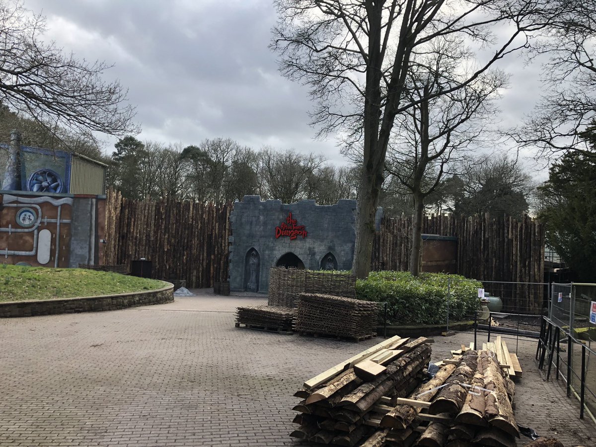
D1T1qUYWsAAUYIu.jpg
 
I'm behind the times here and have only just seen the facade pic. It's horrible.

The Blackpool dungeon looks good (from one angle, the rock shop - looks bloody awful from the sea front), but this... It can literally only be seen from ONE angle.

It's like they set out to make the ONE angle it can be seen from as bad as possible.

ONE angle.

How can it be so cheap and unimaginative from the ONE angle it can be seen.

Alton Towers is a beautiful theme park. I thought it was protected by English Heritage or whatever from carbunkles like this.

I thought there were standards.

It's like Merlin know they will be ripping this down soon so it's best not to bother.

I've seen travelling ghost trains at the local fair run by gypsy's have a better facade than this.

What's next Merlin? Take over The Louvre and paint an emoji on the head of the Mona Lisa?

ONE angle.

Mummy, I'm scared.
 
Last edited:
Alton Towers could be onto a winner this year with the pig huts accomodation and so called dungeon in the carbuncle cup awards :) Its good to see they have planned ahead for when they board it up with a wood fence and leave the area to rot for a few years, just hope they have saved some wood to hid that awful fake dungeon entrance.
 
Don't mention gas tanks / flames / fire to Alton's insurers - they have quite a good record along that line where Skyride stations are concerned! (Although a vending machine electrical fault & halogen floodlight were admittedly found to be the ignition sources on Skyride).

At least with Wicker Man "Big Bob" is not wooden, so the flames are safe. The fence around the Dungeons entrance looks very much 100% wooden.
 
Due to the fact that there are actors needed, it is pay to get in, the facade is uninteresting and that the charlie facade is still visible, this attraction seems as a temporary distraction for bigger plans.

The descriptions, pictures and footage all seem lackluster, potentially boring, so hopefully they will make something interesting out of it. After the 'dungeon' has seen a while

Because there are so many dungeons, this addition seems pointless, and as much as I love alton towers, this seems unsatisfactory.

I hear it's supposed to be like Doom&Sons: that'd be ok


Sent from my SM-A510F using Tapatalk
 
Merlin have proven themselves the worst theme park operators in living memory and after these images no alternative argument exists. No care for guest experience, dictated and based upon short termism, and failing to understand the basic concept of what a ‘good’ theme park is supposed to deliver and be. Rtp capex drops and the slump in the wider UK industry continues. Nothing new really.

If anyone is honestly planning to visit and go to this Dungeon rubbish, I would be interested in knowing why
I agree. Alton lost it's extraordinary care for enthusiasts about 2005 when Tussauds was bought out. Although Merlin Entertainments has improved this slightly, it would be nice to see them not only putting out more quality additions to the park, but actually ventures to cater to visitors needs.

You really see the difference now in comparison to then. A great example of this is seen in the documentary in 1997, named Alton Towers Magic

Sent from my SM-A510F using Tapatalk
 
Didnt see that, I think we need to give it until opening day to see what extras will be added.
Exactly, that's what many on here, other forums and Twitter seem to forget - or don't want to acknowledge ("it looks rubbish now as work in progress, therefore it will be rubbish on opening day") - there is 2 weeks between those pictures and opening day. I imagine the Wicker Man area looked like a building site 2 weeks before opening as well. Give them a chance...if on opening day it doesn't look any different then slate them, but until then at least give them the benefit of doubt.
 
I imagine the Wicker Man area looked like a building site 2 weeks before opening as well

The thing is, it actually didn't. They were already having previews for select media and fansites back then. It was a massive shame that they'd worked so hard to get it ready well ahead of time only to be bit on the arse by the weather on the day it mattered most.

I have no doubt they'll add to the Dungeons facade, but experience of these projects time and time again depicts not much will be done. Finishing covering the Charlie panels, adding the flame torches and perhaps a crate and barrel or two. At most it'll look somewhat acceptable for somewhere say, a seaside amusement resort. Alton Towers is meant to be a theme park yet this year they are seeing three poorly themed additions that could pop up anywhere.
 
Honestly its far better than I expected, I really don't think its bad at all. A long relatively low building like that in a pretty exposed position is very difficult to stop it look like a warehouse no matter how you dress it up. It was either this or literally spend millions on a towering facade that lets be honest probably wont be there that long; charlie was only open 9 years, Toyland Tours 11 years. I'd rather the park saved their money and this looks better than the charlie paint and stickers approach anyway.

Also to all the people posting the likes of "fairgrounds have made better" and "small local parks have made more impressive facades"; prove it. Please find me a building facade (without the warehouse being positioned especially to hide it) that looks better at anything but a world-class park.
 
The first one that pops to my head is The Haunting at Drayton Manor. The facade looks loads better than this....LOADS! Imagine if the show building of that ride is a rectangle, the facade extends along one of the long sides of said rectangle, so the building certainly was not built in such a way to 'hide' it. I am not speaking about the quality of the attraction within, but the facade is loads better.

I am struggling to find a picture that shows the full facade as it is quite long. But it is certainly magnitudes better than this is, done by a regional park, back in 1996. It does a hell of a lot more to set the tone, mood and setting than what this facade does.
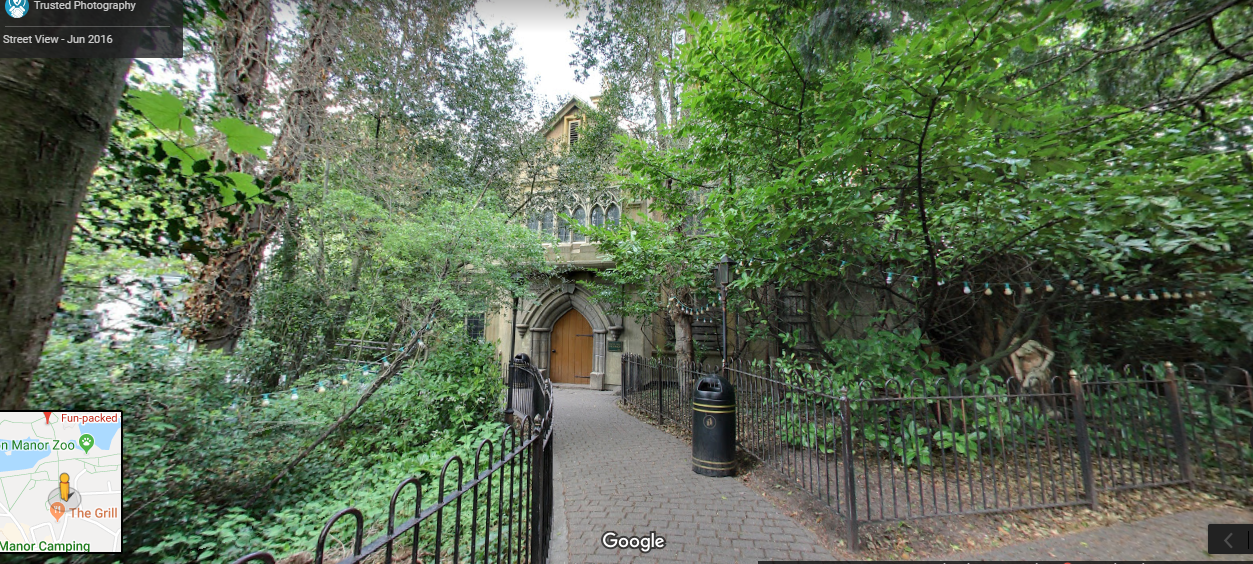
 
The first one that pops to my head is The Haunting at Drayton Manor. The facade looks loads better than this. Imagine if the show building of that ride is a rectangle, the facade extends along one of the long sides of said rectangle, so the building certainly was not built in such a way to 'hide' it.

I am struggling to find a picture that shows the full facade as it is quite long. But it is certainly magnitudes better than this is, done by a regional park, back in 1996. It does a hell of a lot more to set the tone, mood and setting than what this facade does.
The building was built set back from the rest of the park and behind trees that a (probably) 100s of years old. It is far from themeing a building in plain view.
image.png
 
The forest was not always there, the building was much more in plain view before. The Dungeon building is positioned in such away they could 'set' it back with very minor adjustments if they wanted to, so I think it is fair game. They will not spend the money to do that however.

It still stands though, a regional park put more effort into their ride facade back in 1996, than the jewel in Merlins crown can today.
 
Last edited:
Also to all the people posting the likes of "fairgrounds have made better" and "small local parks have made more impressive facades"; prove it. Please find me a building facade (without the warehouse being positioned especially to hide it) that looks better at anything but a world-class park.
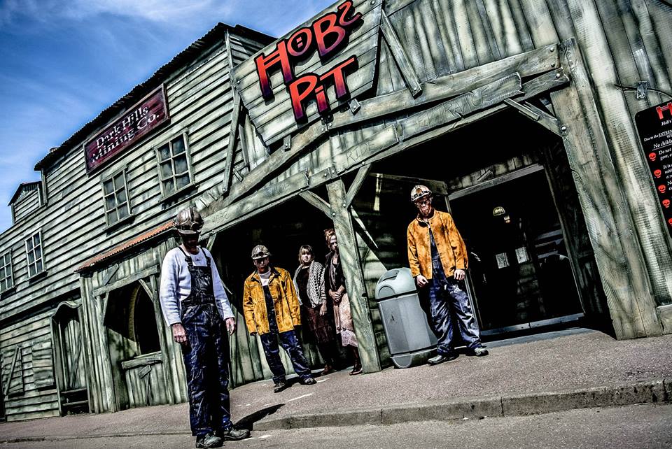
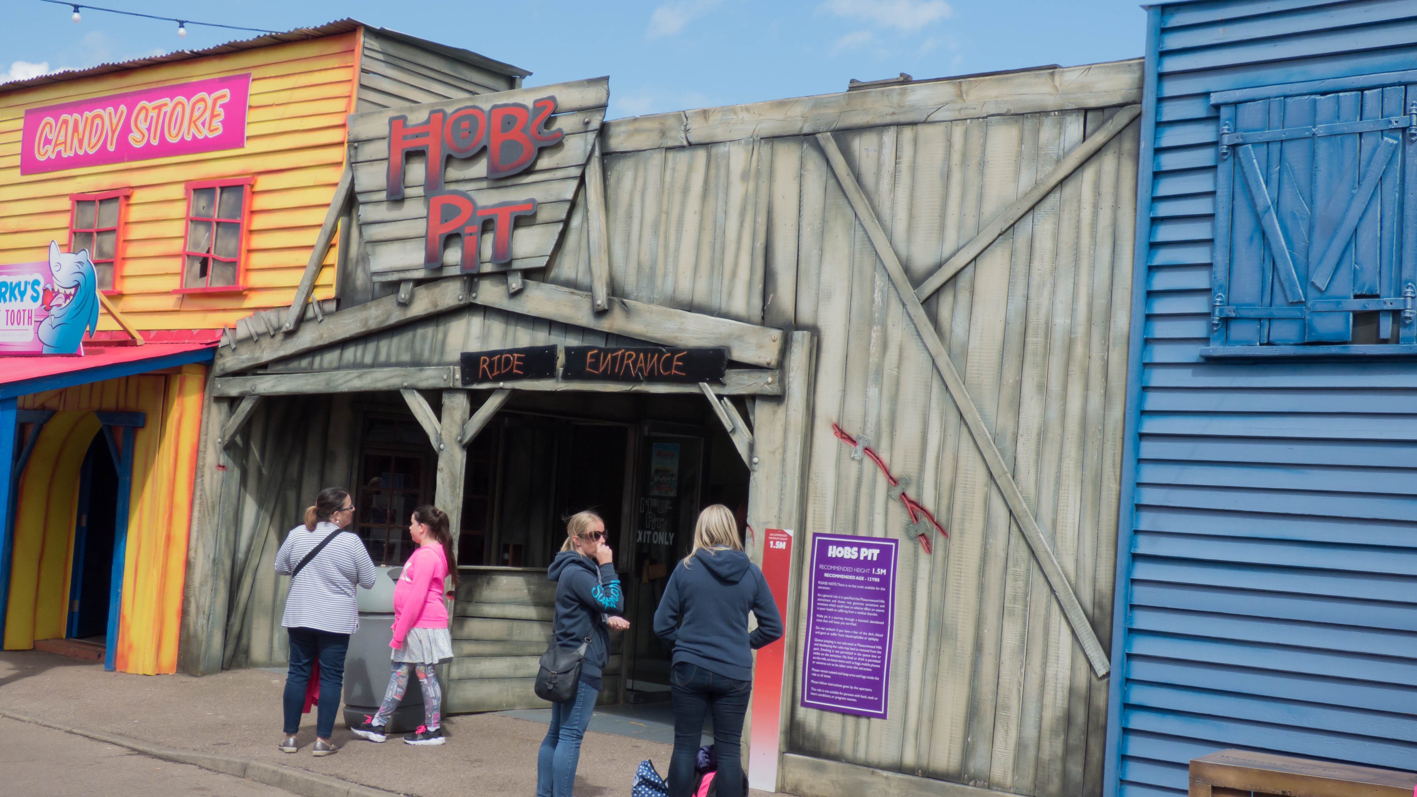
Pleasurewood Hills says hello from 2013.

9025407_orig.jpg
 
Granted it's now closed full stop. However, at least they bothered to apply some level of detailing across the whole facade to an extent rather than focus on an entrance arch, then use remnants of the trees they've been butchering over recent years to hide an old facade.
 
Top