• ℹ️ Heads up...

    This is a popular topic that is fast moving Guest - before posting, please ensure that you check out the first post in the topic for a quick reminder of guidelines, and importantly a summary of the known facts and information so far. Thanks.

The Smiler - General Discussion

djtruefitt said:
They have removed the yellow side guard things that were added on to the ride cars. And they seem to have been replaced by proper black metal bars. I did hear last year that they were one of the things that caused a lot of the rattling.

You certainly have a good eye for detail! ;)
 
Just to confirm from the John Lewis day today, the Smiler logos are back on the front of the train. And all trains do have these new black metal bars, instead of the yellow things they had last year. They look a lot better.
 
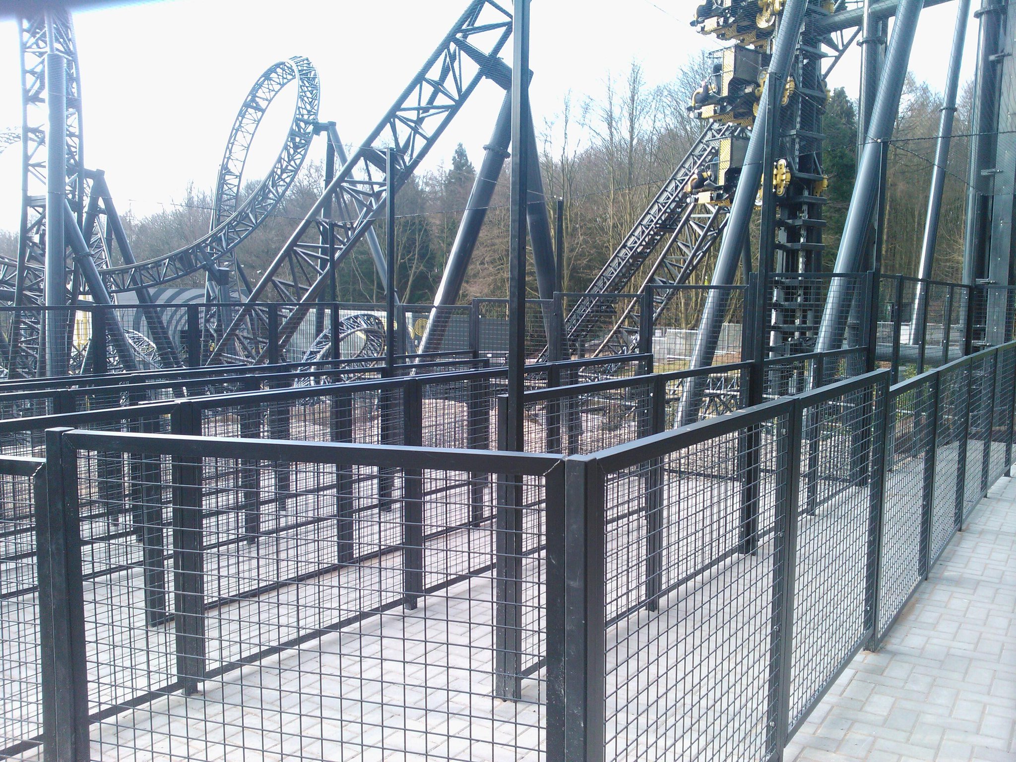
And the new extended queueline: *shudders*

Biysdn0IMAAhbOb.jpg:large
 
Well... At least it's a bit more open than the main queue :p

Fingers crossed as the hype dies down it'll be needed less than before...
 
it's no worse than what is in the pit and at least it's less claustrophobic. Still proves how badly thought out this whole project has been though.
 
Do you reckon we'll be queueing into the Cattle Pen of Horror on Saturday? I bloody 'ope not!
 
From the photos posted by TowersStreet on Facebook, I now have a judgement on the new extended queueline.

It looks horrible. There's no thought gone into the design of it, especially how it affects the areas (in terms of space and appearance). It could've been done so much better.
 
Andrew said:
It looks horrible. There's no thought gone into the design of it ... It could've been done so much better.

Sadly, this sums up the whole project. :(
 
Good to see that they can cut the cattle pen off from the queue line on the quieter days. That was the one and only bit of GOOD planning in this project.
 
Urgh, the queue extension going up X-Sector looks horrible. It also significantly reduces the width of a path that gets very busy at peak times. The only positive is that the cattle pet at the top is paved rather than more concrete.

:)
 
It blends in perfectly and doesn't look out of place or tacked on as an afterthought at all! /s
 
Yeah to be fair it blends in very well with the existing area.

Although while it blends in it still looks as ugly as sin. Could be quite safe to say that The Smiler's queue is almost as bad as Ritas. It does put me off queuing for the ride. Maybe one day the designers will get it in their heads the starting point of the experience is entering the queue itself.
 
I really don't think the queue extension itself looks any worse than whats already there, and Merlin like cattlepens. It will be less claustrophobic and still has a decent view (unlike Rita). But this is comparing it to what is already a fairly crap queue (Merlin like crappy queues, i dont rate Swarm's either).

The configuration to enter it looks ridiculous, they should have moved the entrance arch forwards and had a diversion going right up the hill. But Merlin really need to start looking at the appearance of their rides. All of their queues (excluding Battle Galleons) are hideous.
 
Well it's certainly a very interesting marketing tactic. Is it just me or are there a lot more 2-4-1's from the start of the season this year? There's Kellogg's, Rustlers and now Goodfellas.
 
Top