- News all the latest
- Theme Park explore the park
- Resort tour the resort
- Future looking forward
- History looking back
- Community and meetups
-
ℹ️ Heads up...
This is a popular topic that is fast moving Guest - before posting, please ensure that you check out the first post in the topic for a quick reminder of guidelines, and importantly a summary of the known facts and information so far. Thanks. - Thread starter AstroDan
- Start date
- Favourite Ride
- Nemesis
- Favourite Ride
- VelociCoaster (Islands of Adventure)
- Favourite Ride
- Nemesis
- Favourite Ride
- VelociCoaster (Islands of Adventure)
- Favourite Ride
- VelociCoaster (Islands of Adventure)
- Favourite Ride
- Nemesis
You are using an out of date browser. It may not display this or other websites correctly.
You should upgrade or use an alternative browser.
You should upgrade or use an alternative browser.
The World of David Walliams: General Discussion
djtruefitt
TS Team
Like all things at towers, he will be there the day or two before hand with just the media. Celebrities and their kids. Towers post it a few days later and make it look like it’s the opening. And families kick off they didn’t see him.AT will want pictures of long queues and voxpops of families gushing about the amazing new ride on ITV News at the opening.
Presumably, Mr Walliams is booked to cut that ribbon on opening day.
Just the same with cbeebies land, and cbeebies land hotel, enchanted village and even the sheds.
Croftybaby
TS Member
I wouldn't invite him. He will possibly pull the plug 
Matt N
TS Member
This post from Alton on Facebook seems to imply that we're getting some additional info at 8pm this evening:
Maybe this is some of the "additional surprises" that they were alluding to?
Also, the first of the pre-season priority days is tomorrow (not sure which group it's for), so we may get a new look at the area's progress tomorrow!
Maybe this is some of the "additional surprises" that they were alluding to?
Also, the first of the pre-season priority days is tomorrow (not sure which group it's for), so we may get a new look at the area's progress tomorrow!
AT86
TS Member
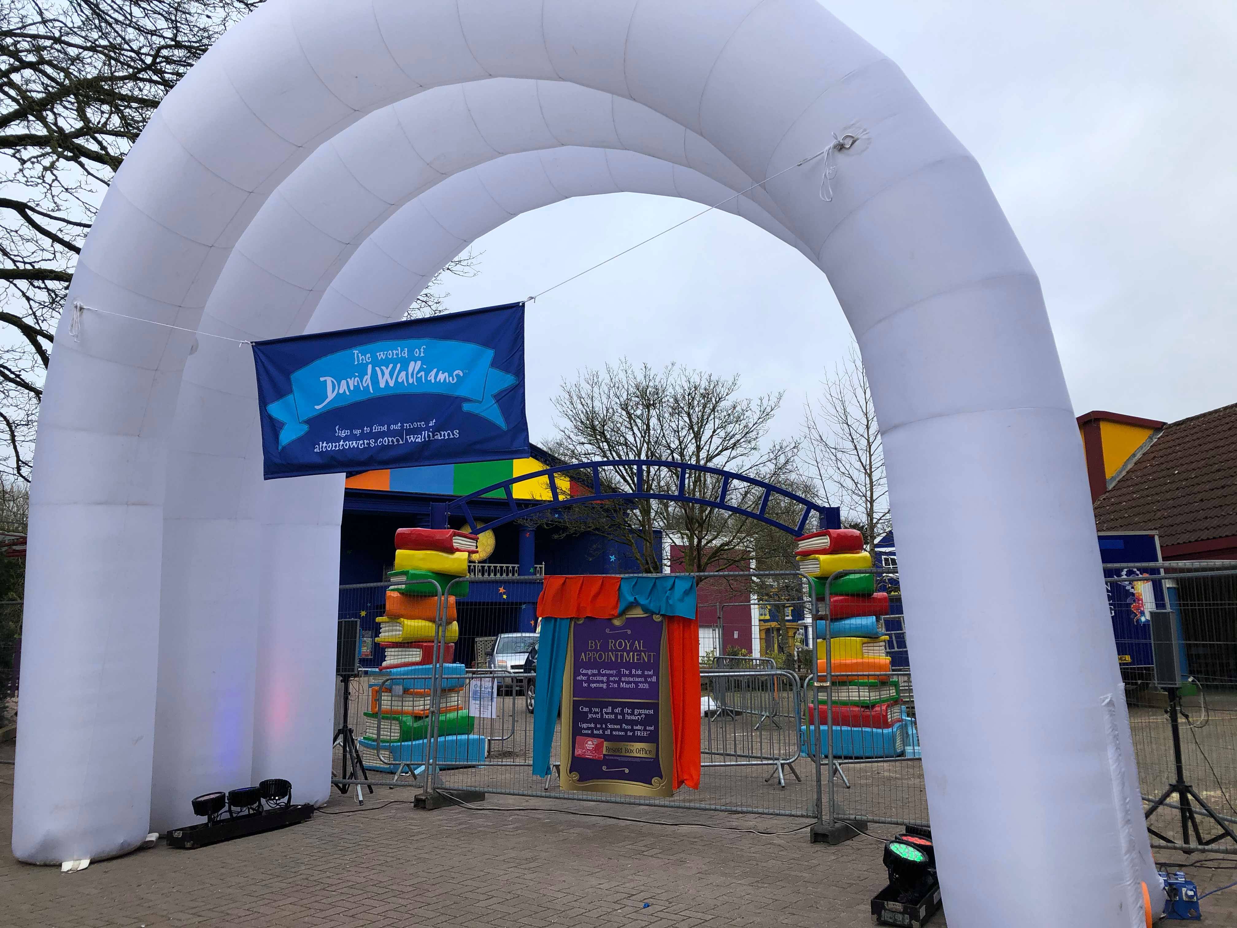
Looks better than I expected
Same.
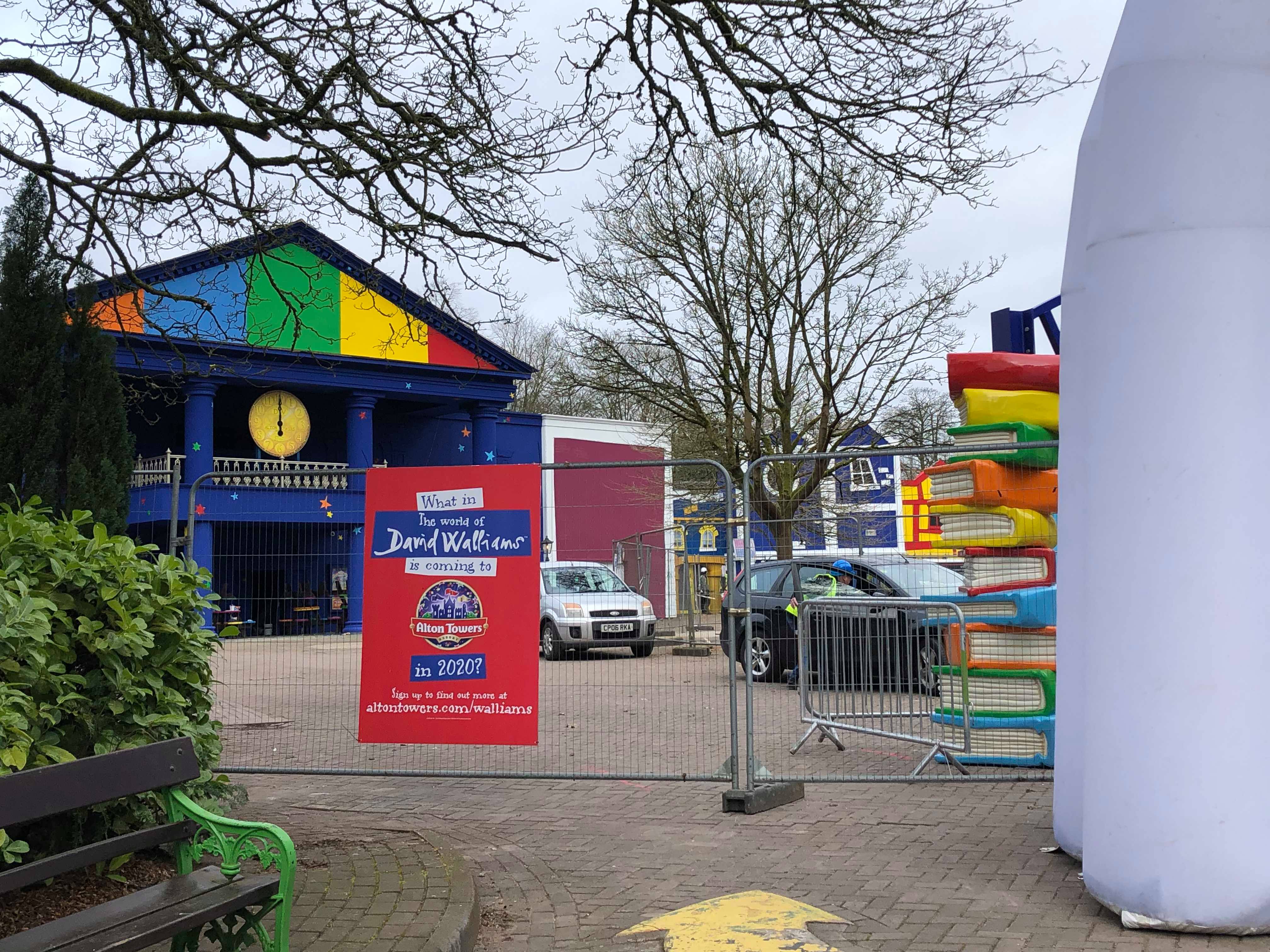
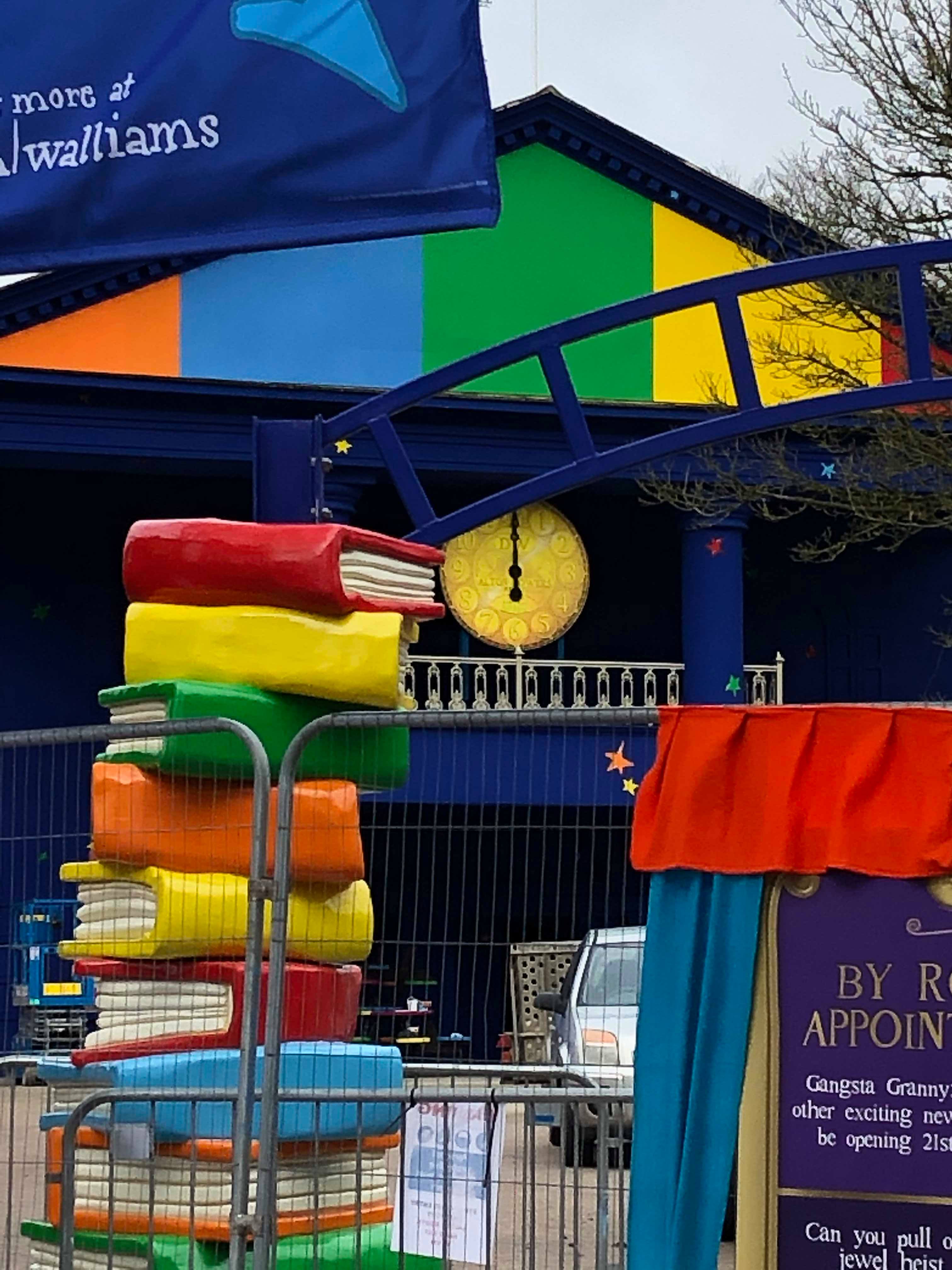
Some more pictures.
Frog Hopper has moved back to its original location in front of the old Nick building.
Could the theatre have some use this season? Meet and greet maybe?
Edit - actually it could be some kind of green screen photo op. There used to be an Ice Age one in the entrance area of the theatre.
siralgenon
TS Member
I don't think it does look that great to be honest. Compared to how Cloud Cuckoo Land looked when it opened in 2009 I don't think this has anywhere near as much detail. It looks more along the lines of Cred Street than anything...
Joel3
TS Member
I'd say the Toadstall site. I think you can see it in one or two or those photos.Interestingly, I don't see Royal Carousel in any of these pictures; where is it going to go?
Matt N
TS Member
Another thing worth remembering is that the area is still very much a work in progress; they could add some more finer details within the next two weeks before opening!
I think it looks like a nice area as is, but it's worth keeping that in mind.
I think it looks like a nice area as is, but it's worth keeping that in mind.
venny
TS Member
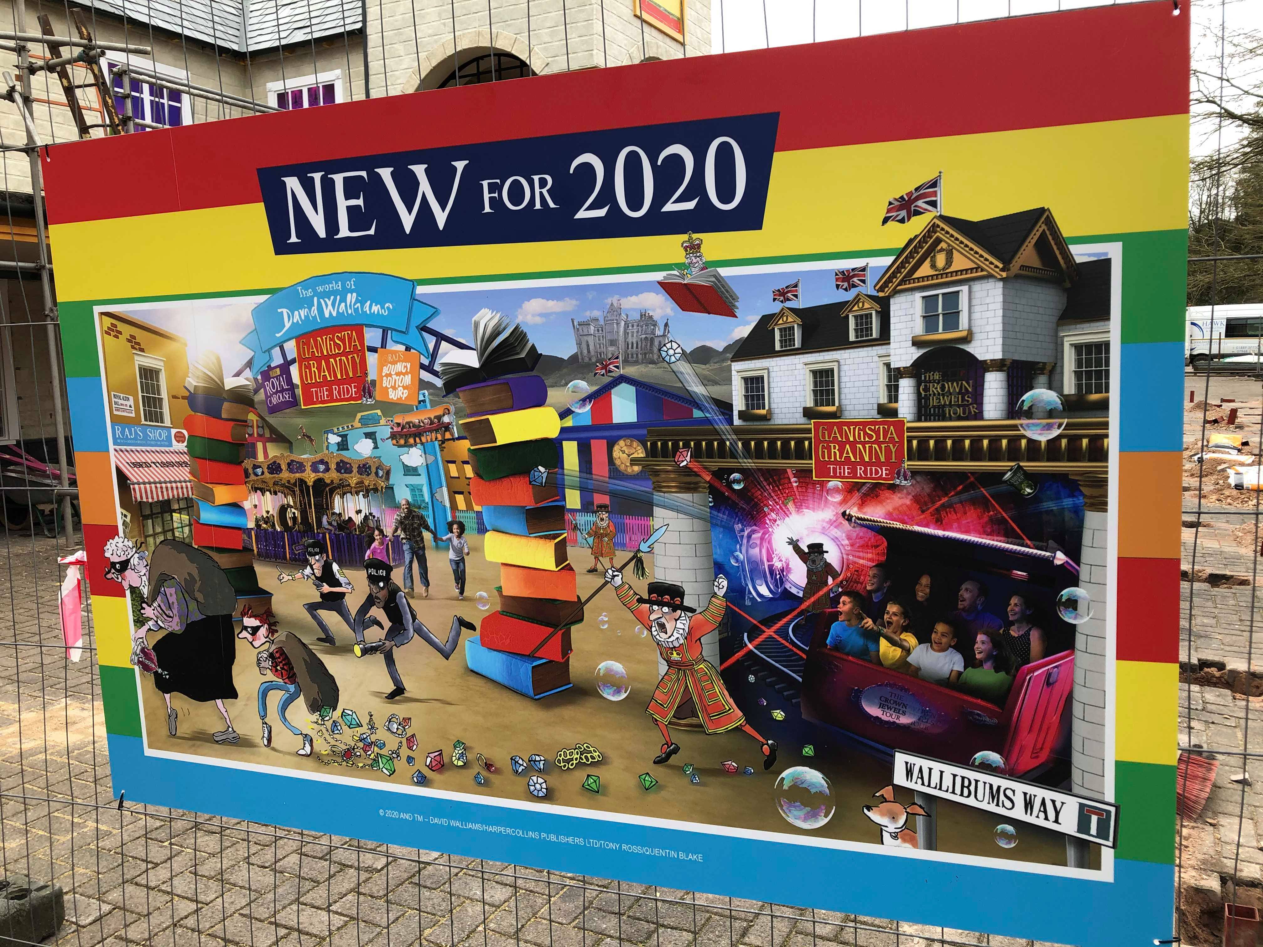
It would appear that this will, yet again, be another charmless overlay.
It’s interesting contrast this with CATCF’s opening. At the time, the detail of that ride was derided by many for lacking detail and substance. Comparing Charlie’s additional facade treatments and detail actually puts the blocky repainting of what we can see so far to shame. The very least they had to do was repaint the buildings in order to call this a “new” land. It looks like that’s what we’re going to get, with the repaint having the same finesse as a four year old’s colouring book.
I guess they’re using the same principle as the Splash Landings repaints.
Of course, I’m only judging by what we can see so far.
Matt N
TS Member
Out of interest, do we think that the theatre will have any use at all this season? Even if only as a smaller attraction e.g. a meet and greet? Only asking because I think that if it wasn't being used, then I don't think they would have bothered moving Raj's Bouncy Bottom Burp back to its old location.
I guess we'll have to wait and see when the park map for 2020 is released!
Also, with regards to the current look of the area; I remember the Dungeons façade was absolutely slated on Services Day 2019, and it looked much better come opening day. They might still have more up their sleeves yet.
I guess we'll have to wait and see when the park map for 2020 is released!
Also, with regards to the current look of the area; I remember the Dungeons façade was absolutely slated on Services Day 2019, and it looked much better come opening day. They might still have more up their sleeves yet.
jmc
TS Member
Without trying to sound overwhelmingly negative, this looks awful.
Yet another rehash of existing buildings, with two ancient fairground rides made to fit in. If it wasnt for the name of the area/rides, you it doesnt seem you would have any idea this has anything to do with David Walliams ‘world’.
Sent from my iPhone using Tapatalk Pro
Yet another rehash of existing buildings, with two ancient fairground rides made to fit in. If it wasnt for the name of the area/rides, you it doesnt seem you would have any idea this has anything to do with David Walliams ‘world’.
Sent from my iPhone using Tapatalk Pro
Well I think it’s a vast improvement, I like the new deeper colour tones. This will be great for kids and it doesn’t need to be over detailed for there market. I feel like there is quite a lot of detail going into what was the wobble world. With the brick facade and gold edges. Purple inner illustrated windows, edges and the cage in the middle. There still be more details, like flags and signs etc. Judging by the artwork on that board anyway. Love the AT clock on the theatre, not sure about the stars as there appear to be going for less tacky/CBB land look. But personal preference. Sure with the shops, finished signs and maybe added theming after: like maybe some centre Pieces like the books? it look like a great little add on area for that age rage. They done far better on low cap year or budgets than I expected. I just assumed they keep all the colours the same as wasn’t that long painted. and some signs slapped over. Exspecially as most the budget has gone intro a whole brand new dark ride. Sure it keep improving & became more complete, as new rides will be announced. Looks fantastic anyway!
Sent from my iPhone using Tapatalk
Sent from my iPhone using Tapatalk
Croftybaby
TS Member
Second to Disney.


