• ℹ️ Heads up...

    This is a popular topic that is fast moving Guest - before posting, please ensure that you check out the first post in the topic for a quick reminder of guidelines, and importantly a summary of the known facts and information so far. Thanks.

The World of David Walliams: General Discussion

There is a lot of uncertainty around at the moment - Brexit, Merlin's ownership, the 'success' or the AT Dungeon etc. For all we know, the plans may have been more substantial and scaled back. From a business point-of-view, maybe it does make sense to dip the toe into the Walliams IP, and then move forward from there. There is a lot of scope for low-cost expansion in the area. There is (what we believe to be) a fully functioning 4D theatre which could be utilised. I'm sure it would be pretty easy to loosely theme low-cost off the shelf flats to the IP too. Who knows what the future is.

The Dungeons arn't a success as they were a cheap quick fix shove it in attraction. Exactly the same as this seems to be. Dipping your toe in is one thing but announcing a new Walliams WORLD and then showing people the same buildings with some Dulux splashed on. and the same kids rides which don't even suit the target market? C'mon. People will see the advert, pay their £50 pp and feel like they've been taken for a (cheap) ride. Will they come back to Walliams World next year? I doubt it.

People saying we should be thankful for the area refresh. It's Merlin who let the place get run down? Should we let them close nemesis for 5 years and then congratulate them when they decide to turn it back on?
 
People will pay £50 per person?
How many exactly?
This is a kid's attraction, in a kid's area of the park, that has had a bit if a makeover.
The geeks are dissapointed?
Maybe it wasn't aimed at them.
 
CCL deserve s another CBeebies quality retheme. Something that reimagines the existing elements of the area, and adds new bits to join it all together.

You have to hope there is a plan for several years of incremental investments, like CBeebies has seen, with new small scale attractions every couple of years.

If that is the plan, my worry is that year 1 can't afford to be underwhelming.
 
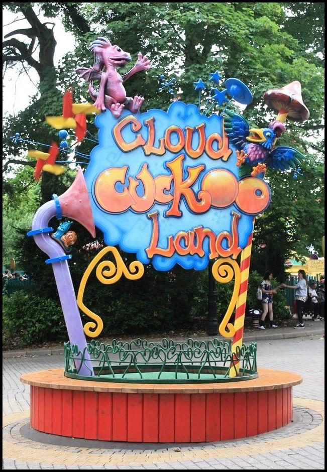
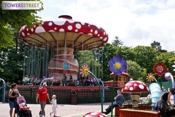
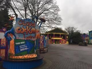
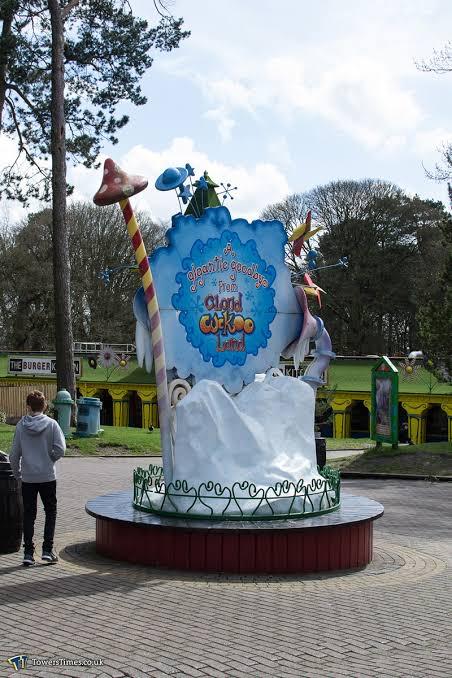
I was just wondering what happened too cloud cuckoo land old theming. If it could be reused or something similar to make the area look more busy or complete. Like some nice big Center pieces not just the benches as a focal feature.

5b6eda9e16e4cb6ae03f717fe9f6e59d.jpg
98c9ccba18777af0d8bd0fadbf36aeb3.jpg
14964f2268e210de72fae4aff9d84d38.jpg
da5e061fa9d39de68558fcd15fb8f65b.jpg


Sent from my iPhone using Tapatalk
Knowing Merlin Magic Making, they will store it then use it as Scarefest theming in five years time.
 
I’m also laughing at how many times the sign has been changed over the years. Also I can’t believe how many colours the buildings have gone through too. It’s like, No one has a clue what to do with this area. I’m just hoping over this & next year they can connect it all together, As it’s starting too get Embarrassing. Also feel the entrance book arches, Could of gone down the none plastically tacky cloud cuckoo look. Especially as they appear to have gone down the more deeper tone colours on the buildings.

5ca0a73d9a61d0db20ef317ec10e14f5.jpg
c289a75b72e213ed714b1f8857cd8633.jpg
 
Last edited:
From what I have seen, and it is not yet finished, it looks okay. Certainly better than it looked last year, but not as good as Cloud Cuckoo Land was when it first opened in 2009.
 
I was just wondering what happened too cloud cuckoo land old theming. If it could be reused or something similar to make the area look more busy or complete. Like some nice big Center pieces not just the benches as a focal feature.

5b6eda9e16e4cb6ae03f717fe9f6e59d.jpg
98c9ccba18777af0d8bd0fadbf36aeb3.jpg
14964f2268e210de72fae4aff9d84d38.jpg
da5e061fa9d39de68558fcd15fb8f65b.jpg


Sent from my iPhone using Tapatalk

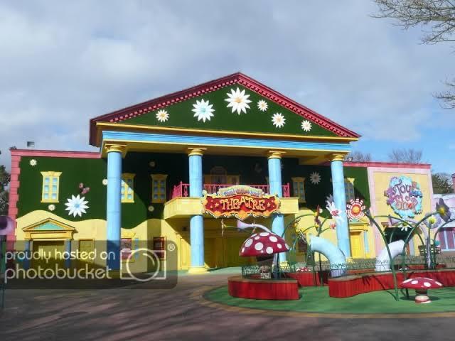
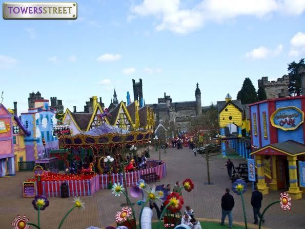
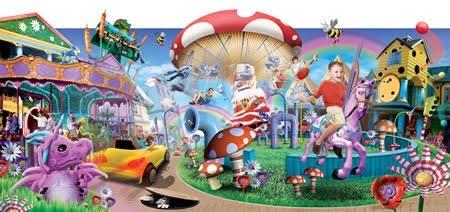
This was my point from earlier. Look how bright and colourful all the buildings are with their little details and theming elements. It had 6 attractions (excluding Charlie) a shop and a cafe. That was 2009. Now jump forward 10 years when you'd think budgets and standards had increased and we've got 4 attractions (if you include Driving School) and 1 shop with little to no theming and it all looks pretty dull. I just don't think it's good enough.

As I'd said I'm sure Gangsta Granny will be a decent attraction, it's the area around it which is what's bugging me. I think you'd struggle to find someone who thinks the area looks better now than it did in 2009 when CCL opened and again when Ice Age opened.
 

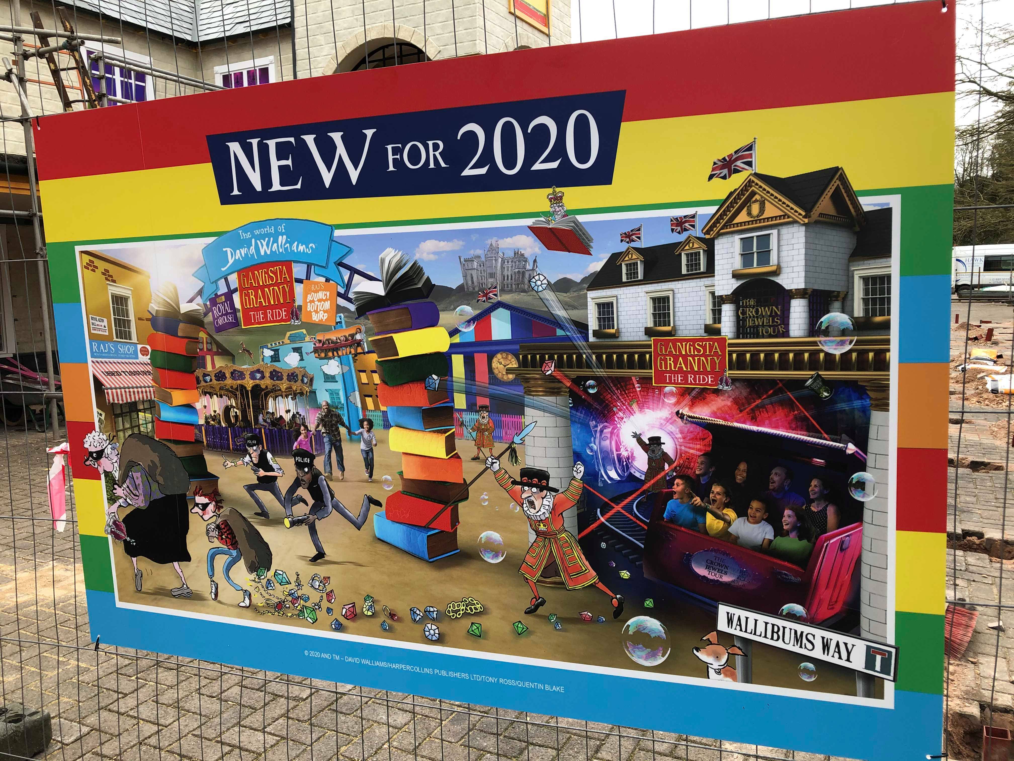
Only just seen this but had to comment and say that I can't believe this is being used as a promotional poster. It looks like they took it straight from an early development mood board!

I've come to expect the shoddy photoshop promo material from them anyway but this is such a mess, I don't know what to look at.
 
As has already been mentioned, it is still a work in progress and I imagine (or maybe I hope?) that there will be a few instalments in phases like CBeebies Land, especially as I think a lot of the pressure comes from the IP side wanting their product to look good.

I think it looks good for what it is, and especially love the camouflaged Frog Hopper, genuinely couldn’t find it for a bit in the pictures (although I am blind).

Roll on opening day so we can see it properly! My daughter is nearly 0.9m and I can tell you now, she couldn’t care less about these tiny bits of detail. She just wants to go on the rides and run around. For example, we took her to CBeebies Land at Christmas and she spent about half an hour staring at a picture of Mr Tumble stuck to a plain fence in the sensory garden. That’s kids for you!
 
As much as I am glad to see Towers doing something to this section of the park, part of me cant help but feel that something is missing and they could have done so much more.

  • Reuse/repurpose the cinema building
  • More theming and styling
  • Reopening/replacement of Twirling Toadstool
  • Connect the surrounding areas more

 
Having seen it in person, it’s nice to see the area refreshed, however it very much is just another repaint. I dread to think how many layers of paint some of those buildings have! It’s also funny how some nickelodeon Outta control features still remain 23 years later!

The gangsta granny building looks better, as it has brick effect and extra details compared to before.

Also with the carousel moving to the site of toadstool it does open the area up massively much like it was when the area opened. However it seems a massive cattle pen will now be in the middle of the area for gangsta granny, also a cattle pen is being built for the frog hopper.

However nothing had happened currently to the driving school, so if that remains it will look tired and odd next to all the new rides.

Then again you’ve also got the dungeons next to the cloud cuckoo land burger kitchen, in to David Walliams and then back to cuckoo land?
 
This was my point from earlier. Look how bright and colourful all the buildings are with their little details and theming elements. It had 6 attractions (excluding Charlie) a shop and a cafe. That was 2009. Now jump forward 10 years when you'd think budgets and standards had increased and we've got 4 attractions (if you include Driving School) and 1 shop with little to no theming and it all looks pretty dull. I just don't think it's good enough.

As I'd said I'm sure Gangsta Granny will be a decent attraction, it's the area around it which is what's bugging me. I think you'd struggle to find someone who thinks the area looks better now than it did in 2009 when CCL opened and again when Ice Age opened.

so true. As said I’m sure the actually attraction will be a good solid attraction. However the area should be going up in standards and progress from 10 years. Not back, standards are much higher now especially with theming. Hate to say it but tornado springs would of been a great then for this area as age gap. All the buildings could of been detailed and fitted to suit. With a few new rides and toadstool refurbished.


Sent from my iPhone using Tapatalk
 
Only just seen this but had to comment and say that I can't believe this is being used as a promotional poster. It looks like they took it straight from an early development mood board!

I've come to expect the shoddy photoshop promo material from them anyway but this is such a mess, I don't know what to look at.

665b908f866c2ee5dd05dcf64f5442a0.jpg


To be fair if anything it’s the same style as 10 years before.


Sent from my iPhone using Tapatalk
 
Here’s another comparison, appears all we get is lose of detail & theming each time. However hopefully they might add details before opening day. I mean the frog hopper should be removed from the park now, It’s so old and dated! It really adds nothing too the park & there are 2 others similar rides in CBeebies land. The horse carousel also very old fashioned ride now. Shouldn’t be refurbed, should be taken to a fairground. So many other rides better for this age range & in-between.

bac172c4949cd33c8be1708708deceb5.jpg
3c92907d9693a18de6907ac436560bbb.jpg
dc4a899ff6de391516de7fef336e1f74.jpg


Sent from my iPhone using Tapatalk
 
Last edited:
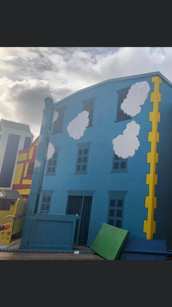
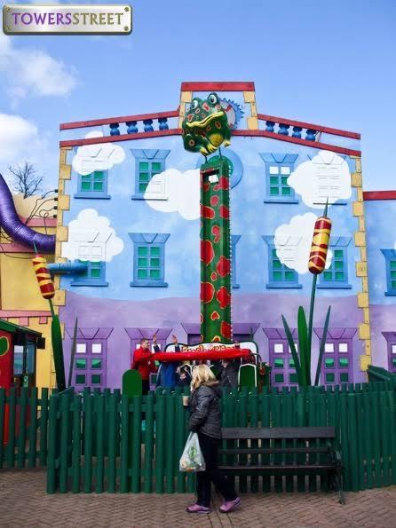
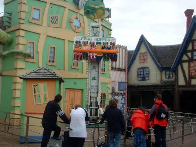
I’m really confused, I’ve just noticed there are less windows etc behind the frog hopper building? Is it a different building to its previous position, back in the day?


Sent from my iPhone using Tapatalk
 
I’m really confused, I’ve just noticed there are less windows etc behind the frog hopper building? Is it a different building to its previous position, back in the day?


Sent from my iPhone using Tapatalk
Same building. The facade was redone around 2016 I believe under the TLC programme and the actual themed windows were removed and the replacements just pained on.

Before/During/After.

oKSwoI6.jpg

EzQnZp2.jpg

PTkNzj7.jpg
 
Last edited:
Top