• ℹ️ Heads up...

    This is a popular topic that is fast moving Guest - before posting, please ensure that you check out the first post in the topic for a quick reminder of guidelines, and importantly a summary of the known facts and information so far. Thanks.

Thorpe Park: General Discussion

No offence to Rob (as I’m not one for personal insults) but the map really is as lacklustre as a wet weekend.

Imagine launching your first rollercoaster in more than a decade and approving a map that represents it with a set of thin lines that are indistinguishable from its queue.

That early 2000s map shared on the last page was popping with energy and excitement - it’s far more important to show off the rides than have something that’s technically closer to scale but tediously boring.

Well done Thorpe, another branding triumph.
 
I do find the whole 'modernising' of brands is just making them boring and mediocre in general, things like the map, logo and soundtrack (from what we've heard) does play into that 'modern' identity that they're going for but for me it's just bland, however if it's what works for companies these days then I guess go for it, although I'm not a fan.

As long as the superior park keeps their charming logo and hall of the mountain king then I'm happy.

Also after seeing the map I am quite gutted there will not be a splash down plaza for hyperia, I was definitely going to be spending some time there gawking at this shiny new mack hyper coaster, seems like a missed opportunity as people standing and taking videos and pictures to post on their socials is not a bad thing for the park.
 
It does come across as an odd move. I know Thorpe quite well, but I was struggling to work out where the rides were, and what they were.

I know the flats pretty well but I couldn't for the life of me decipher what Quantum was based on my memory, the name and the little block on the map itself. I had to Google it. I've been 10+ times and I frequent this forum.

I think they've underestimated how much people think of rides as "that big tall one that shoots you up and over the top" and that a letter label leading to the word "Stealth" and a big flat oval won't really cut it.

Don't get me wrong, with the choice to go fully 2D, top-down made, it's a really wonderful effort, the details are cute. But that choice itself, I think is a misstep.
100%. There's nothing wrong with the actual artwork, the design brief being a top-down, 2D plan view is just odd.

You're opening the UK's tallest rollercoaster and you decide the best way to show it off is a map style that makes it as flat as the Flying Fish. Baffling.
 
I think its important to clarify that the 2D top-down map design has been used by Thorpe for a few years already. After a quick search it looks like the map was 2D from 2021 and 2020 was the last 3D map. This isn't something new that has come as a result of the re-brand.

From the designer's comments its pretty clear that the map was designed for the app first and foremost and I think the 2D style is absolutely the right choice for that since it is used for GPS navigation, all of the exaggerated features of the old-style maps (especially the particularly 'wacky' ones from the fat-head days) probably wouldn't work well for that use.

In fact some of the older maps are really not very useful as maps at all, they might look more interesting but the paths aren't drawn accurately so someone who is not familiar with the park would likely struggle to plan a route from A to B. (That is their primary purpose after all!)

As for Hyperia, you'll be able to see it pretty clearly on most approaches to the park, as you cross the bridge and then also from most places within the park. I don't think anyone is going to miss how tall it is.
 
Also after seeing the map I am quite gutted there will not be a splash down plaza for hyperia, I was definitely going to be spending some time there gawking at this shiny new mack hyper coaster, seems like a missed opportunity as people standing and taking videos and pictures to post on their socials is not a bad thing for the park.
That is a shame. I wonder if they’ll pull a swarm on us and put it in in 2025.
 
Rob Yeo is a brilliant designer/artist, hands down the best in the community in my opinion, if you haven't already, you should check out more of his work. Its clear he was limited to creating a map which worked in the app, and once that limitation is imposed its always going to be difficult to create something overly exciting.

I think they should really have gone with a functional app version and an 'artistic licence' paper version, it would have been great to see what Rob could have done with full freedom of creativity.

I know he's also done some work for Alton Towers recently, so maybe we will see him do their map too? I think the AT map has been way too busy and clumsy in recent seasons.
 
I am not sure why people are moaning about the new map not showcasing the new ride in all it's grand size. The map provides a function first and foremost and it seems to fill that function rather well.

The new coaster is literally going to be dominating the skyline from not only anywhere in the park, but outside the park boundaries too. Seeing as the map serves a purpose of getting people to where they want to go, the physical size of the coaster in it's physcial form will serve to draw guest to it, you don't need the map to do that, the thing is huge and it will quite easily do it all by itself.

Let the map do what it is designed to do in navigating people around the park efficiently and let the physical scale of the ride speak for itself. The map is designed to be used by park guests after all.

As we have seen in the past, once you start getting a map to do to many things, (showing ride scales being one) the primary focus of the map seems to get lost, such as the map being un readable from a navigation perspective. We certainly have seen that in the past at many parks, including towers, where stuff is squeezed in, not to scale and everything in between. Making them crap for the purpose they are designed to serve.
 
Last edited:
Hard disagree for me. The map is just as important for marketing as it is navigation IMO. A map can still be easy to follow and be 3D and attractive. See the 2007 map posted earlier.

People see the park in 3D in real life. Surely the coasters are much easier to see in 3D than flat lines? Stealth, Tidal Wave and Storm Surge are all just flat elongated ovals. The average visitor doesn’t know the layout of each coaster like we do. They know them as “the one that goes upside 10 times”, “the one that launches up to the sky”. Now the map is just squiggles that you need to use a key for to work out what things are.

It's 2024. Almost EVERYONE has a smart phone. The map not only places a pin to where you are, but the direction you face. See a ride in the distance, you can work out what it is based on the direction you are looking in the app's map.

You can market your rides in vastly different and far more effective ways than directly on the navigational map. Such as in the app, push notifications etc.

I would have been inclined to agree 20 years ago perhaps. But not now.

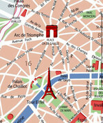
To me, this is like saying people will not visit say the Effiel Tower because a navigational map of Paris does not show it's true scale or it's scale at all for that matter.
To be fair, the demographic in Thorpe Parks case is younger than the average navigatior to a city who would be reading a map. This is why having the map and specifically the marketing materials work in the most effective way to reach the target audience, such as push notifications and via a smartphone is by far the most effective solution for that demographic.

Even now. People struggle to read a map, so there is bound to be a good portion of younger guests to the park who struggle too. So having the map in digital form, where they can literally point their phone in the direction of where they can see a large ride with their eyes, then have the map app tell them in what direction they are looking, and thus can quickly see what rides are in that direction on the map is far, far more effective for the less adept map readers, than any of the older map solutions, including the old maps that used to show rides in their scale, luring people to them. In my oppinion at least.
 
Last edited:
The maps/apps for Chessington, Europa Park (and Phantasialand? And I’m sure many other parks) all have GPS built into them to do just that but still show scale of the rides and present them in a much more exciting way. But each to their own!

And Paris is a bit more famous than Thorpe Park, but since you mention it… ;)
IMG_3917.jpeg


But Google & Apple maps, arguably the most popular mapping services that people use, do not show it.

Paris is far more famous yes, but the Effiel Tower and Hyperia share a similar trait in that almost every person who visit the city, or the themepark, will know about the attractions. They are both very famous in their own respective remits.

So you could make the argument and I would theorise that the percentage of people who don't know about the tower / ride, vs the total percentage of people who visit is very similar, without it being huge on a map. Everyone knows the Effiel Tower and everyone is going to know about the huge, skyline dominating rollercoaster before they even get through the park gates (unless you are unfortionate enough to be blind). We are talking about percentage ratios here, not total numbers, very important. Anyway that is getting a bit too deep.

I don't know. I find the maps functionality fine. I'm intregued to hear other oppionions, but I don't see it being an issue. It is not like the ride will be less popular because its not highlighted massively on the map.
 
Last edited:
Top