- News all the latest
- Theme Park explore the park
- Resort tour the resort
- Future looking forward
- History looking back
- Community and meetups
-
ℹ️ Heads up...
This is a popular topic that is fast moving Guest - before posting, please ensure that you check out the first post in the topic for a quick reminder of guidelines, and importantly a summary of the known facts and information so far. Thanks. - Thread starter Ian
- Start date
- Favourite Ride
- Closed season on TST
- Favourite Ride
- Closed season on TST
- Favourite Ride
- Rise of the Resistance
- Favourite Ride
- Air / Blue Fire
- Favourite Ride
- Forbidden Journey

You are using an out of date browser. It may not display this or other websites correctly.
You should upgrade or use an alternative browser.
You should upgrade or use an alternative browser.
TowersStreet - Make Your Mark
Sam said:Here's my entry, I presume it'll be including in the voting process.

We don't need a votice process. It's won already! <3
DiogoJ42 said:I love it, but then I guess I'm biased on the matterI think the TS on it's own works well, just as TT used to.
The important question is, "how the hell am I going to build that out of Lego???
If you love us you will find a way to build it. If not, then LEAVE!
James
TS Founding Member
Kelpie said:Ta guys!
The font for the 'Towers Street' text is changeable, if the site team have something in mind already for their branding
I just used that one as an example (trying to find something closeish to the T & S which are taken from Alton's own logo!)
lol, I mostly was trying to design something that could work also as a badge.... *has a problem*
The font underneath would be changed to suit the branding of TowersStreet (so a similar text to the one currently being used on the homepage).
That logo looks fantastic though, Kelpie. I look forward to seeing the variants of the logo!
Great logos so far guys and gals! Don't forget to submit your logo(s) designs to [email protected]
Tim said:Unfortunately I’ve been too busy to give my full opinion on what I think of the designs so far but there was something I wanted to say about both BigAl’s and Meat Pie’s Logo which might influence what everyone else is doing. While I think they’re really good designs I think they could have an issues when being used as a Logo because scaling them won’t be as easy as with the TT logo which looks good at any size.
This is more of an issue with BigAl’s which I think would be a fantastic home page image but is probably too intricate to be a Logo.
Not to knock either of your designs which I think look great and deserve proper comments when I get the chance. I just think we need something a bit more iconic. I could imagine Meat Pie’s frogs coming to good use.
I understand your concerns about scaling and so I've done some shrinking to test what it would look like:
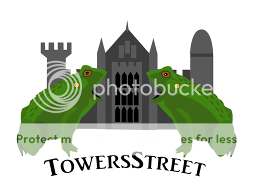
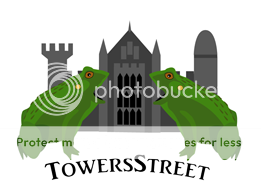
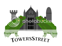
When it gets to anything under 200x150 (that's the size of the third example), it starts becoming difficult to recgonise all the elements but would the logo ever need to be shrunk to smaller then 200 pixels wide?

Joel
TS Technical Admin
I know somebody asked a few pages back - but the current font on the TS homepage logo is Fontastique - found here http://www.dafont.com/fontastique.font
I see Kelpie already worked it out Nice logo too Kelpie! Yay!
I see Kelpie already worked it out
Nice logo too Kelpie! Yay! Joel
TS Technical Admin
Jem8472 said:Hummmmmm. After seeing some of the logos so far I think I might keep my eye offending attempt at a logo to myself.
Send it in! Just do it!
Alastair
TS Team
Kelpie said:Well I plan to do a few variants, but here is the basic one I've come up with....

(copyright all me!)
I think it would look good with 'Towers' above the TS and 'Street' below it - in a font size which fills the width of the TS logo. Only my humble opinion though.
Tim
TS Member
Meat Pie said:Tim said:Unfortunately I’ve been too busy to give my full opinion on what I think of the designs so far but there was something I wanted to say about both BigAl’s and Meat Pie’s Logo which might influence what everyone else is doing. While I think they’re really good designs I think they could have an issues when being used as a Logo because scaling them won’t be as easy as with the TT logo which looks good at any size.
This is more of an issue with BigAl’s which I think would be a fantastic home page image but is probably too intricate to be a Logo.
Not to knock either of your designs which I think look great and deserve proper comments when I get the chance. I just think we need something a bit more iconic. I could imagine Meat Pie’s frogs coming to good use.
I understand your concerns about scaling and so I've done some shrinking to test what it would look like:
When it gets to anything under 200x150 (that's the size of the third example), it starts becoming difficult to recgonise all the elements but would the logo ever need to be shrunk to smaller then 200 pixels wide?
Actually that shrinks better than I thought it would. I was just looking at the Towers Nerd Logo and noticed that on their forum they only use the central tower when the logo needs shrinking further. Could a similar thing be done with a frog?
Also I had an interesting idea for your frog design. Have you considered having the Towers Street name look like water being spat out of the frog’s mouth? I know it would be the wrong shape for a Logo but it might make an excellent page heading. I could do a mock up of what I mean if I get the chance later.
Mi-Nigle
TS Member
I decided to have a stab at this logo but unfortunately (for the logo anyway ) I go on holiday Saturday and don't really have time to finish it.
Seems a shame to waste so if anyone thinks they can do something with it, by all means have a crack. PM me and I'll send you the PS file. If not, no matter!
) I go on holiday Saturday and don't really have time to finish it.Seems a shame to waste so if anyone thinks they can do something with it, by all means have a crack. PM me and I'll send you the PS file. If not, no matter!
Tim said:Actually that shrinks better than I thought it would. I was just looking at the Towers Nerd Logo and noticed that on their forum they only use the central tower when the logo needs shrinking further. Could a similar thing be done with a frog?
Also I had an interesting idea for your frog design. Have you considered having the Towers Street name look like water being spat out of the frog’s mouth? I know it would be the wrong shape for a Logo but it might make an excellent page heading. I could do a mock up of what I mean if I get the chance later.
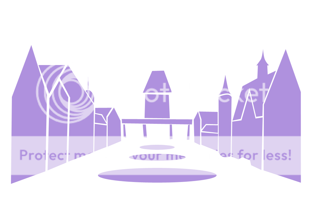
You mean like this?

I think it's a bit too small, but that is with keeping to the current dimensions of the current forum logos. I don't know how flexible the design of the boards are, but perhaps slightly larger versions could be used if the space was expanded.
Also, I tried for so long to make a logo where the frogs spat the title out, but it never looked compositionally appealing. However, with the space of a banner/heading it could theoretically work quite nicely.
This made me smile! I never thought I'd see Towers Street become a red light district ;-)BigAl said:Here's a weird one I threw together this morning:

Neon!
Squiggs
TS Team
Russell said:What is the font you guys have used for the TowersStreet.com banner on the home page?
Sorry... this totally slipped my mind when I got in.
But the winner is.................
Fontastique!
BigAl
TS Member
Really? It reminds me of take-away signs or the Krispy Kreme doughnut signs.T said:This made me smile! I never thought I'd see Towers Street become a red light district ;-)BigAl said:Here's a weird one I threw together this morning:
Neon!