- News all the latest
- Theme Park explore the park
- Resort tour the resort
- Future looking forward
- History looking back
- Community and meetups
-
ℹ️ Heads up...
This is a popular topic that is fast moving Guest - before posting, please ensure that you check out the first post in the topic for a quick reminder of guidelines, and importantly a summary of the known facts and information so far. Thanks. - Thread starter Ian
- Start date
- Favourite Ride
- EuroSat
- Favourite Ride
- The Metropolitan Line
- Favourite Ride
- Steel Vengeance
- Favourite Ride
- Rise of the Resistance
- Favourite Ride
- Hex

You are using an out of date browser. It may not display this or other websites correctly.
You should upgrade or use an alternative browser.
You should upgrade or use an alternative browser.
TowersStreet - Make Your Mark

LewisNavex
TS Member
My older brother who is studying design at present would like to submit these ideas. I told him him you guys were looking for a logo and he had a go. Let me know what you think and I'll be sure to tell him. ")


Jem8472
TS Member
Well I am putting this up as I thought I might as well. Due to lack of talent its not what I wanted to do. Its roughly my idea.
In the massive empty red square I was going to put some pic/outline/shadow of the towers much like other people have got. But I dont have the right picture to do it so it makes it a little difficult
Also towards the bottom I would have the news / forum / chat tag.
Hope you all like it

*hides*
In the massive empty red square I was going to put some pic/outline/shadow of the towers much like other people have got. But I dont have the right picture to do it so it makes it a little difficult
Also towards the bottom I would have the news / forum / chat tag.
Hope you all like it
*hides*
DiogoJ42
TS Member


John
TS Member
This is my favourite so far, but I think the 'T' looks a bit empty. With that in mind, I tried moving the tower a bit higher up. I don't have the skills to do it justice, but this is the sort of thing I was thinking of:Kelpie said:

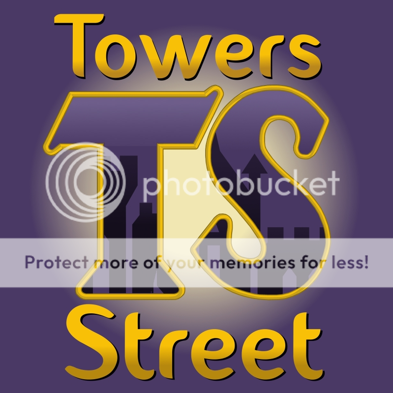
Any thoughts?

Jordan
TS Contributor
Have to say, Kelpie's logo is definitely my favourite so far.
Remember that the logo has to be instantly recognisable when rendered at many different sizes, so something that relies on loads and loads of detail in the logo is probably going to have some issues when scaling it.
Remember that the logo has to be instantly recognisable when rendered at many different sizes, so something that relies on loads and loads of detail in the logo is probably going to have some issues when scaling it.
Alastair
TS Team
Jordan said:Have to say, Kelpie's logo is definitely my favourite so far.
Remember that the logo has to be instantly recognisable when rendered at many different sizes, so something that relies on loads and loads of detail in the logo is probably going to have some issues when scaling it.
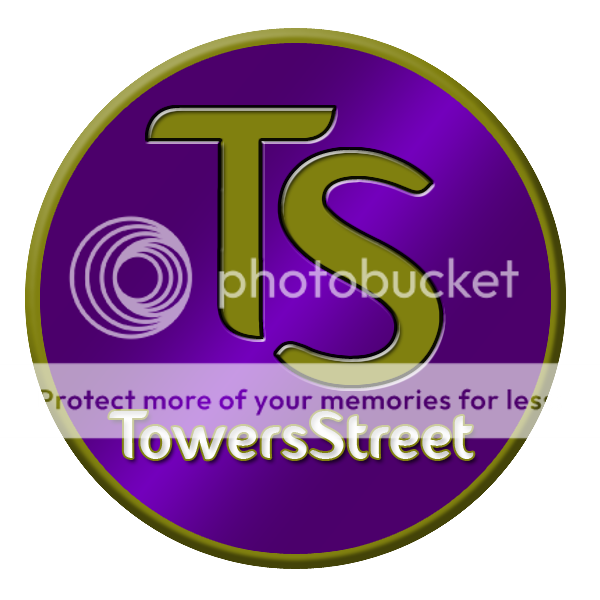
Yeah mine is designed so you could take the TS out of the middle and use it out of the rest of the logo.
Ryan
TS Member
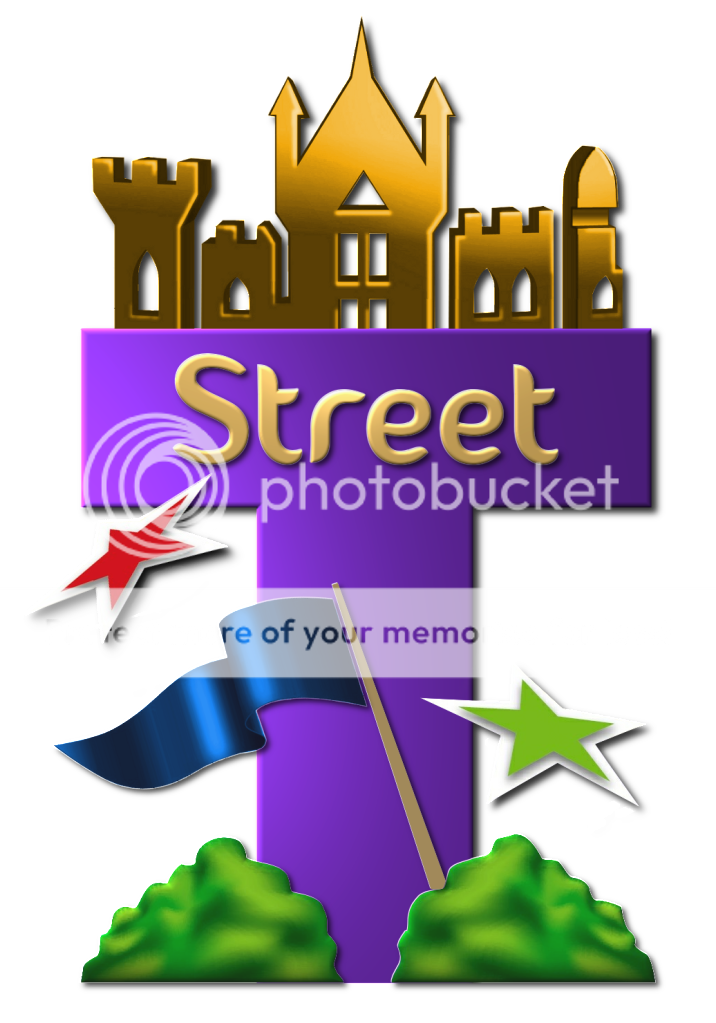
Gone for something pretty simple - it's the main tower of the towers flanked with a take on the three flags in the towers logo. What does everyone think?

On this one, the 'flags' are only on one side, giving the idea of progression...moving on...

Here is a another version with the full towers in gradient purple and blue

And the last one, the towers in purple and blue and the name now has a shared gradient 'S'

And to give an idea of the logo at it's smallest

It would be really helpful if you guys could tell me which one to develop -
1) Single tower and 'wing' flags
2) Single tower and single set of flags
3) Full towers
Also, which font? -
1) The TS fontastique font
2) The other one (bog-standard segoe ui)
3) Something else altogether
On this one, the 'flags' are only on one side, giving the idea of progression...moving on...
Here is a another version with the full towers in gradient purple and blue
And the last one, the towers in purple and blue and the name now has a shared gradient 'S'
And to give an idea of the logo at it's smallest
It would be really helpful if you guys could tell me which one to develop -
1) Single tower and 'wing' flags
2) Single tower and single set of flags
3) Full towers
Also, which font? -
1) The TS fontastique font
2) The other one (bog-standard segoe ui)
3) Something else altogether


James
TS Founding Member
Fantastic logos so far people! Really impressive work.
Don't forget to submit your logo(s) to [email protected] - with the subject 'Logos' and include your forum username within the email.
Don't forget to submit your logo(s) to [email protected] - with the subject 'Logos' and include your forum username within the email.
That's simply fantastic! I love it thoroughly!Kelpie said:Well I plan to do a few variants, but here is the basic one I've come up with....

(copyright all me!)
bethpepper
TS Member
John said:This is my favourite so far, but I think the 'T' looks a bit empty. With that in mind, I tried moving the tower a bit higher up. I don't have the skills to do it justice, but this is the sort of thing I was thinking of:Kelpie said:
Any thoughts?
I wonder if anyone with leet photoshop skills can edit John's modified version further and putting the words on the middle of the image, in that font. I just wanna see what it would look like but I wouldn't have a clue where to start!