• ℹ️ Heads up...

    This is a popular topic that is fast moving Guest - before posting, please ensure that you check out the first post in the topic for a quick reminder of guidelines, and importantly a summary of the known facts and information so far. Thanks.

2013 Map

Blizzard

TS Member
Favourite Ride
Gotta be Oblivion tbh!
Its about that time of year now where preperations are starting for next year, so lets share some ideas for the 2013 map.

With SW7 opening next year, I suspect a whole new map design will be implemented for two reasons:
Firstly, SW7 looks unlikely to fit on the current map & secondly, the park may want to style the map on the SW7 theme, similar to the 98-200 maps that were based a little on Oblivion's theme.

Would you like to see a simple, minimalist design, a quirky, artistic, crammed or something else? Also lets not forget the system in which the attractions are labled & the layout on the back of the map.

Discuss!

:D
 
I have absolutely no idea what they would decide on if they were to change the design, however I would just hope that the map would once again become usable rather than just a kind of cartoon with Air right next to Rita and certain attractions completely disproportionate to their actual size and placement. The entire point of it is that it guides guests around the park, however the number of people I've heard complaining that it's basically useless proves that it needs a major redesign.
 
Im suspecting a new map as the current one keeps getting more and more squished!

Agree with the fact its not very useful as a map, its very badly laid out and areas bleed into one another when they arent even close i.e. air and rita, and the fact it looks like CCL is right behind oblivion.

While I hated the look of the old 'habbo' maps at least they gave a realisitic idea of where everything was and the scale of the gardens too.
 
I hope it's better than the tribute to abstract nihilism that is the current map. To actually find your way around, it's UTTERLY useless.

Sent from my HTC Wildfire using Tapatalk 2
 
It's a nice poster but as a map it's bloody awful... A map should help guests find things - and the current map is useless at that! Hopefully a redesign will be in order that keeps an artistic design but gives a better sense of layout and scale.
 
I would like to see the 2013 map go back to a similar design to the 2008-2010 maps. As they were artistic, appealing and also came of good use to navigating around the park.

The current maps only serve well as a poster and nothing more. Which, for a first timer at Alton Towers, or even just a regular guest - is pretty useless.

I can see the brand having a light new look next year (I'm guessing the new marketing director will want to put their stamp on the resort) along with a newly designed map.
 
They need to draw the pathways then fit the rides in, rather than drawing the rides and not bothering with the paths.
 
Firstly I think it will be bigger, it seems like they are getting big every year but I'm really looking forward to the scarefest map before the 2013 map
 
The Scarefest poster map will be even more cluttered than it is is already, and certainly isn't going to help anyone navigate the park! Although, at least the potential for advertising SW7 is there.
 
I like the artistic value of the current map and even the style, but they need to shrink the resort section and allow the themepark bit to expand.
 
I'm certain that we will see a new map style next year. The current style is awful in terms of it being a map and there's no way they can fit SW7 onto it. In my opinion they should pretty much get rid of the hotels etc from the map; maybe have something small pointing out where they are but nothing more than that. Then the map will feel a lot less cluttered and there will be a lot more space for theme park and key related stuff which is important on a map as well as something that has got worse every year recently as they cram as much in as they can. Then they can have a separate Resort map for those wishing to use the whole of the resort. It makes much more sense. They won't do it though as having the hotels/waterpark/golf on the main map is advertising.

:)
 
Surely they can just wack an whole load of Resort advertising on the back of the map instead of actually having it as a part of the map.
 
Ive suggested this before, have the monorail going off the page with a 'folded corner' saying look over, then on the opposite side have the resort.
 
It does annoy that the hotels and waterpark take up loads of the map, they could put them on the back and not lose any interest from guests. The map does need spreading out, the current one is crap, you only have to look at something like the Twirling Toadstool to see its been dropped on the map where they could find a space for it. There are no end of mistakes on it such as backwards Oblivion, Hex the wrong way round etc.

I would like a easior to understand map, but certainly not really basic like we had a few years ago. I think SW7 will be the main style the map will follow, like when TH13TEEN came.
 
There are far better ways they could promote the "hotels" than taking up 1/3 of the map.

If they spent money, which I appreciate is tough, on the Car Park Monorail Station, they could totally "resort" it up! Have proper signage, like a railway station, with "RESORT STATION", massive murals for the hotels, theming and lighting - making into a completely resort destination.

Guests would be immersed in the hotels/spa/waterpark/golf just for a few minutes while they queue and/or leave. It would be quite a good idea to ensure everyone hears of it.

I always felt it was a pity that they did the monorail trains up, but the stations themselves remain like some sort of atomic war shelter...
 
It's hard, every map they make has to do so many different things. It needs to promote the resort, appear attractive, function as a navigational tool and push guests towards different areas of the park.

I didn't like the habbo hotel style maps, the 2010 map was fairly decent. One thing that gets me is that in essence, Alton Towers is a V shape in terms of where attractions are, but no map really shows this. I think an OS map is the way forward..
 
It just needs to be a fun quirky map which is actually readable, but it could do with numbers instead of ride names on the front as it just clutters it up, similar to those found at Disney Parks and PortAventura :)
 
I've lost count of the number of times I've overheard people at the park saying they don't understand the map or they don't know where they are and they just spin the map around like it's going to help! No wonder so many get thrown on the floor! If the park doesn't have a new one next season then somebody, somewhere, needs a kick up the bum!

:p
 
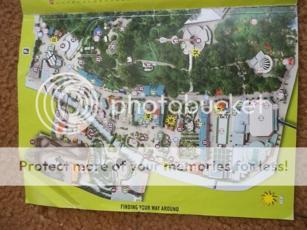
I thought this would be a good time to compare previous years maps. These are the 2010, 11 and 12 maps together, and highlights (in case anybody had forgotten) just how much bigger the 2012 map was than the other 2. And given that 2011 is almost identical to 2012 you would think that they would have added more detail in the enlargement, but instead just blew the image up when the map was already known by them to not be very good at all.
102_2294.jpg


I do like the colour coding of the separate areas from this year’s map though, compared to the 2011 approach which was to alternate the colours between the areas, and just made things ever more confusing. I don’t however like the fact that the entire back of the map is taken up by sections telling you about rides that are in the park and describing them. I think that was a waste of space which could have been used to advertise events and things like fried chicken. Instead they’ve got a small section on the events and I think Alton could have lost potential customers for them as it was not brought to their attention enough.

Onto the fact of hotels being on the map, I don’t think they necessarily need to go. I think the last 2 years have put a negative front on it, but it is helpful for the advertising of the hotels. If we think back to the 2010 map which was far better than the 2 following it, especially given it was half the size of this years, it had the pat rides in the right place etc. and it had the hotels on it, off to the side and it worked well. So I don’t think they really need to take the hotels off the 2013 map.

Finally to my last point. Probably the best theme park map I have ever used was Liseberg’s 2009 it wasn’t the best looking map ever, but it was definitely helpful and showed me where to go and how to get there.
102_2300.jpg

But if you look at the size difference between that and this years Alton map I think it shows that for a map to be good and helpful it doesn’t necessarily have to be huge. Liseberg’s is tiny, but it was still helpful, obviously Alton’s would have to be bigger, but maybe 2013’s doesn’t have to be Scarefest size.
102_2301.jpg


Now, 2013. I agree that it should be linked into SW7 for extra advertising, as then everytime the visitor looks at it, they think of SW7. And just because it should be linked in. I have always liked the idea of a sketched sort of style map, I think it would be good if it was like that for 2013 but maybe in a charcoal style rather than pencil and then coloured from that. It would be completely different to what they've had recently which needs to be done in my opinion. We've had maps in the same style for too long, it needs to be changed again to add that tiny little bit more to the experience.
 
Can I just ay that the map thisyear is no bigger than the maps from 2009-2011. You are comparing the map to the leaflet versions as opposed to the gaten maps. I can tell by the folds & the obvious size.

Unless I'm missing something?...
 
Top