CoasterCrazyChris
TS Member
- Favourite Ride
- Nemesis
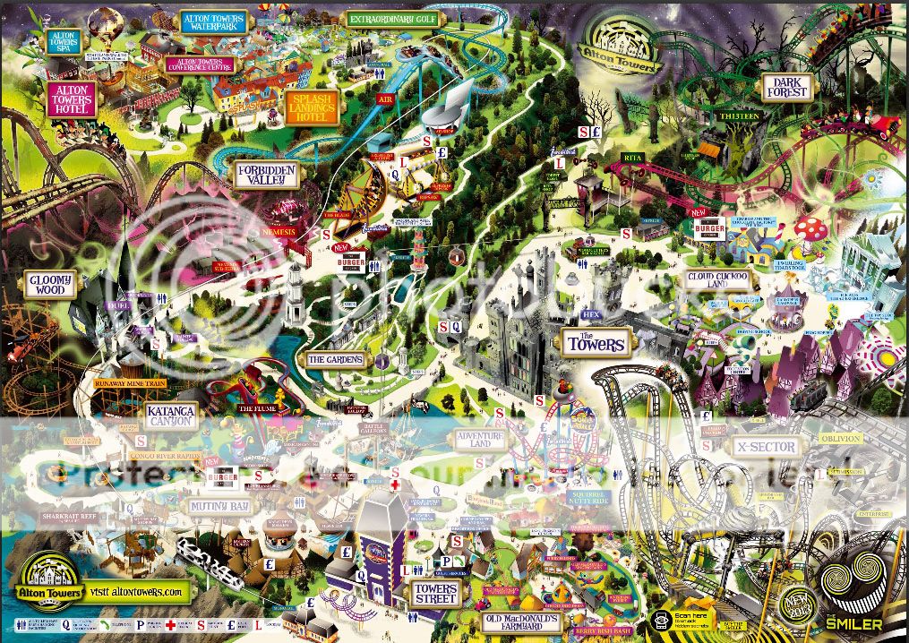
electricBlll said:It's not really Alton Towers being lazy, since they don't even make the map; they commission professional graphics firms to do it and are probably on a three-year contract. Obviously they would brief the designer on what they want, so they exaggerated style is down to Alton Towers, but the overall look of the map is determined by the company. They have still had to contact the graphics company to update their old design, so they aren't being lazy by not bothering to do anything.CoasterCrazyChris said:Lazy, lazy, LAZY.
And they've done a great job. Previous maps have had so little detail or characteristic representation that you wonder if the artist had ever been to Alton Towers. Whereas now you are constantly noticing little details they have hidden and it feels less sterile. This is definitely one of my favourite maps, although I liked the trilogy from 2008-2010 slightly better because of the variation of colours each year.
It seems most people on here dislike it because they expect others to be confused, not because they are confused themselves. Empathy is good but I think the guests complain enough themselves! I just enjoy the brilliant artwork.
Fair enough....but have have you seen what they have done to Oblivion on the map?
For that sole reason alone the designer should be shot and the map condemned.
Also, functionality is far more important than artsy fartsy flair when it comes to an Alton Towers map. The place is just far to big for it not to have at least something which gives a half good indication of scale.