• ℹ️ Heads up...

    This is a popular topic that is fast moving Guest - before posting, please ensure that you check out the first post in the topic for a quick reminder of guidelines, and importantly a summary of the known facts and information so far. Thanks.

[2023] The Curse at Alton Manor

Status
This topic has been locked. No further replies can be posted.
Im sure I will be slated on here, but now having seen the exterior clearly, the paint job looks very poor standard as far as these things go. Blotchy and why does the paint seem to run out halfway?

Also I can't tell what the intention was here at all. It looks more phoney/cartoony but doesnt click. Whatever, I have better hopes for the inside.
Maybe it's not finished yet, as there is still two weeks to go? We'll have to wait and see.
 
I personally think that the repaint, if it is finished, looks more intimidating (perhaps to reflect the ride) but the quality of the finish is inferior to what was there before. However, how many of the GP will even realise that it has had a repaint?
 
I really hope they jet wash that moss of the roof! A bit of ivy is nice but we don't need complete dilapidated realism.

The original facade when it opened had a good balance of looking clean but a bit worn and spooky. The problem with Alton Towers now is that you sometimes can't tell real dilapidation and what's just grungy theming.
 
Not a fan based on that picture. The roof could do with a clean and some of that ivy could be stripped back a bit more. The colour scheme is fine although it's a bit jarring seeing a facade with a fresh lick of paint compared to the rest which is years of actual neglect.
 
However, how many of the GP will even realise that it has had a repaint?
This isn't really a benchmark for quality though, otherwise you wouldn't spend £1000s to change the look in the first place. You're not really meant to notice the paint job itself.

Regardless of the intention (I honestly cant tell if it was to look more / less vibrant or more goofy / sinister), the quality of the paint job as it looks right now isn't great. It's also can't make its mind up which colours are for the timber, shading/dirt or for the rest. I hope it improves.

This is the first disappointment I've felt with it so far so here's hoping the ride itself is great.
 
Just me that likes the new paintjob then? I think it actually looks better.
I prefer it as well!

Although I’ll admit that some finishing touches at the high points perhaps wouldn’t go amiss, I overall really like the new paint job based on what it currently looks like!

I also think the potential story of an open house gone wrong is an intriguing premise, and as others have said, it would provide a very clever justification for you being at the house in the first place… I wonder where Emily Alton would come into that, though?
 
Just me that likes the new paintjob then? I think it actually looks better.
I like it apart from the 2 sections to the side of the window above the door which don't appear to have the new colour scheme for some reason.

I've been looking at the façade through the years and whilst its difficult to compare as camera technology has changed I think my least favourite is HH as it opened, it looked good when it had worn though.

1678034070887.png
 
I don't really have an opinion about the colour of the building. Maybe just a jet wash of the roof and I'll be satisfied.
 
I believe The original look of the facade looked and still looks wonderful to this day. It had a great balance of realism and a bit of a fictional feel to it as if it was from an old novel. This just feels too cartoonie, like something right out from a scooby-doo episode. They personally should've given it the same treatment they gave to The Rehydrator a few years back, repainting it back to its original with a more fresh and less 'out there' look.

I remember reading the TLC thread and the amount of positive reactions people had from Rehydrators original paint scheme put back on was pretty big on the thread. I can't see why that couldn't be replicated on this project.

But hey, at least we finally have a great view of the house once again! Sorry Dave, but sacrifices must be made.
 
it would provide a very clever justification for you being at the house in the first place…
Because haunted houses are fun and you want to explore!

I've been looking at the façade through the years and whilst its difficult to compare as camera technology has changed I think my least favourite is HH as it opened, it looked good when it had worn though.
Looking at those my favourite is the original, it looked mildly spookier without looking "painted", it looked like a real house you'd stumble on in the woods. Epick
 
Last edited:
Im sure I will be slated on here, but now having seen the exterior clearly, the paint job looks very poor standard as far as these things go. Blotchy and why does the paint seem to run out halfway?

Also I can't tell what the intention was here at all. It looks more phoney/cartoony but doesnt click. Whatever, I have better hopes for the inside.
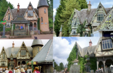
I think the intention is that is looks cartoony and like a dilapidated haunted house is “expected” to look.
 
Last edited:
To be honest, I actually don’t think that the facade looks all that different. It looks subtly darker (and if I’m being honest, I actually prefer that), but other than that, it essentially looks the same as before to me.

And to be honest, I’m glad about that. The ride’s facade didn’t really need any major changes, in my opinion, and it still fits the new theme of the ride well.
 
Status
This topic has been locked. No further replies can be posted.
Top