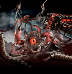
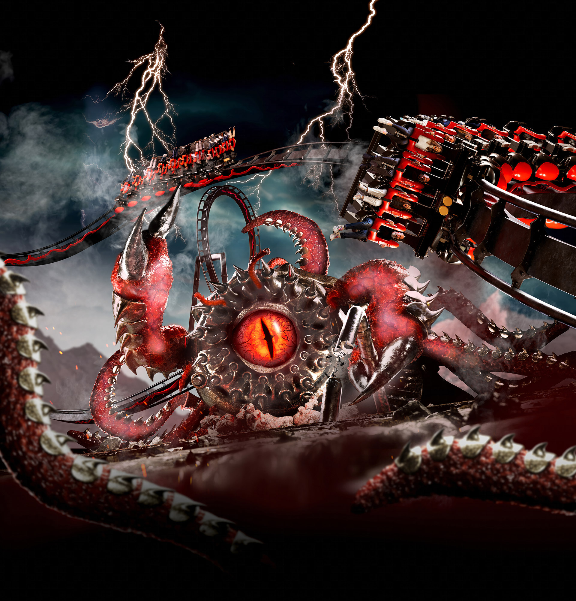
Perhaps we should just wait until it’s painted and themed, I mean it could have a monster coming out of it or anything? Shipping containers can be utilised well. I mean we’re kinda forgetting the nemesis monster is one big shipping container and actually the whole area “rustic look” was majority shipping containers anyway? This is one area where they actually get away with it quite well to be honest.
In my opinion the new nemeses monster/station track and theming looks pretty outstanding to me so far!
As for forbidden valley it’s a beautiful landscaped area and quite unique, it was full of rustic looking shipping containers anyway. Some of which are currently getting demolished and rebuilt, so painting them black and adding little touches whatever they will be, in my eyes is a welcome improvement and will be noticeable to guests. New theming and a story is always welcome, talks of new cafe, nemeses shop and potential new flat…to say this is a downgrade project baffles me, to me you only have to look at the arcade container to realise this area is going to look much smarter! Hopefully they will paint Sub terror to black, red or grey. I actually think it be really nice to have the same colour pallet running consistent through an entire area.
Merlin are stepping away from the darker colours and themes we have seen this and they address this issue. However this is an area where the darker theme really has always suited, I wouldn’t want overly bright colours and fun theming as this wouldn’t compliment Nemesis at all. So I’m going to blame closed season blues on this one.