Can’t say I’m a fan.
It already looks pretty outdated in my opinion. This sort of style is what we were doing about 7-10 years ago. Text logos can work fine for certain types of company, but for a theme park I’d be looking for something with more character. It needs to make a statement and stick in your mind, and that’s pretty tricky to achieve with text alone. Only a few large parks come to mind that manage it.
EP incorporated the flying stars and used a very clean, professional looking font. They also use two very bold and contrasting colours that stand out.
Phantasialand use a unique style, paired with something more standard for the “land” part.
They too however created a version of their logo with more personality, bringing in their dragon characters. It’s not suitable in all cases, but it’s a good option for showing something more fun.
Efteling use a clean style but that still has a themed feel to it. In this one they too use stars/sparkles, but they are included with purpose. Even if you were to removed the swoop from the E you would still likely associate them as the dot over the i.
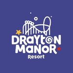
All that the new Drayton logo has is a cheap and clumsy swirl for the O and two little Shutterstock stars that look like a naff afterthought to try and give it some personality.
It’s generic, amateurish and devoid of any personality or charm. I would really hope this is just something they’ve tried to come up with in-house and haven’t paid large sums for a branding agency to come up with it (not that I believe they have…).
My biggest concern is that it looks cheap. As someone else has said previously, it looks like the sort of logo the local nursery or soft play area pays the local graphic designer and £99 website shop to come up with. It doesn’t look like the logo of an established, large scale attraction. It’s what I have expected to find for somewhere like Sundown, Bottons or any seaside fair/amusement park. Not Drayton Manor.
Consumers
do make these associations too. It’s the reason branding and marketing are such huge industries (it’s kept me in work for nearly a decade now
). People do judge the book by its cover, and the quality of the brand makes a statement to customers. I’m not suggesting that people will stop visiting Drayton because of a new logo, but it will set a different tone for their marketing and shift perception I think.
It’s a shame really, as the old branding was pretty iconic in my opinion, and seemed to have stood the test of time pretty well given how long it had been in use. It was getting ready for a refresh and yes the inclusion of Shockwave was questionable given the audience they now seem to aim for, but a
refresh was all that was needed. Not a complete ground-up restart.