- News all the latest
- Theme Park explore the park
- Resort tour the resort
- Future looking forward
- History looking back
- Community and meetups
-
ℹ️ Heads up...
This is a popular topic that is fast moving Guest - before posting, please ensure that you check out the first post in the topic for a quick reminder of guidelines, and importantly a summary of the known facts and information so far. Thanks. - Thread starter PeteB
- Start date
- Favourite Ride
- Forbidden Journey
- Favourite Ride
- Hex - The Legend Of The Towers
- Favourite Ride
- Hex
- Favourite Ride
- Oblivion
- Favourite Ride
- bandit (movie park)
- Favourite Ride
- Your Dad

You are using an out of date browser. It may not display this or other websites correctly.
You should upgrade or use an alternative browser.
You should upgrade or use an alternative browser.
Scarefest 2012
djtruefitt
TS Team
I was there yesterday and asked about it but they didnt have the cards, but they have issued me the ticket (just like a park ticket) and they said I just need to go to the box office when im next on park to pick the card up. By the sounds of things it will be like an annual pass.
BigAl
TS Member
OllieeBee said:Alton Towers twitter have just posted a picture of what appears to be a CoS light? I can't post the picture because I'm technologically inept. Getting excited now though!
This one?

They also posted this one too...

Which obviously reads "The Sanctuary".
Their tweet:
Get yourself comfortable as the Doctor will see you now

Max
TS Member
Ugh.
I hate that logo so, so much. I looks like something from a Saturday morning cartoon, the font used is fine, its just that yellow circle thing, It looks like it was made in Fireworks in 5 minutes and the way the text curves looks like a bloody greetings card!
I hate that logo so, so much. I looks like something from a Saturday morning cartoon, the font used is fine, its just that yellow circle thing, It looks like it was made in Fireworks in 5 minutes and the way the text curves looks like a bloody greetings card!
Harv
TS Member
Not really understanding all the sign-hate here?
It's not that bad. It matches the predictions made earlier in the year of a black and yellow colour scheme (someone pointed out that this was likely due to Oblivion - Orange/black, Submission - Blue/black, Enterprise - Green/black). The font is clear and fairly futuristic/official looking. It's a little bland but at the end of the day it serves it's purpose.
The text is what's interesting me.
'The Doctor Will See You Now' - that's intriguing. I really like it and I have a feeling that genetic mutation/experimentation is a theme that they'll be playing around with. Good stuff.")
It's not that bad. It matches the predictions made earlier in the year of a black and yellow colour scheme (someone pointed out that this was likely due to Oblivion - Orange/black, Submission - Blue/black, Enterprise - Green/black). The font is clear and fairly futuristic/official looking. It's a little bland but at the end of the day it serves it's purpose.
The text is what's interesting me.
'The Doctor Will See You Now' - that's intriguing. I really like it and I have a feeling that genetic mutation/experimentation is a theme that they'll be playing around with. Good stuff.
LiamC
TS Member
Sanctuary
There you go.
Regarding the logo, I can see why they've gone for a simplistic design in that it leaves it wide open to the imagination as to what actually will go on in there. But I don't really think it works towards the general public. If they had tarted it up and bit and dropped some Easter eggs in there as to what people may expect, I think it could have been a more substantial effort.
That's just my two cents anyway.
Vicky
TS Member
Very interesting how they're posting that The Ministry of Joy are directly linked to SW7 and will perhaps feature as part of it's backstory, but that's off topic...
The logo is a bit bland, but it still features the "smile" design we've been seeing around park in a way, and it fits with the futuristic design of x-Sector but that won't really go with the Towers at the setting, the logo for the Sanctuary should be more "old" as it is the establishment, TMOJ is more modern.
It's mainly what happens inside the maze that gives you an impression, so as long as that's more impressive than the logo! It certainly doesn't give any clues towards it...
Sam
TS Member
All I can think of is American gay magazine The Advocate.

Also, the Altonville Motel is a blatant rip-off of Alfred Hitchcock's Bates Motel from the film Psycho, but I love it!
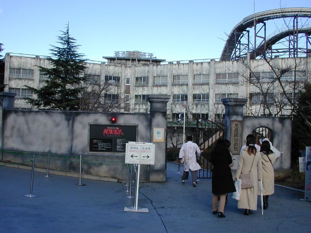
The Sanctuary also reminds me of the permanent Haunted Hospital scare-maze, the world's biggest, at Fuji-Q.
Also, the Altonville Motel is a blatant rip-off of Alfred Hitchcock's Bates Motel from the film Psycho, but I love it!
The Sanctuary also reminds me of the permanent Haunted Hospital scare-maze, the world's biggest, at Fuji-Q.
josht
TS Member
That really does look good great themeingSam said:All I can think of is American gay magazine The Advocate.
Also, the Altonville Motel is a blatant rip-off of Alfred Hitchcock's Bates Motel from the film Psycho, but I love it!
The Sanctuary also reminds me of the permanent Haunted Hospital scare-maze, the world's biggest, at Fuji-Q.
Ben
TS Founding Member
I dont mind the sanctuary logo, Im assuming its meant to look like a medical centre and working in the medical world I can tell you we get some awful logos around - this is quite clever.
They cant pull off the 'safe professional institute' look with a messy, damaged logo can they? It needs to be sterile with just a hint of what else is there - they do it well.
Woo.
They cant pull off the 'safe professional institute' look with a messy, damaged logo can they? It needs to be sterile with just a hint of what else is there - they do it well.
Woo.
For me, the logo has kind of a subliminal, double meaning to it. On one hand, I see the white lines at the bottom as teeth like in the graffiti marketing, and on the other - when the white "teeth" are combined with the surrounding white line at the edge of the circle, I see an enclosure (or cell) forming - as the name suggests - a sanctuary.
queenofspeed
TS Member
To be honest, the logo looks a bit tacky......with the whole theme i don't think it looks quite right. It looks a bit like a prototype tbh.
this looks so cool! really looks like what it is meant to be! i hope alton can pull this off with cos because that would be amazing. like, a real big top with their awesomeness stripes! so not gonna happen!Sam said:All I can think of is American gay magazine The Advocate.
Also, the Altonville Motel is a blatant rip-off of Alfred Hitchcock's Bates Motel from the film Psycho, but I love it!
The Sanctuary also reminds me of the permanent Haunted Hospital scare-maze, the world's biggest, at Fuji-Q.