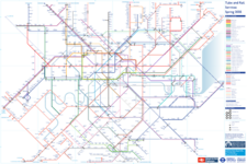
As anyone who lives, works or visits London knows, the tube map has become an absolute mess. Nothing quite fits together, there's no flow or balance or logic or internal geometries and symmetries to it or anything. It's a shame that arguably the most iconic wayfinding diagram of all time has fallen like this. Compare what we have now to
my personal favourite from 1977. So I decided to make a new one, and while I was at it, have a bit of fun and add in some of the projects that are either planned or were before covid slashed all the budgets.
The first thing that had to go was the zones. Although I'd prefer to get rid of them entirely, on a system this big it's probably an inevitability. But that doesn't mean they have to be on the map the way they are, dictating the layout so much. I don't actually think they serve much purpose at all on the map. The vast majority of riders are either commuters who will know their zones (or their costs) or tourists who mostly stay in the inner zones where it doesn't really matter too much what zones they pass in to. If they must exist at all they can be made available elsewhere, such as the back of the map, or just add little numbers next to the station labels. Removing the zones allows the Sutton loop to be drawn as a nice rectangle, and on the version I made without National Rail, a perfect square, which I'm so pleased about. The current loop is one of the absolute worst features of the map.
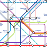
When I started drawing, the intention was to properly follow TfL's own rules for interchanges. Shared platforms and tracks get lines that touch and a single interchange dot. Changes that require moving to different platforms get connector dots and lines that are seperate. At the moment, it seems almost random how they are displayed on the official map. Yet despite this, many big stations are a hideous mess of blobs. Unfortunately with the big stations serving so many services now this method doesn't really work how it was intended to back in the 30's. So I've decided to allow myself freedom to allow different lines to share a dot if they head in different directions. It should still be intuitive that lines crossing at 45 or 90 degree angles are not on the same platforms. This has allowed some really neat interchanges.
The other reason I've decided not to follow the dot rule strictly is I decided to prioritise line simplicity and get rid of the wiggles. The Northern line through Charing Cross (now seperated from the City branch of course) and the Central line are completely straight and form an x-y axis through the centre. I thought about having Crossrail be the east-west axis but the distortions required were too much. I think having it weave across the central grid still conveys what its purpose to the system is. The 'thermos flask' is completely symmetrical too. The entire central portion is based on a square grid, and an earlier draft has Crossrail staying higher up to avoid having extra kinks to get to Farringdon and sticking to the grid better, but the stretched out connections were unpleasant to look at. The southern, National Rail section has the familiar pyramid shape centred on Blackfriars.
The downside is there are a couple of stations which have really big, unweildy dot networks, but I decided to accept this compromise in exchange for preserving the central grid. Maybe I could have compromised and had the Central line have one dip for Bank. Overall though I can't believe how simple stations like Liverpool Street reduced to considering how that's looked on recent real maps. One of my other favourite tube maps was
Beck's proposed 1961 map which had the Victoria line heading at a perfectly straight 45 degrees end to end. I didn't quite manage that - the northern end needing to connect with the Overground and the entire southern extension makes that impossible, but the central chunk is straight, and all it cost was giving Euston some big arms. Of course, Paddington is displayed correctly. I was dissapointed I couldn't get the straight line right across it from Richmond to Dartford that I've seen others achieve, but other design choices - especially the decision to show the proposed Northern Line extention to Clapham, meant it wasn't possible.
I've decided that the District and Piccadilly lines should swap over at the Ealing and Uxbridge ends, not only would this improve operations it would allow platform alterations to get level boarding and screen doors at most stations. Great Northern, Greenford line and the Victoria - London Bridge service is to be brought in to Overground. I've kept the new colours but decided against the new names as I find some of them a bit try-hard. The current parallel lines for non-tube services I've changed though, I felt with the new colours on the Overground it became hard to tell lines apart from a distance. I'm not a fan of the dotted line currently used for Thameslink as I find it distracting, but when I tried it out on my Overground, it actually seemed to work nicely. Crossrail has been made a full colour line, as from a rider's perspective it's just a modern, bigger tube, so why should it not only be different from the tube, but be drawn in the same way as the Overground which has much lower frequencies.
The parallel lines instead go to local and regional National Rail services, and long distance services are faint lines with thin hard borders, inspired by how central London NR services were sometimes shown on older maps. Obviously in my version, the railways have been renationalised so Network South East and Intercity are back. I thought a lot about how to colour these services, originally each terminus had its own colour, and although it made it easier to follow where services from multiple termini meet, it was just a mess of colour, and so I went for something
done in the past by NSE - just using the NSE colours to group services based on which direction they head in, except for Thameslink. Reusing colours in opposite directions means they don't clash, and that the Watford - Croydon service can fit into both North and South Central regions. The downside to this is it becomes difficult to follow where two or three services interact, such as at Selhurst. Combining lines would have helped but it was more important to me to maintain seperation of each termini so those unfamiliar with the network can see that not every station in the suburbs goes to every termini in its grouping. For similar reasons I decided to seperate Tram and DLR services based on where they go.
One thing I do need to do to improve the map is add back in disability access. The current system of blue circles with the symbol in place of ticks and dots does not look good and gives too much weight on the right of the map. The distinction between step free access to train and step free access only to platform isn't entirely obvious without looking at the key to see which colourway for the circles is which. I'm not really sure how best to implement it though. I've thought about little blue dots next to the station names in the same way things like the Double Arrow or airport symbols go, with an empty circle for platform access and a full circle for train access; or changing the ticks to their own colour instead of the colour of the line, but neither of these really looks right or is very clear. Ideas?
The full size image is way too big for TS so hopefully the compression hasn't made it totally unusable lol. As always with these things it's a work in progress so any advice for usability improvements, tidying up or obvious mistakes I've missed ,give me a shout