• ℹ️ Heads up...

    This is a popular topic that is fast moving Guest - before posting, please ensure that you check out the first post in the topic for a quick reminder of guidelines, and importantly a summary of the known facts and information so far. Thanks.

The World of David Walliams: General Discussion

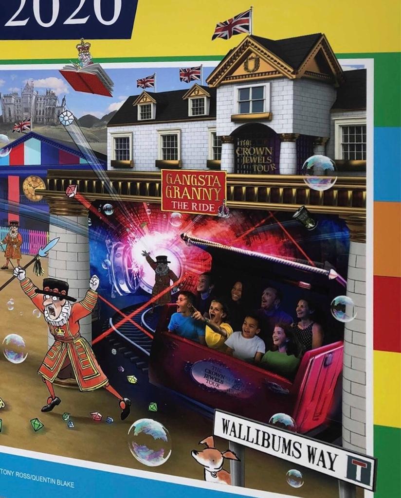
I don't think there's anything wrong with the entrance, I like the logo and the crown jewels sign. My only niggle would be I don't like the funny red thing behind the logo, I don't think that bit is needed.

Yeah that’s the bit I was referring to in my post, just didn’t explain it very well.

The big red section seems cheap and unnecessary and actually appears to hide the nicer ‘Crown Jewels Tour’ signage.
 
I actually think that looks really nice; I like the detailed brickwork on the walls!

I think that this ride will be a really fun addition to the park, and just what the area needed!
 
- Like the brick work.
- Don’t mind the sign
- Like the bit behind the sign
- Don’t like the windows

Based on the rumoured budgets I think this is acceptable.
 
The entrance looks like the work of Leek Signs. I would have expected something of a better quality even for a lower budget ride.


In all fairness I understand there going for more the traditional style too the books. Where they went wrong with Charlie, So less 3D. So I kind of understand It. I love how they used actual planters, Nice touch. I actually like the windows. Far better than just painting over them. Maybe if lit up could be better (but budgets again) I’ve noticed the theatre, the windows have just been painted over, that’s disappointing. Also Do we think the pillars be brick themed like the rest & concept art?


Sent from my iPhone using Tapatalk
 
Last edited:
48fdba16d8116925ea8ef29ed3b04398.jpg


Like the picture, I would still like too see all the roof terrace details & finishes along the edges. However looking at the art work the sign different & so are the other building colours. The books style and colours are different too. But the planters are a nice add on, as wasn’t on the pics. Hopefully more theming be added too the area on open day. I can imagine the ride inside will be good!


Sent from my iPhone using Tapatalk
 
The red sign looks temporary perhaps, just for a press event. All the red seems to just cover up whats behind it (looks very incomplete).

Although, Merlin...
 
Filming for the TV advert has apparently been taking place today.

This picture shows the entrance sign to the new area. Banners appear to have been added to the theatre since the weekend and you can just about see the horses for the carousel which appear to have been repainted.

 
I suspected this would happen, its turned into gangsta granny land.
I’m actually glad they used less emphasis on David Williams him self, it’s bizarre & looks cheap too call a whole theme area to his name anyway. At least now it puts more focus on the rides and themed land than a celebrity’s name more. For the record I actually like David Williams. It’s also very hard to distinguish his character from tv to an recognised serious author.
 
I like the actual purple glass (if it is) behind the Crown Jewel text. The other windows look naff. I can see what they are doing with the red fabric banner as in it's supposed to be a gangster granny take over of the Crown Jewels ride.

Looks OK, Nothing special but nothing to moan about. I'm more interested in seeing what they have done with the shop.
 
Top