- News all the latest
- Theme Park explore the park
- Resort tour the resort
- Future looking forward
- History looking back
- Community and meetups
-
ℹ️ Heads up...
This is a popular topic that is fast moving Guest - before posting, please ensure that you check out the first post in the topic for a quick reminder of guidelines, and importantly a summary of the known facts and information so far. Thanks. - Thread starter Ted
- Start date
- Status
- This topic has been locked. No further replies can be posted.
- Favourite Ride
- Journey to the Center of the Earth
- Favourite Ride
- Voltron Nevera
- Favourite Ride
- Pirate Adventure
- Favourite Ride
- Monsters Unchained: The Frankenstein Experiment
- Favourite Ride
- Black Hole
- Favourite Ride
- Voltron Nevera
- Status
- This topic has been locked. No further replies can be posted.
You are using an out of date browser. It may not display this or other websites correctly.
You should upgrade or use an alternative browser.
You should upgrade or use an alternative browser.
Thorpe Park: General Discussion
JMW
TS Member
Looks like a radio station!
Zeock
TS Member
I have to say, I actually quite like it! It’s simple, but quite classy!
The new slogan is also “the home of feel-good thrills”.
Here’s the final branding video, for a bit of additional context and information:
Hopefully this new brand ushers in a new dawn for Thorpe Park after a rough few years!
The logo looks quite retro. I like it, but I prefer the infinity logo, at least for the moment.
whywhowhere
TS Member
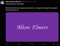
God, this has only got me hoping Merlin doesn't decide to ruin the logos of Towers and Chessie as well.
Skyscraper
TS Member
Trooper Looper
TS Member
So... bland... oh no... I'm getting Drayton Manor flashbacks now!
Aside from that, I'm very excited for Thorpe Parks future
Aside from that, I'm very excited for Thorpe Parks future
Joeythorpe
TS Member
Thats my local station also and I thought the exact same


whywhowhere
TS Member
Even Thorpe's logo from 1979 (when it was a bit of a low budget park) was vastly superior to this dull nothingness.It's dreadful. Looks like something from a low budget park 20 years ago. Aside from Drayton, I'm struggling to think of a worse UK park logo.
whywhowhere
TS Member
I can guarantee within the next few days we'll see every theme park YouTuber react negatively to this logo change... except Jack Silkstone, Thorpe Park's chief propagandist, who probably designed it.
Joeythorpe
TS Member
The logo is at the top of thorpes website already, it looks … bad, I’m not sure if it’s gonna grow on me tbh :/
We were all too quick to laugh at Drayton new logo
We were all too quick to laugh at Drayton new logo

whywhowhere
TS Member
I think Drayton's logo is fine. At least it's made an attempt to be fun with the swirls and stars. Thorpe's new logo is literally just text in fonts that look like they came from Microsoft Word.The logo is at the top of thorpes website already, it looks … bad, I’m not sure if it’s gonna grow on me tbh :/
We were all too quick to laugh at Drayton new logo
AT86
TS Member
Just realised, no ‘Resort’ ?
The_bup
TS Member
Like.. there isn’t even a symbol or anything!Thorpe Park... more like Thorpe Business Park.
Blackhole_Sun
TS Member
Skyscraper
TS Member
They said in the video that they want to be known as a "theme park with onsite accommodation" instead of a "resort ".Just realised, no ‘Resort’ ?


