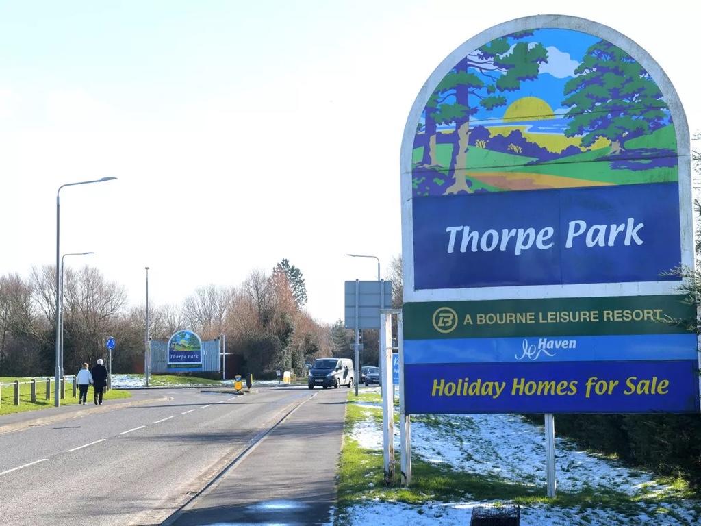
whywhowhere
TS Member
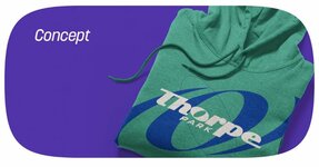
They should hire me. My dad is a graphic designer so I'm qualified enough.Don't give em ideas now!!
They should hire me. My dad is a graphic designer so I'm qualified enough.Don't give em ideas now!!


Hey, if it cleans the park up I guessHot take: I get it. I don't necessarily like it (also don't hate it) but I can understand something dynamic, clean & simple. It also has a few nods to the previous logos.
It's nothing like I expected at all, the logo itself appears a little too corporate for a theme park and will certainly take a lot of getting used to but I quite enjoy the new colourful brand (it's giving 90s!) and 'feel good thrills' identity.
Saved By The Thorpe Belle
Nothing in the 90’s looked like that or had that sort of colours used.Hot take: I get it. I don't necessarily like it (also don't hate it) but I can understand something dynamic, clean & simple. It also has a few nods to the previous logos.
It's nothing like I expected at all, the logo itself appears a little too corporate for a theme park and will certainly take a lot of getting used to but I quite enjoy the new colourful brand (it's giving 90s!) and 'feel good thrills' identity.
First two images are popular 90s styles... final image is new Thorpe Park visual identity... I see similarities...Nothing in the 90’s looked like that or had that sort of colours used.
Hot take: I get it. I don't necessarily like it (also don't hate it) but I can understand something dynamic, clean & simple. It also has a few nods to the previous logos.
It's nothing like I expected at all, the logo itself appears a little too corporate for a theme park and will certainly take a lot of getting used to but I quite enjoy the new colourful brand (it's giving 90s!) and 'feel good thrills' identity.
They are an impression of what people thought the 90’s looked like….First two images are popular 90s styles... final image is new Thorpe Park visual identity... I see similarities...


Thing is, I get nostalgia and how popular it is, but if their intention - if only slight - was to encapsulate the 90s vibe, why do that when they're rebranding and they're leaving the old behind and looking to a bright, clean, fresh future?First two images are popular 90s styles... final image is new Thorpe Park visual identity... I see similarities...
In a reply to Attraction Source's post announcing the logo someone wrote this:
From: https://x.com/mattl_27/status/1730313287852584988?s=20
That does seem a bit far-fetched, but I wonder what the reasoning behind dropping "resort" is?