jmc
TS Member
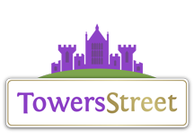
I’m not protective about any theme park branding whatsoever other than Towers (I’m on a Towers forum, duh) but which ever way I look at it this is truly dreadful! Does not shout out escapism/fun/family/theme park etc.
Funnily enough I have a graphic designer friend on facebook who has picked up on this who is not an enthusiast at all… a sample of replies on his original sharing of the logo “very corporate looking ”:-
”:-
- its giving wordart
- Ew I could make this on Paint
- MagicFM logo
- Loose Women logo
Oh dear.
Its reaaaaally ironic that this logo looks more suited to the previous marketing angle they have publicly derided than their previous one!
Sent from my iPhone using Tapatalk Pro
Funnily enough I have a graphic designer friend on facebook who has picked up on this who is not an enthusiast at all… a sample of replies on his original sharing of the logo “very corporate looking
 ”:-
”:-- its giving wordart
- Ew I could make this on Paint
- MagicFM logo
- Loose Women logo
Oh dear.
Its reaaaaally ironic that this logo looks more suited to the previous marketing angle they have publicly derided than their previous one!
Sent from my iPhone using Tapatalk Pro

