Joeythorpe
TS Member
Just realised that the new logo also spells out as ‘Thorpe PARK’  so much for not shouting at us :/
 so much for not shouting at us :/ so much for not shouting at us :/
Nope that is hideously dated.You know its bad when Pleasure Islands logo looks 10 times better when comparing the two.
Yep I think Thorpe had already stopped withe the resort branding anyway? Given they have “accommodation” but not really a hotel or much else it made since not to push that they are a resort.

Come now Matt, surely by now you've realised that your extreme positivity on... well, all things, isn't necessarily a true reflection of the general consensusI have to say, I’m really surprised at how much hate the new logo is getting.
Yes, it’s perhaps not the most jazzy or “magical” logo on earth, but I think it’s nice, clean and classy. I appear to be in a vast minority in thinking that, however!
Part of me wonders if new logos are a bit like coaster names, where people hate them initially, but get used to them over time. This logo instead of the infinity logo will definitely take some getting used to, but I wonder if part of the current hate for it is the fact that it’s new and different. I remember Drayton Manor’s new logo getting absolutely slated a year or two back, but people don’t really seem to mention it now.


Part of me wonders if new logos are a bit like coaster names, where people hate them initially, but get used to them over time.
Despite what people say, I’m not necessarily positive about absolutely everything. If you had a read through my post history, I’m sure you’d find plenty of posts where I’m not necessarily overwhelmingly positive about things. I try to be constructive and balanced.Come now Matt, surely by now you've realised that your extreme positivity on... well, all things, isn't necessarily a true reflection of the general consensus
No, it's not just that we don't like change - it's that it fails to convey the message it is required to.I have to say, I’m really surprised at how much hate the new logo is getting.
Yes, it’s perhaps not the most jazzy or “magical” logo on earth, but I think it’s nice, clean and classy. I appear to be in a vast minority in thinking that, however!
Part of me wonders if new logos are a bit like coaster names, where people hate them initially, but get used to them over time. This logo instead of the infinity logo will definitely take some getting used to, but I wonder if part of the current hate for it is the fact that it’s new and different. I remember Drayton Manor’s new logo getting absolutely slated a year or two back, but people don’t really seem to mention it now.
I definitely do agree that the logo looks pretty good on the merchandise, and much better than what the logo looks like on its own.I do think it looks better in the merchandise renders that Thorpe Park have on their website, where it has patterns framing it. Perhaps seeing this version of it might make it grow on people?
Honestly, I have no connection to Thorpe's logo. I'm not up in arms it is changing. I'm just in awe they made something so awful. I don't think it looks that amazing on the merch.

Just my quick 2 pence worth.
Hate it, hate it hate it. Bland, unimaginative and thoroughly corporate. What grates me more is we've had a 3 day build-up to this. Like they were unveiling something amazing.
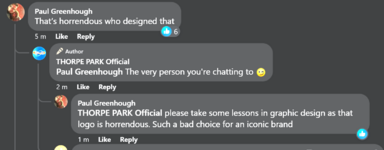
Also, just had a little look on Twitter and seems their social team are going full 'attack' mode. Rude, sarcastic and very unprofessional.
If this attitude is part of the new 'branding' then they need a serious rethink.