• ℹ️ Heads up...

    This is a popular topic that is fast moving Guest - before posting, please ensure that you check out the first post in the topic for a quick reminder of guidelines, and importantly a summary of the known facts and information so far. Thanks.

Thorpe Park: General Discussion

“Themed areas” might be a stretch, as Thorpe Park have never really prioritised area theming, as far as I can tell. I’d certainly say that the themed areas aren’t as strong at Thorpe overall as they are at other parks, but it’s not really something they seem to prioritise.

However, I think it would absolutely be fair to say that Thorpe Park could be in the running for having some of the country’s best themed rides, dependent on your thoughts.

I personally feel that Swarm in particular could definitely be in the running for the UK’s best themed coaster. I think it’s really detailed, with lots of awesome set pieces, and I love the whole environment of Swarm Island! I would personally argue that Swarm is better themed than, or at very least as well themed as, any coaster at Alton.

I also think that Saw: The Ride is really well themed, with a very good indoor queue and dark ride section. The dark ride section in particular is really cool!

While I haven’t done The Walking Dead: The Ride, I’ve also heard some very good things about the theming of that.
Totally agree with you.

Maybe this is controversial but I'd say that Swarm is probably the best themed coaster in the UK after Wicker Man. In another year I might've said Vampire or Nemesis (but, let's be honest, the state of Vampire's theming has progressively gotten worse since 2002; and Nemesis wasn't looking particularly great either in its final years before construction started on the retrack). Swarm's got a unique station, interesting storyline, and those destroyed vehicles scattered about and the billboard add so much to the experience and create some great headchoppers. Walking Dead has good theming for what it is too - for me it's made a pretty forgettable family coaster scary. Hell, even Ghost Train has good theming (even if it's a terrible experience overall).

It proves that Thorpe can do great theming when they want to. Unfortunately (for me at least, as a theme park enthusiast rather than a coaster or amusement park enthusiast), a lot of the time they don't seem to want to - or they just don't have the money to, which is debatable considering Chessington did some of the UK's best ever theming in the late-80's with relatively little money using random scrap items, but I don't know what goes on behind the scenes.
 
Last edited:
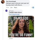
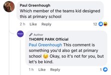
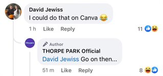
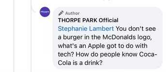
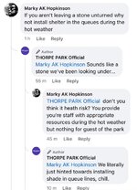
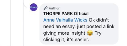
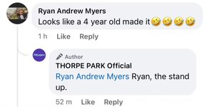
Some of the replies last night from the Thorpe park team across social media platforms were absolutely uncalled for. Someone really took it all to heart and got pretty defensive/sarcastic.

A few examples attached.

Attacking people back is not really the way the park should be represented, nor the way to get people on-side with their new brand. I think perhaps they should be looking on indeed.
 

Attachments

  • IMG_6696.jpeg
    IMG_6696.jpeg
    91.6 KB · Views: 114
  • IMG_6689.jpeg
    IMG_6689.jpeg
    62.5 KB · Views: 114
  • IMG_6688.jpeg
    IMG_6688.jpeg
    36.6 KB · Views: 110
  • IMG_6690.jpeg
    IMG_6690.jpeg
    40.9 KB · Views: 109
  • IMG_6694.jpeg
    IMG_6694.jpeg
    82.2 KB · Views: 114
  • IMG_6693.jpeg
    IMG_6693.jpeg
    110.6 KB · Views: 113
  • IMG_6691.jpeg
    IMG_6691.jpeg
    35.4 KB · Views: 111
  • IMG_6695.jpeg
    IMG_6695.jpeg
    41.2 KB · Views: 114
Some of the replies last night from the Thorpe park team across social media platforms were absolutely uncalled for. Someone really took it all to heart and got pretty defensive/sarcastic.

A few examples attached.

Attacking people back is not really the way the park should be represented, nor the way to get people on-side with their new brand. I think perhaps they should be looking on indeed.
Admittedly a lot of the comments were quite rude, so it's quite understandable that the unpaid intern (or Jack Silkstone) behind the social media account might wish to give that attitude back, but there was clearly genuine discontent and unhappiness with the new logo behind them.

I'm not usually a "customer is always right" kind of person, but when you have quite a decent majority of people telling you they don't like what you're doing, perhaps it would be a good idea to listen to them and not engage in such a way - I mean this isn't just one rogue hate comment or anything. Then again, I'm no marketing expert. Maybe being rude and dismissive is all part of their 'fun new look'. Either way, to me I think this is the most embarrassing blunder Thorpe Park has ever had.
 
This ‘re-brand’ seems to have fallen at the first hurdle. On the one hand they are putting out videos and blog posts about how this is a new beginning, where they want Thorpe Park to be for everyone and they want to listen to guests and take on feedback.

Then on the other hand they are sarky and borderline rude to customers in their social responses. This is literally going against what you said your new brand was about - so is it a re-brand or not? I thought they wanted to move away from confused branding? This is just more of the same.

Again, in the video they said they have moved away from all caps and calling themselves a resort. Yet their Twitter name and bio is still called THORPE PARK Resort. Who is planning and co-ordinating this? It’s not exactly slick.
 
Admittedly a lot of the comments were quite rude, so it's quite understandable that the unpaid intern (or Jack Silkstone) behind the social media account might wish to give that attitude back, but there was clearly genuine discontent and unhappiness with the new logo behind them.
We're long past the days where unpaid interns are behind social media accounts. They have an entire social media department and it would have been a fully paid up paid employee's responsibility to manage the account last night, especially with such a high profile launch.

Incidentally, unpaid internships are illegal. If you know someone who's hiring interns to work for them, and not paying them, please report them to ACAS and HMRC. - https://www.gov.uk/employment-rights-for-interns
Just a figure of speech/internet joke really, Goose. Probably makes it worse if they're paid to do this, come to think about it.
 
Wow, where to start with this one!

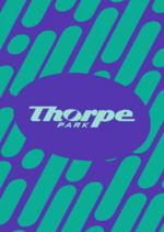
As others have already pointed out (as well as Thorpe Park), the new logo is a wordmark. I can understand why they thought taking this direction for the logo was a good idea, as it can allow for the logo to be very easily applied to all sorts of backgrounds etc. And I actually think the logo looks pretty decent when it is sitting in front of a graphic or design pattern, as seen on that example hoodie. However, I think it looks poor on a plain background, whether that be in one their new brand colours or the navy blue on white. It's just lacking something. Also when the logo is shrunk down to fit a social media profile image it's actually quite difficult to read.

Going back to the wordmark concept, I see that they said yesterday that other successful brands like Disney, Google and Coca-Cola have a wordmark. The difference here is that these wordmark logos have been in existence since almost day one of each company. They are instantly recognisable because it is all we know from these brands. So it is going to take time for Thorpe Park to achieve the same brand recognition with their new logo.

I do really like the new brand colours and six dynamic patterns they have. They are vibrant and have a bit of a retro but still modern feel to them. I also like they they're dropping 'Resort' from the name; Thorpe Park is clearly not a resort and it is good that the new leadership at Merlin are allowing them to move away from this. This almost certainly would not have been allowed under the previous leadership who wanted resort plastered everywhere on all of their theme parks.

The new honest/authentic approach is something I like as well. Although I think they should ease off with some of the sarcastic/defensive replies regarding the logo on social media. They must have known that whatever the logo was going to be, there would be a negative reaction to some degree as naturally humans do not like change.

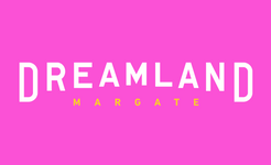
Wordmarks seem hot right now, it’s seen to be a trendy and fresh approach. A wordmark means the brand can overlay on attention seeking colours and backgrounds without having to stick to rigid brand/colour guidelines. It’s all a bit Dreamland Margate, trying to be cool.
 

Attachments

  • IMG_0652.png
    IMG_0652.png
    6.3 KB · Views: 45
2.png

I don't think it looks so bad with a background like the above. Revealing your new logo against a white background probably wasn't the best choice.

Personally, the main issues for me are the 'logo' not suiting social media icons (*squints*) and how this new 'brand' has been implemented. It seems you have a marketing team with a vision, and the social media team has been left to do what they like. The logo on the website also looks odd, and I feel they should have rebranded/designed the website simultaneously (I know Merlin sites are all the same, but maybe they could change that up a bit now).

It has all been so poorly implemented. Is it a resort now or not? Logo says no, website and social media say yes. It's not the best start to reenvisioning your brand.
 
It looks incredibly dull on the plain background originally posted in this thread (I never bothered to watch the video after seeing that as it was such an underwhelming reveal). It looks better on something like the above image but however they present it there are 3 stylistic choices that really bug me:

1. The long tail on the E.
2. The O being slightly taller than the other letters
3. The massive letter spacing in P A R K, if they wanted it bigger they could have used wider letters
 
I like the rebrand but I’d say its main strength is its versatility, so we may not be able to appreciate it properly until we’ve been exposed to more applications. They’ve shown a few examples in the PR (like the stealth/rush posters) and I think they look quite charming!
 
I like the rebrand but I’d say its main strength is its versatility, so we may not be able to appreciate it properly until we’ve been exposed to more applications. They’ve shown a few examples in the PR (like the stealth/rush posters) and I think they look quite charming!

^^ this… on a vibrant colour background or in white on a dark area of an image it looks good.
 
so… why was the graphic designer/brand consultant manning the socials last night?
IMG_0653.jpeg
It’s Merlin, they had the tea lady in charge of ride maintenance during fireworks this year. Would expect that they have to do a number of roles within roughly the same areas.

The cups of teas haven’t been the same since though!
 
so… why was the graphic designer/brand consultant manning the socials last night?
IMG_0653.jpeg
I would imagine that they're replying as "the park" and not an individual. This will have been farmed out to an external design consultancy, or done in house at Merlin. Not given to Thorpe's social media manager.

That, or they got Siobhan Sharpe from Perfect Curve to handle everything.


From: https://youtu.be/EOZmxz-cYmI?si=Xpp5oqSTi6OoG58S

From: https://youtu.be/uUzdGaepo0M?si=JCIN1sLKoNLbA5Xu
 
Last edited:
I understand that the social media response is crap, but would you expect anything else from Thorpe? I see that most of this is from that hate site that funds Elon Musk's retirement fund that half this forum seem to be avid fans of. If you go on a site where hate is rampant, directly mentioning an account known for being rude in the name of trying to be 'cool' and 'edgy', aren't these responses entirely predictable?

Regrettably, this is all typical Thorpe, typical Twitter/X, typical social media in general, and typical behaviour from the kind of people who choose to log on to these sites just to tag others to vent their disapproval from the safe distance of a mobile phone screen.
 
Last edited:
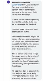
A member of the passholder group called TP out regarding their tone of voice on social media following the logo reveal and this was their response. Team Jack Silkstone seem to have been the brains behind the 3 part series (I'm sure I saw a tweet confirming they had full involvement but can't find it again - think it was from Arch Nemesis) with that in mind... this adds further to speculation that they are behind the rebrand...
Screenshot_20231202-085430_Facebook.jpg
Apparently Jack Silkstone has already confirmed that he wasn’t involved with the logo, for what it’s worth.

Although it admittedly wouldn’t have been overly surprising for Jack or some of his friends to be involved seeing as they now seem to work for Thorpe in a borderline official capacity.
 
Top