
whywhowhere
TS Member
Totally agree with you.“Themed areas” might be a stretch, as Thorpe Park have never really prioritised area theming, as far as I can tell. I’d certainly say that the themed areas aren’t as strong at Thorpe overall as they are at other parks, but it’s not really something they seem to prioritise.
However, I think it would absolutely be fair to say that Thorpe Park could be in the running for having some of the country’s best themed rides, dependent on your thoughts.
I personally feel that Swarm in particular could definitely be in the running for the UK’s best themed coaster. I think it’s really detailed, with lots of awesome set pieces, and I love the whole environment of Swarm Island! I would personally argue that Swarm is better themed than, or at very least as well themed as, any coaster at Alton.
I also think that Saw: The Ride is really well themed, with a very good indoor queue and dark ride section. The dark ride section in particular is really cool!
While I haven’t done The Walking Dead: The Ride, I’ve also heard some very good things about the theming of that.
Maybe this is controversial but I'd say that Swarm is probably the best themed coaster in the UK after Wicker Man. In another year I might've said Vampire or Nemesis (but, let's be honest, the state of Vampire's theming has progressively gotten worse since 2002; and Nemesis wasn't looking particularly great either in its final years before construction started on the retrack). Swarm's got a unique station, interesting storyline, and those destroyed vehicles scattered about and the billboard add so much to the experience and create some great headchoppers. Walking Dead has good theming for what it is too - for me it's made a pretty forgettable family coaster scary. Hell, even Ghost Train has good theming (even if it's a terrible experience overall).
It proves that Thorpe can do great theming when they want to. Unfortunately (for me at least, as a theme park enthusiast rather than a coaster or amusement park enthusiast), a lot of the time they don't seem to want to - or they just don't have the money to, which is debatable considering Chessington did some of the UK's best ever theming in the late-80's with relatively little money using random scrap items, but I don't know what goes on behind the scenes.
Last edited:
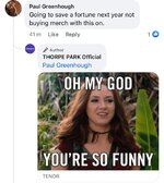


 with just a few minor changes to the letter ‘O’
 really quite shameful tbh. What were they thinking? Did the designers not get a hint that the brand refresh was hyped up on social media and it mightve been worth putting in more effort