- News all the latest
- Theme Park explore the park
- Resort tour the resort
- Future looking forward
- History looking back
- Community and meetups
-
ℹ️ Heads up...
This is a popular topic that is fast moving Guest - before posting, please ensure that you check out the first post in the topic for a quick reminder of guidelines, and importantly a summary of the known facts and information so far. Thanks. - Thread starter Randomizer462
- Start date
- Favourite Ride
- NemiLerVion
- Favourite Ride
- Voltron Nevera
- Favourite Ride
- Nemesis/Dragon Khan
- Favourite Ride
- NemiLerVion
- Favourite Ride
- NemiLerVion

You are using an out of date browser. It may not display this or other websites correctly.
You should upgrade or use an alternative browser.
You should upgrade or use an alternative browser.
Towers Loving Care
Towers freak
TS Member
Fairly sure that picture is not 1994 (might be wrong), that look like the paintwork has aged a little.
Found another picture from during the construction and the monster was not a clean cream colour like it is in the latest pictures from the refurb but a little more darker and dirtier.
(might not have explained myself as well as I wanted but I hope if you compare them, you might get what I mean)

Courtesy of the Stoke sentinel
In comparison with latest pictures
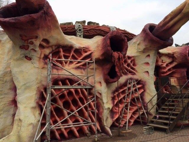
To me I always saw the alien as having an exoskeleton a bit like a crab, if you go back to the back story of the ride the alien was sat under the ground for millenia. It would need a hard rock like shell rather than skin in order to be protected from the weight of rock and earth so it wouldn't be crushed. Being bone/rock grey in colour would fit this.Would it be too much to say I think the new station paint looks better than 1994! The bone grey was good but I feel it would look somewhat dated today. The organic cream however has a real living quality to it, while remaining disturbingly alien.
Last edited:
TheMan
TS Member
Can't do a true side by side as the weather's dull on the new photo, the original photos are very bright sunshine.
But the fact we are needing TO DO side by side comparisons to discuss the FINER points of this is a TRULY BEAUTIFUL THING.
Towers, whoever got this through, I love you.
This old girl has deserved this treatment for ages.
I probably do still prefer the original, well I do, but my goodness she needed and deserved this!
jon81uk
TS Member
Great picture on the TLC Twitter this morning.
https://twitter.com/altontlc/status/703514085917388800
https://twitter.com/altontlc/status/703514085917388800
Great picture on the TLC Twitter this morning.
https://twitter.com/altontlc/status/703514085917388800
Embedded for you
")
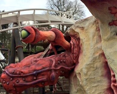
That detail is astonishing. It's so odd to look at because this is genuinely what appears to be the mark of Disney standards, yet here we at, at Merlin's flagship park.
If this level of quality persists, we'll be in for a treat.
CGM
TS Member
The paintwork is good and should be commended but let's not get carried away.this is genuinely what appears to be the mark of Disney standards,
The paintwork is good and should be commended but let's not get carried away.
It's not as if they've just slapped some paint down and moved on, it's clear that an element of precision, care and a level of intense detail has been applied to the eye and the tentacle below it.
Had I been referring to the actual building highlighted in the image I'd say fair enough, as to me it still looks a little bare and needs padding up to look a little less flat and false. If they can take the detail from the more organic structures in this photo and apply the same level elsewhere, then the whole project would be more than simply 'good'.
Skyscraper
TS Member
maybe they'll paint it to match the track?...and the track in the background is still bright white. It's going to look a bit odd this highly detailed cream coloured monster having crisp white track emerging from it.
TomLad
TS Member
Pictures?Top of the loop has been painted in bright white as well
TheMan
TS Member
Please let us just enjoy the fact they have painted and cleaned the station, I think comparing them from opening day to now is nit picking. Yes there will be fine detail changes but it looks 1000 times better than it did 6 months ago
No it's not. It's comparing them.
For those of us who remember the impact it had at opening, and wishing others to experience the same, and having wanted it back to the fantastic experience it was back then - a like by like comparison, which in actual fact, is a compliment and is also down to taste as no one is actually criticising the work that's been done, just which they PREFER, is perfectly normal.
There's areas of concern, but it seems to me slowly but surely Towers are answering those concerns with detailing.
I still prefer the original. Because it was the original. But I am in NO WAY saying the standard they seem to be aiming for here, is in actual fact, anything but exceptional.
No it's not Disney, but then again... it never was!
The fact that it's being compared to the quality of the 1994 original (when it was arguably at its best), rather than just last season (when it was arguably at its worst) can only be considered a compliment to towers. Right Now, I could say it looks as good as the original, and maybe by next year it may even look better.No it's not. It's comparing them.
For those of us who remember the impact it had at opening, and wishing others to experience the same, and having wanted it back to the fantastic experience it was back then - a like by like comparison, which in actual fact, is a compliment and is also down to taste as no one is actually criticising the work that's been done, just which they PREFER, is perfectly normal.
There's areas of concern, but it seems to me slowly but surely Towers are answering those concerns with detailing.
I still prefer the original. Because it was the original. But I am in NO WAY saying the standard they seem to be aiming for here, is in actual fact, anything but exceptional.
No it's not Disney, but then again... it never was!
TheMan
TS Member
I am going to reserve judgement until i see with my own eyes, just like i first saw it in 1994.
Thing is though my friend, we'll never hear "DUM DUM CHHSHHHH DUM DUM CHSSSHHHH" for the first time lol.
STILL gives me chills thinking about that after all these years!!
Or the first time the floor goes down.
It's so standard now people are used to it.
Mind you, there's still plenty of people who've never seen one before - and it's amazing seeing youngsters and the terror in their eyes as they face their fears and ride... and for that matter, some of their parents lol!!
I do love that about Towers, how it's always friendly like that.
Their eyes as that floor goes and that's it - then watching the HUGE grin when they come back.
THAT is pure magic.
Something Wardley has now given to multiple generations of families. Incredible really when you think about it properly. The amazing impact he's had on so many people's lives.