- News all the latest
- Theme Park explore the park
- Resort tour the resort
- Future looking forward
- History looking back
- Community and meetups
-
ℹ️ Heads up...
This is a popular topic that is fast moving Guest - before posting, please ensure that you check out the first post in the topic for a quick reminder of guidelines, and importantly a summary of the known facts and information so far. Thanks. - Thread starter adsyrah
- Start date
- Status
- This topic has been locked. No further replies can be posted.
- Favourite Ride
- Phantom Manor
- Favourite Ride
- Nemesis
- Favourite Ride
- Nemesis
- Favourite Ride
- Nemesis
- Status
- This topic has been locked. No further replies can be posted.

You are using an out of date browser. It may not display this or other websites correctly.
You should upgrade or use an alternative browser.
You should upgrade or use an alternative browser.
X-Sector Developments (Including Oblivion)
Natalie
TS Member
Like a accent wall in a room, I have a goldy cream colour paint on my walls apart from one which is a black flocked wall paper where my bed is. You need a pop of colour to add interest for the eye which is why each ride in X-Sector has it's own highlight colour.
E
electricBlll
So, are your walls painted entirely orange and cream? Are your walls intended to look like the semi-industrial headquarters of a secretive technological experimentation organisation?
I only care because X Sector used to possess such a good, dark vibe that I have always enjoyed - even before I was tall enough to ride Oblivion. I don't see why this had to be changed.
And now I'll shut up.
I only care because X Sector used to possess such a good, dark vibe that I have always enjoyed - even before I was tall enough to ride Oblivion. I don't see why this had to be changed.
And now I'll shut up.
E
electricBlll
No, it's not "Merlin doing a repaint". Merlin didn't even approve of the sponsorship and asked to reverse the changes in 2011, but for some reason the pipes were not reversed. Repaints are hardly ever a positive thing at Alton Towers, unfortunately (see the loss of all detail on Nemesis' station or the recent Splash Landings changes). Oblivion's brilliant black track repaint was a remarkable exception.
This it what the building would look like with all sponsorship removed. That wouldn't be so hard to do, plus it would be a start at turning the Rehydrator into something interesting again.
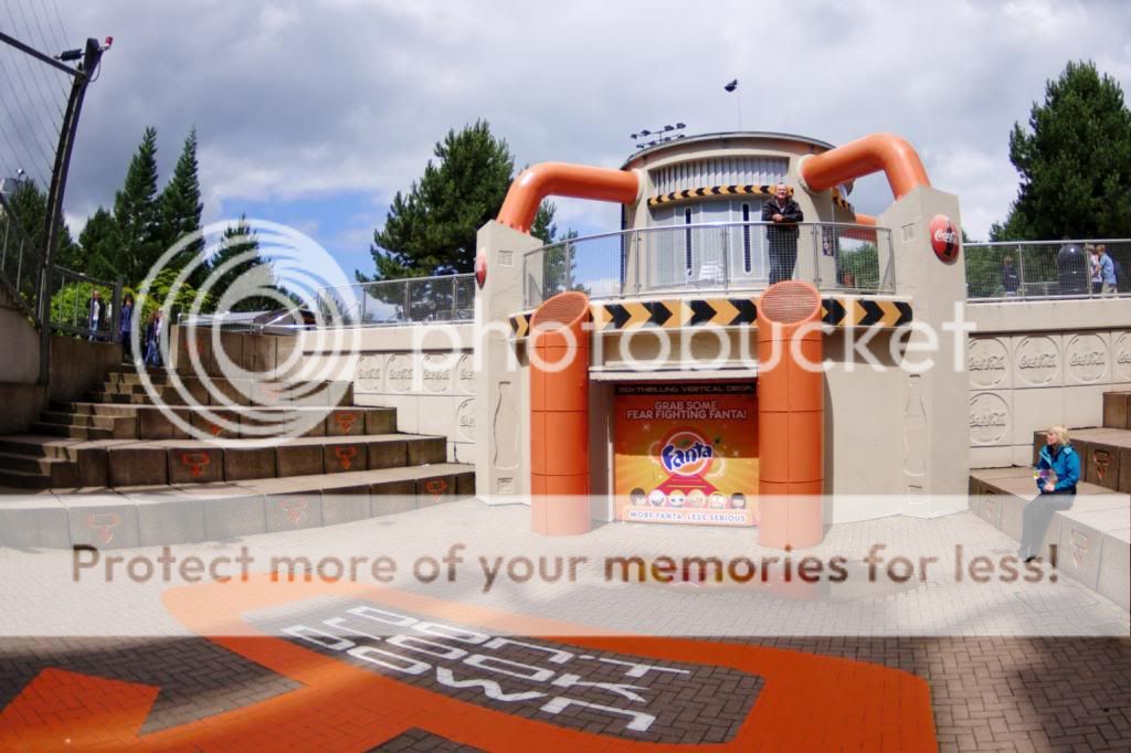
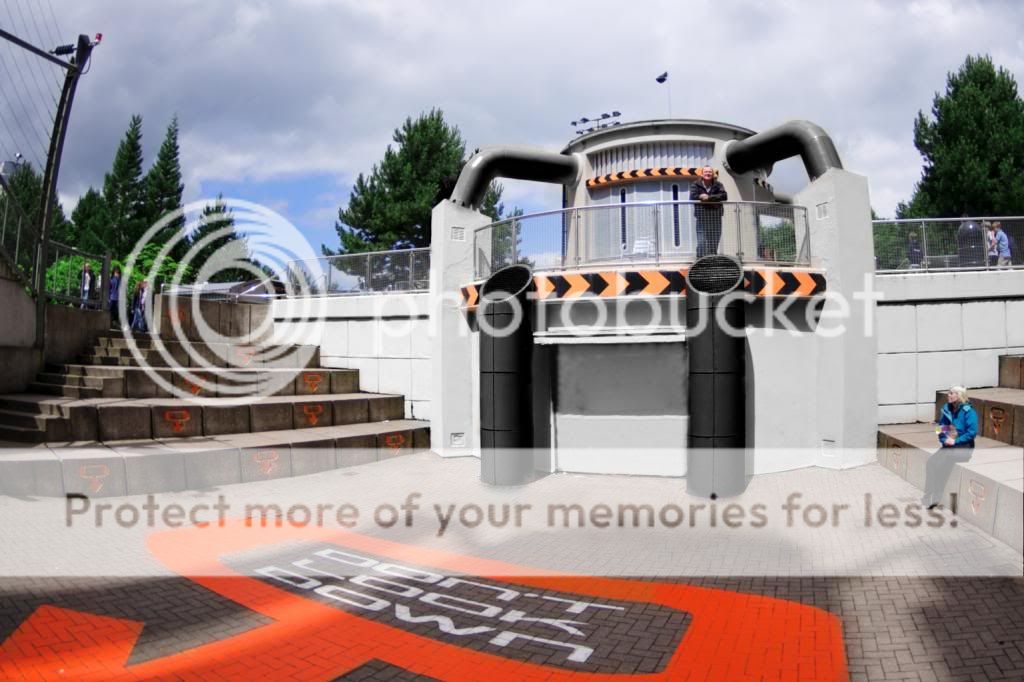
Surely the bottom image looks more effective, or am I going mad?
This it what the building would look like with all sponsorship removed. That wouldn't be so hard to do, plus it would be a start at turning the Rehydrator into something interesting again.
Surely the bottom image looks more effective, or am I going mad?
My point is we're seeing a repaint happen and people are complaining.
Looking at those two images, I prefer the orange pipes (though not the huge Fanta logo). It mixes things up a bit, and looks a bit more interesting. As for the sponsorship, I genuinely did not even realise the lack of Coca-Cola logos until I had looked at for a while; bar the Fanta thing, it's completely unintrusive. Maybe it's the fact I haven't finished Alton that much in my life, but when I look at oranges pipes, I see nothing wrong with it...
Fits in nicely with the trend the X Sector rides have as well. All the rides are black with a secondary colour - orange, blue, green and yellow for Oblivion, Submission, Enterprise and Smiler respectively (unless I'm imagining things..). It's not like it doesn't 'fit in' with the style, and it just makes things look a bit better.
I see nothing wrong with it at all..
Oh for goodness sake, if people want to complain about something they dislike, they have every right to.. Just because they are having a repaint, doesn't mean that they are painting it in a design concious or consistent manner.
Painting these pipes orange is a massive mistake as when used in abundance it makes for a bright, inviting and fun atmosphere, as opposed to the mysterious industrial complex that X-Sector has always been and is still meant to be. Black as a colour has universally accepted design connotations of the dark, of the unknown, of edgyness and even sleekness. It's perfect for Oblivion and the rehydrator.
If just seeing it repainted is enough to warrant celebration despite whichever inappropriate colour is picked then why don't they paint the pipes hot pink while they are at it?
As Bill has already made clear, using orange highlights is a great way to inject colour into the area but keeping within the areas minimalist aesthetic. Nothing as big as those pipes should be orange.
Meat Pie said:Oh for goodness sake, if people want to complain about something they dislike, they have every right to.. Just because they are having a repaint, doesn't mean that they are painting it in a design concious or consistent manner.
If just seeing it repainted is enough to warrant celebration despite whichever inappropriate colour is picked then why don't they paint the pipes hot pink while they are at it?
As Bill has already made clear, using orange highlights is a great way to inject colour into the area but keeping within the areas minimalist aesthetic. Nothing as big as those pipes should be orange.
I'm not saying people don't have the right to complain, not at all. I'm just surprised, that's all.
It seems to be a bit marmite whether people like it or not really, but it seems the park have gone with orange, and want to stick with orange. I'm glad to see that they're giving it a freshen up when they could have quite easily avoided doing so. Orange suits the style Oblivion has, so I don't think it's creating a massive continuity issue with styles and theming.
I get that people may not like the colour, and I get why, but I personally don't think there's anything wrong with it. Regardless of whether the colour is liked or not, though, it's good to see that we're seeing upkeep done on smaller things inline with the appropriate style, something which Merlin is highly criticised for...
E
electricBlll
The only reason they have given it a repaint is because they have changed the food on offer.
It's back to being a hot dog stall, now with nachos also.

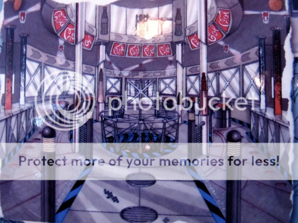
Such a far cry from the original intention:
It's back to being a hot dog stall, now with nachos also.
Such a far cry from the original intention:
CoasterCrazyChris
TS Member
I suppose the only positive from this is we do get a half decent themed sign. Don't like that condiment stand though, kind of ruins the symmetry of the building a bit.
Rehydrator aside, has anyone seen the pictures of the tall fences around the pond? Completely pointless. Seems like they are putting those ugly fences around anything and everything they possibly can, regardless of whether are needed or not.
")
Rehydrator aside, has anyone seen the pictures of the tall fences around the pond? Completely pointless. Seems like they are putting those ugly fences around anything and everything they possibly can, regardless of whether are needed or not.
Andrew
Former TS Team Member

Copyright to Jack Gater
More painting is continuing on the Rehydrator. It's looking quite good now and the orange pipes don't bother me that much now because they've been repainted.
Just needs a good jet wash in X Sector (especially in the drop zone) and it will look fantastic!
CoasterCrazyChris
TS Member
Since when was the fencing around the drop boarded up? Looks dreadful....
Andrew
Former TS Team Member
CoasterCrazyChris said:Since when was the fencing around the drop boarded up? Looks dreadful....
I think it's been there for quite a while and has signs on the other side giving directions to rides.
EDIT: They're there on Street View at Alton which was taken in 2009.
E
electricBlll
I'm sorry, but this photo is just depressing, there's no atmosphere or excitement on display here. And I disagree that the fluorescent pipes help to brighten the area up in bad weather, it just shows up the stains more. (No, it's not supposed to look grotty)

I've noticed the pipes are actually a brighter hue compared to the previous coat. You can see they have removed the chevrons while they paint the vents. And, is it just low light, or are the walls a darker shade of beige? It's certainly doesn't look as good as the original silvery colour.
On the plus side, The Smiler looks fantastic rising up from the adjacent pit.
_________
Oh, and, farewell open space around Oblivion's tunnel exit, you were good in your time. I took this photo in 2011:
Andrew
Former TS Team Member
I'm sure that the area around the Rehydrator will look better once the concrete has been cleaned properly. From other photos, the paint looks the same colour as it always was, so it must be that that photo is darker (which would also make the area much more depressing).
As for the space around Oblivion's exit hole, you win some, you lose some. Yes, it's a shame that that has now gone but at least we have a colossal coaster next to it.
As for the space around Oblivion's exit hole, you win some, you lose some. Yes, it's a shame that that has now gone but at least we have a colossal coaster next to it.
CoasterCrazyChris
TS Member
Personally I think the paint on the concrete steps looks worse than the pipes.
You're not supposed to paint concrete you fools! (Especially without cleaning it first)
You're not supposed to paint concrete you fools! (Especially without cleaning it first)
E
electricBlll
People + sunshine = atmosphere? That's not my understanding of the word.Blaze said:There's no 'atmosphere' in that picture because there's about five people tops in it and it's an overcast day.
I'm talking about the ugliness and grottiness of the whole area. Not really Alton Towers' fault, since concrete just acts that way after a while. They simply could have maintained it better, by which I don't mean painting over the flaws with pretty luminous colours. If they are trying to clean it, then good for them.
There have been rides and paths next to that hole for years. The fences are not required, since there are already taller fences on the edge of the hole itself.Andrew said:Yes, it's a shame that that has now gone but at least we have a colossal coaster next to it.