• ℹ️ Heads up...

    This is a popular topic that is fast moving Guest - before posting, please ensure that you check out the first post in the topic for a quick reminder of guidelines, and importantly a summary of the known facts and information so far. Thanks.

Disneyland Resort, California: General Discussion

LOL at Universals, although Disney has generally preserved their history better, and Universals are in the process of turning two of their 'classic' rides into Jimmy Fallon and Fast and Furious.

Disney World has a more complex ride system, but I think I prefer the Disneyland version because it's less stop start. I will save my ultimate judgement until it's complete, but the Hollywood Tower Hotel did fit the theme of the park perfectly.
 
I don't think the DCA Tower is anywhere near as good as Florida's original, which is a massive compliment, given that it's still better than 80% of rides I've ever been on. I think this will work out, but on a personal level, I'd much rather it wasn't happening.
 
I think this overlay is a terrible idea.

Yes GOTG is popular and the DCA Tower may be the weaker of the four towers, but should be happening? No!

The tower rides are amongst the most Iconic and popular Disney rides in the world and replacing one of them with a quick-fix popular IP overlay feels like an insult to most Disney fans.

Sure, it doesn't mean this won't be a bad ride (it could be s very good ride), but the way they're doing this is unacceptable and not to mention will scratch away some of the amazing work done to make DCA the amazing park it now is from the shambles it used to be.

Had this ride been built elsewhere in the park (even with the same ride system) I think it could've been a massive hit for the park, but instead it's a home goal. The 4:1 dislike ratio on the YouTube video says it all really and knowing Disney they won't U-turn now.

As a Disney fan, I always try to see the positive in what they do, even their recent ones. Like replacing an ageing boat ride with the popular Frozen or even Avatar land replacing nothing. But with this, there's nothing I can do to justify it.

The California Tower will be dead very soon and if/when I ever do DLR it will be long gone.
 
It has been confirmed that they Disneyland Railroad and other attractions around the Rivers of America will re-open in summer of next year. This includes Fantasmic!

:)
 
Whatever you think of the Gaurdians of the Galaxy re-theme to ToT, Disney have stooped to a new low:

Screen%20Shot%202016-09-20%20at%203.30.57%20PM-600x350.png

Source: Theme Park Tourist

Removing the iconic signage whilst the ride is still open seems a little unnecessary. I'm sure there are reasons for it (i.e. they know they are pushed for time with the makeover and want to get a head start on the exterior) but it goes against almost every long standing Disney principal!

:)
 
I'm still horrified that Disney are doing this, and messing with one of their most well-known and beloved attractions.
 
It looks like someone's stuck a load of drinking straws to it and gone mad with the spray paint. They haven't made any great effort to conceal the Art Deco features of the building. Whether that's intentional or not, it comes across as a cheap rush job and doesn't fit in with the new theme at all.
 
They probably saw how much praise Universals were getting for banging stuff out, and thought, 'right, we'd better bang something out'. So they banged, and this is what came out.
 
Well after being in California when they removed the sign last month, I have to admit my attitude toward the change did soften a little. I was prepared to wait and see what they came up with in the finished product, but this video has me ridiculously disappointed in the state of what they've come up with.

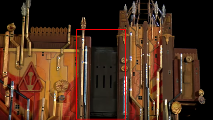
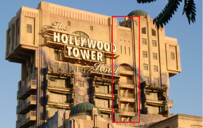
There's one thing that's REALLY winding me up about this model. There's a middle bit to ToT:

6f3b63c75589408d9fe4f495fde34baf.png


..Which is clearly part of the building, so can't be removed. The initial concept art shows that this area would be themed as well, but in this model it's an utter mess:

912da39a7df34b8ab99742558133e29e.png


48d6d2c4a8e9499c84bd0ca24347e060.png


Black paint?! IF that's in the final product, that's going to look an absolute state against the (usually!) bright blue sky in California. It's just looking cheap, hideously tacky and a terrible knee jerk reaction to capitalise on the success of the movies. The Marvel MCU and the park's guests deserve better than this if Disney are so desperate to capitalise on it.
 
Top