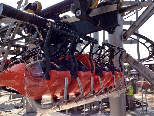
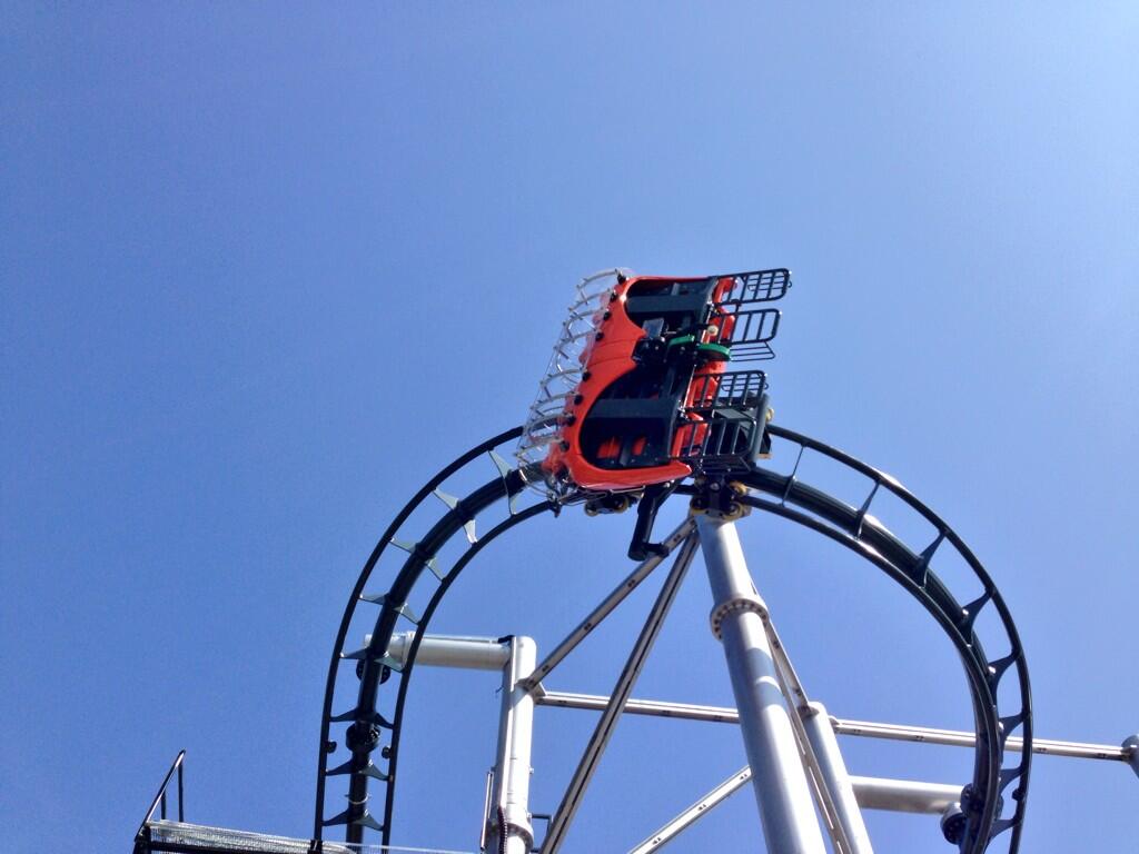
Yeah same restraints as vampire essentially, although unlike Chessington instead of releasing them and then pushing down on the stuck restraints, they push down on all of them before opening them. It's just more faff that they create with that ride. That rides loading procedures are pure faff anyway.CGM said:BowMan said:Bit off topic but does anyone know why they check the restraints on Kumali once the ride is over? Seemed a bit pointless :/
I'm pretty sure that they're pulling down on each restraint to ensure it releases properly.
- News all the latest
- Theme Park explore the park
- Resort tour the resort
- Future looking forward
- History looking back
- Community and meetups
-
ℹ️ Heads up...
This is a popular topic that is fast moving Guest - before posting, please ensure that you check out the first post in the topic for a quick reminder of guidelines, and importantly a summary of the known facts and information so far. Thanks. - Thread starter soundwave96
- Start date
- Favourite Ride
- Forbidden Journey
- Favourite Ride
- Forbidden Journey
- Favourite Ride
- Forbidden Journey
- Favourite Ride
- Eejanaika (Fuji-Q Highland)
You are using an out of date browser. It may not display this or other websites correctly.
You should upgrade or use an alternative browser.
You should upgrade or use an alternative browser.
Flamingo Land: General Discussion
BigAl
TS Member
Flamingoland's Twitter have put up a cool picture of Hero's lift from directly beneath it:
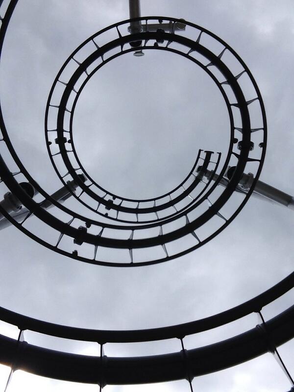
Great! But where's the rest of this BEAST!?

Great! But where's the rest of this BEAST!?
BigAl
TS Member
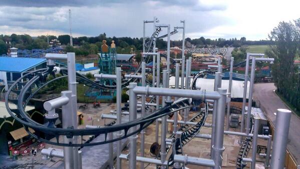
More goodies from Flamingo Land's treasure trove of tweets! 
First, another image of Hero:
A few Tweets referencing Smiler's problems...
flamingopics:
Flamingo Land Resort:
Michael Cherkassky:
Flamingo Land Resort:
And finally, surely this ride should be nicknamed 'Right-hand Turn: The Ride'...
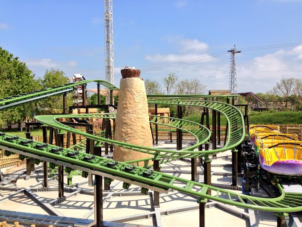
Just one turn left!
First, another image of Hero:

A few Tweets referencing Smiler's problems...
flamingopics:
@flamingolanduk hero is looking great!
Flamingo Land Resort:
@flamingopicsuk many thanks here's another great shot of #Hero should make the customers smile pic.twitter.com/JlIJWdTgRK
Michael Cherkassky:
@flamingolanduk @flamingopicsuk I like the way you put "it will make the customers smile" is this because the smiler keeps breaking lol?
Flamingo Land Resort:
@CherkassJames as if we would we sink so low ;-)
And finally, surely this ride should be nicknamed 'Right-hand Turn: The Ride'...

Just one turn left!
BigAl
TS Member
Rose Of Dawn
TS Member
Those dinosaurs may be incredibly out of scale, but I'm sure kids will love them. Doesn't look too bad at all.
Sam
TS Member
Another issue for me is the layout (as in the lack of vision and planning of). Nearly all parks have an identifiable geographical personality, which informs their character as a theme park. Disney being the most obvious example, but think of the way Alton horseshoes around the valley, and then forms a circle around the Towers.
Drayton is another good example, with the lake providing one structural point, and the main street another. The rides and attractions are then 'pegged' onto these geographical features. Flamingoland may be well themed in parts, but its layout is completely random, rides and areas scattered about all over the park, with seemingly no long-term planning about how it will form a better park.
Rides and themed areas back awkwardly onto each other, and rather than major rides being on the park edges, they're slapped in the middle. It gives the park a very weak personality or character, and doesn't give much hope that it'll become anything better than it is now in the future. :S

I mean look at it, it's so bloody random. Apart from Lost River Ride (possibly their finest hour), none of it looks like it's been located or placed with any sort of thought or planning. It literally does look like the park has been designed by dropping ride outlines on a map and then filling in paths in-between.
Drayton is another good example, with the lake providing one structural point, and the main street another. The rides and attractions are then 'pegged' onto these geographical features. Flamingoland may be well themed in parts, but its layout is completely random, rides and areas scattered about all over the park, with seemingly no long-term planning about how it will form a better park.
Rides and themed areas back awkwardly onto each other, and rather than major rides being on the park edges, they're slapped in the middle. It gives the park a very weak personality or character, and doesn't give much hope that it'll become anything better than it is now in the future. :S

I mean look at it, it's so bloody random. Apart from Lost River Ride (possibly their finest hour), none of it looks like it's been located or placed with any sort of thought or planning. It literally does look like the park has been designed by dropping ride outlines on a map and then filling in paths in-between.
Dave
TS Founding Member
Sam said:Another issue for me is the layout (as in the lack of vision and planning of). Nearly all parks have an identifiable geographical personality, which informs their character as a theme park. Disney being the most obvious example, but think of the way Alton horseshoes around the valley, and then forms a circle around the Towers.
Flamingoland may be well themed in parts, but its layout is completely random, rides and areas scattered about all over the park, with seemingly no long-term planning about how it will form a better park.
Rides and themed areas back awkwardly onto each other, and rather than major rides being on the park edges, they're slapped in the middle. It gives the park a very weak personality or character, and doesn't give much hope that it'll become anything better than it is now in the future. :S
To be fair Europa Park has no central geographical point, its entrance is in an illogical position and areas back onto each other. Obviously EP made something of that so there is no reason somewhere else cannot.
FL issue will remain until they get their head out of the sand and fix their operational issues.
CGM
TS Member
Sam said:I mean look at it, it's so bloody random. Apart from Lost River Ride (possibly their finest hour), none of it looks like it's been located or placed with any sort of thought or planning. It literally does look like the park has been designed by dropping ride outlines on a map and then filling in paths in-between.
I've always thought it resembles a badly thought out RCT park. It's like that situation where you've clicked on build ride and you're hovering around the park trying to find a space where the blue squares will fit. Flamingoland just build the ride in the first space they find, usually near the entrance.
All of the major rides are bunched into an area that probably isn't even a quarter of the park's size. I know that the animals need plenty of space but in terms of the amount of land they own, Flamingoland's got to be one of the UK's largest parks and the space could be much better utilised.
Disney understood that by spreading out the major attractions and locating them as far away from the entrance as possible, you distribute visitors throughout the park. This avoids congestion and introduces guests to minor attractions on the way, reducing queues on the major rides. Flamingoland have ended up with the complete opposite of this meaning that the front of the park gets crowded whilst the massive, open areas around Lost River Ride are practically deserted.
I suspect it's a matter of infrastructure. Perhaps Flamingoland don't want to foot the bill for providing high voltage 3-phase power to the far reaches of the park. It could also be that FL wants to keep the rides as far away from the zoo and the village as possible so that they don't upset the animals of the locals.
There is one small area of Flamingoland that I think feels like a proper landscaped theme park rather than a glorified fair and it's the area next to the lake between Kumali's drop and Voodoo. I don't know why they don't make better use of the lake as it's by far the most naturally beautiful part of what is mostly quite a flat and barren park.
The current layout is effectively three parallel strips of land divided up by the monorail and a line of trees, both of which seem to be some sort of sacred barrier as the park won't allow anything to cross their path. It creates this weird end to end feel and whilst you can cut across from one area to another, to do so you often have to walk through a shop or arcade, it's in no way intuitive and just bizarre. Some parks you can visit for the first time and you don't need a map to find your way round. I've been to FL many times but its layout still confuses me.
Sorry for this somewhat lengthy, formless post but theme park layouts just don't get discussed enough around here!
Plastic Person
TS Member
Oh, herro.
